X GIRL

«Все мы по-своему необычны»

WORK PACKAGE FOR A PERFUME BRAND

HISTORY OF CO-OPERATION

Our web studio was approached by video blogger Diana Rozhkova. This feminine and young girl knows very well what is needed for those who are young and active. That’s why she decided to launch her X girl perfume line with fragrances for every mood.

The main message of the brand: a unique fragrance for a modern girl, in which everyone can find herself and reveal new facets! Everything depends only on what she wants to be today.

Translated with www.DeepL.com/Translator (free version)

MARKET ANALYSIS

Each of our projects starts with a thorough marketing analysis of the market, for X girl the following indicators became the starting points:

  • Target audience of perfumes – teenage girls and young girls up to 25 years old.
  • Sales market – large cities of Ukraine.
  • Buying situation – personal company islands in shopping centres, online shop.

DEVELOPMENT OF LOGO VARIANTS:

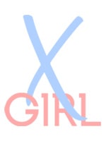
LOGO DESIGN

The main symbol of the new line of fragrances is the sign X. This sign is used to denote everything exceptional, innovative and unusual. The X symbol has the meaning of luxury, success and speed. In addition, statistics show that most customers are more emotionally receptive to a product if its packaging, name or logo contains the symbol.
This was the impetus for the creation of the X girl logo: unified for the entire range, yet unique for each individual perfume. The design of the perfume logo is made in two colours: soft pink and Tiffany. This palette emphasises the main mood of the brand – romanticism, femininity and youth.


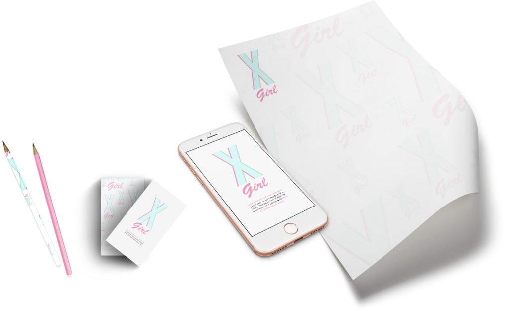
CORPORATE IDENTITY DEVELOPMENT:

To attract and remember the target audience it was decided to use a unified approach to the design of the range, the choice of colour combinations and key images, the design of the website and product packaging.

We faced a difficult task: to create a corporate identity that would loudly announce the new perfume brand. And we succeeded!
The result of the work of our designers and marketing specialists was the creation of:

DEVELOPMENT OF ORIGINAL PACKAGING:

The key concept of the new brand was the X symbol, then our designers chose to play with this element by filling in the background and additional details. Thus we created 20 variants of perfume label design and this is what we got in the final result.

X-MAX CONCEPT:

  • A bright, bold and self-contained design.
  • To reveal the essence of the fragrance, we have chosen one image, which we fill the space inside the X sign with.
  • The attention of the beholder is concentrated on the centre of the package, allowing him to grasp the main idea and complement the product with his own associations.

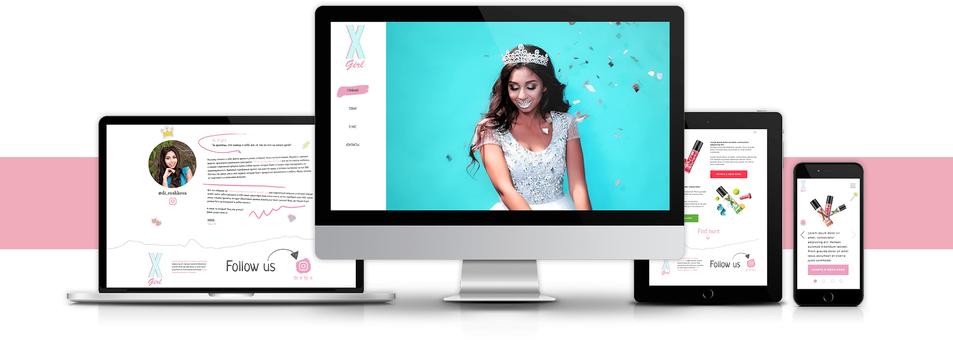
WEBSITE DESIGN AND DEVELOPMENT:

Any project in the modern world needs online representation, especially if it is youth products.

The design of the online shop is made in magazine style, with elements of collage and handwritten fonts. Delicate colour palette of design emphasizes the orientation on the youth audience.

On the first page of the site there is a presentation video, the main characters of which are real X girls. Each of the girls is unusual and unique, as well as her fragrance

THE CREATION OF A SHOPPING ISLAND:

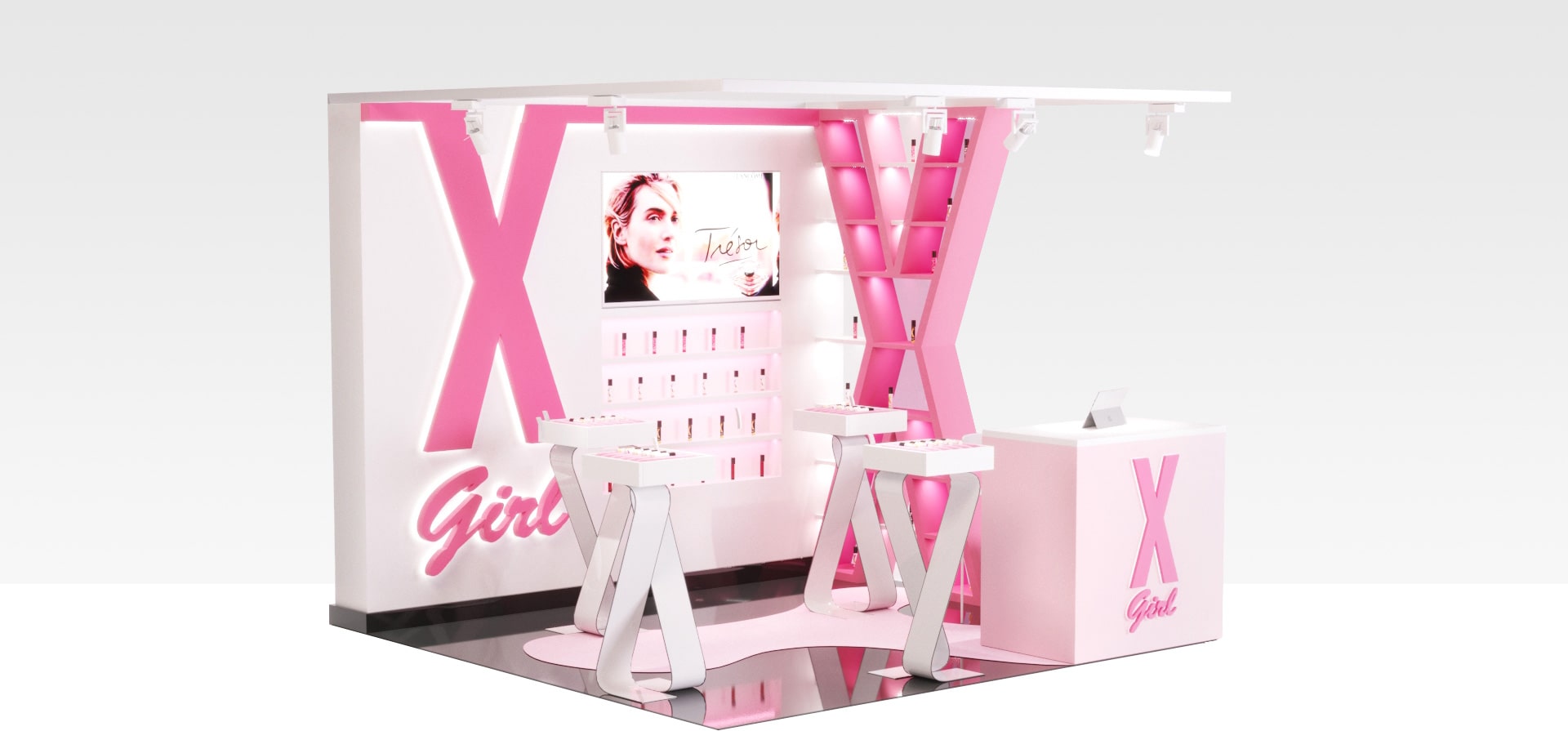
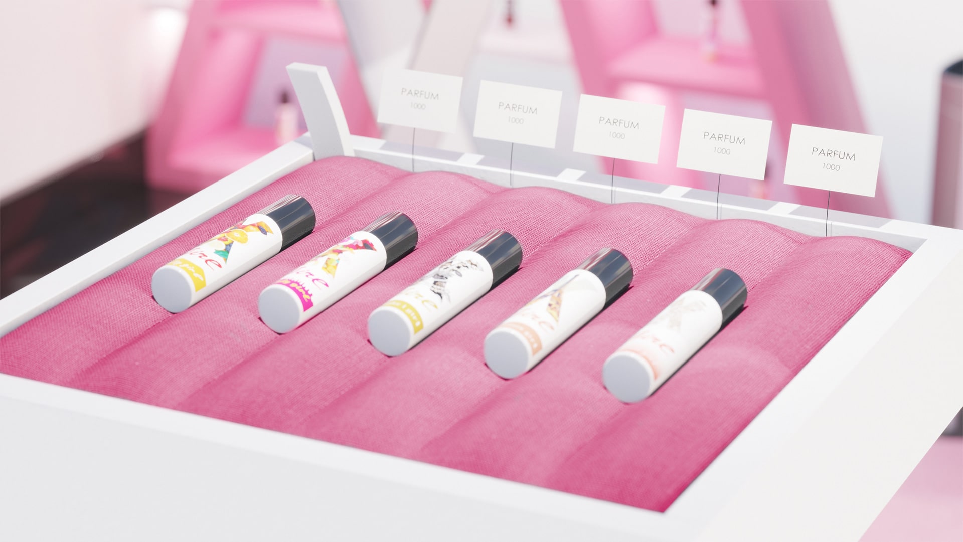
After a successfully completed assignment for the development of corporate identity, logo, label design and website, the customer X-girl turned to one of the companies of our holding company, which is engaged in industrial design. The purpose of the new project was to create an original shopping island.

The use of minimalistic not overloaded design.
The choice of sharp and polygonal shapes that brightly emphasise the shape of the logo and add to the design the atmosphere of a “princess castle”.
Integration of the photo zone as an element of the back wall of the island. Its design is intended to attract the attention of female users, who, taking photos against the background of the island, will promote the brand in social networks.

CLIENT'S WISHES TO THE RESULT OF 3D-VISUALISATION:

  • Use of discreet colours chosen after design analysis of Ukrainian and foreign references.

  • Use of minimalistic not overloaded design.

  • Choice of sharp and polygonal shapes, which brightly emphasise the shape of the logo and add to the design the atmosphere of a “princess castle”.

  • Integration of the photo zone as an element of the back wall of the island. Its design is intended to attract the attention of female users, who, taking photos against the background of the island, will promote the brand in social networks.
VIDEO PRESENTATION

Click to rate this post!
Voted: 0

Did you like the work? Leave your vote:)

DID THIS PROJECT MAKE YOU WANT TO WORK WITH US?

Discuss Your Project

Developing the Work Plan

Pricing and Timelines