
UMBRELLA MILK BRAND MILDAR
History of co-operation
Molex is a well-known St. Petersburg distributor, which approached us in the summer of 2017 to develop a new umbrella brand of hard cheeses. The main production is handled by Lidsky Dairy Canning Plant, the leading dairy cannery in Belarus.
The goal of the company’s management is to enter the top 5 in terms of packaged cheese sales in the North-West Federal District and Central Federal District of Russia. In the future, the product portfolio will be supplemented with the following items: butter, milk, processed cheese.
Task: development of the Mildar dairy brand
Branding for the company included this range of services:
- Marketing research and strategy development
- Creation of naming
- Launch of brand design of cheese packaging
- Preparation of original layouts
Trend Analyses
After internal and external audits, we found that:
- product sales market – Moscow and the region, St. Petersburg and the region;
price segment – medium, medium plus; - sales locations – wholesale, small and large retail.
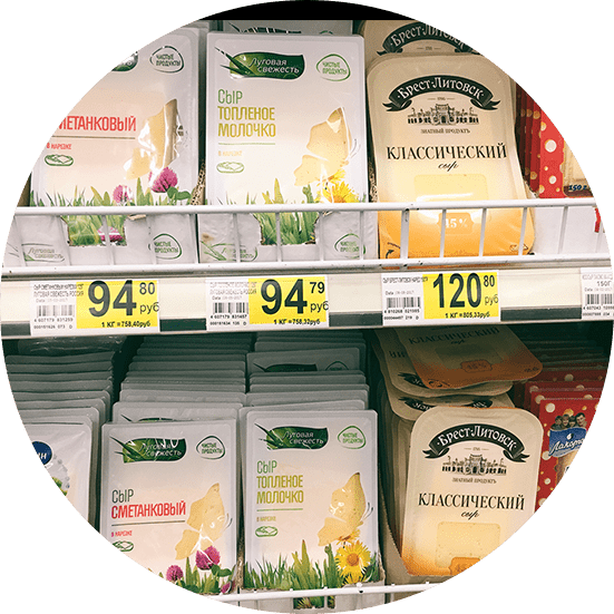
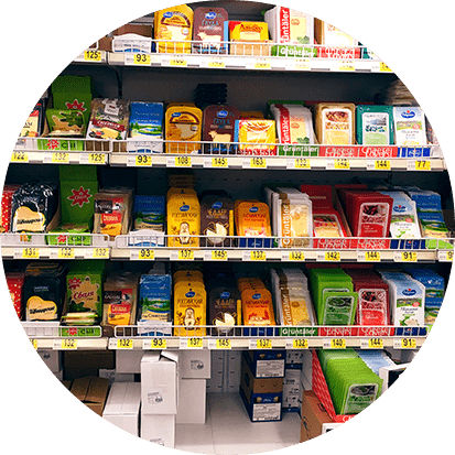
- main competitors: umbrella brand Savushkin Product (Brest-Litovsky, Savushkin Product), Lugovaya Freshness, Syrobogatov, umbrella brand Neva Milk (Thousand Lakes, Gold of Europe).
Consumer portrait
As part of the marketing analysis, we found that:
Women are more likely to buy dairy products than men – 64.2% of women versus 35.8% of men. More than 60% buy dairy products more than twice a week, 35% – daily.
Among men, 43% purchase at least twice a week. Only 18% of the male audience buys milk for children. And half of men (48%) buy dairy products exclusively for themselves.
Based on general statistics and internal research it was found that our CA consists of:
- young non-working mums;
working mums; - fathers with a car;
parents whose children are grown; - self-sufficient men and women.
Phase II. Strategy development
Strategy Objectives:
To bring a new dairy brand to the market and introduce it to consumers.
To enter the top 5 in terms of packaged cheese sales in the region.
Win the favour of the target audience – families with children and women who shop regularly – by communicating the brand’s positioning and Unique Selling Proposition.
Increase brand awareness among the audience and attract the attention of retailers by planning an advertising campaign to reach at least 70% of our target audience – 570,000 married women living in Moscow, St. Petersburg and their regions.Establish ourselves in the minds of consumers as a brand with a history of producing high quality products.
Ways to achieve goals:
Develop a positioning statement that describes the market segment in which the product will be sold. This will help you stand out from your competitors and show your audience the benefits of your product. Our goal is to choose the most competitive positioning statement.
Create a unique selling proposition (USP) for each product to cement its image in the mind of the customer.
Develop targeted advertising messages for each of the CA groups.
Conduct an advertising campaign to promote the brand, utilising the potential of outdoor advertising, internet promotion and TV commercials. This will increase memorability and have a positive impact on distribution.
Phase III. Creating a cheese brand: naming
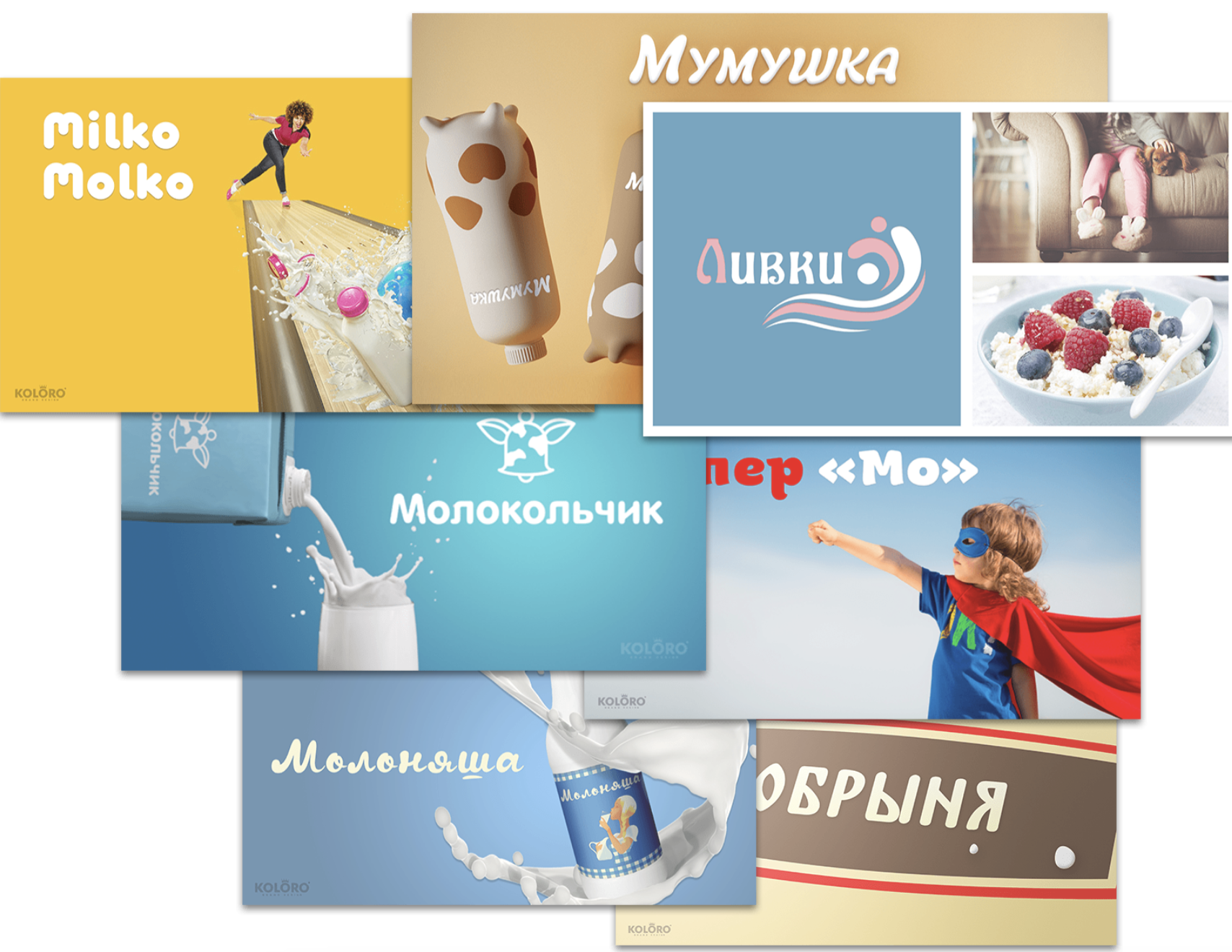
Most slogans for dairy products emphasise 3 main criteria:
- freshness;
- tradition;
- health.
These were the key aspects in creating the naming for TM “Mildar”. Our copywriters developed more than 100 variants of names for the trade mark. Among them the focus group selected the best names that met the following requirements:
- dissimilarity with the names of competitors;
memorability; - sweet-sounding;
absence of association with concepts that are not related to dairy products; - domain availability for the TM website.
Out of the ten most successful variants we chose the final concept that fulfils all the stated requirements – “Mildar”.
Associative series: cute, gift, present, dairy gift
Positioning: Mildar – we keep family values. The most precious thing in the world is love. Show your loved ones your care!

Phase IV. Launch of dairy product packaging design concept
Design Trends
Through research and competitor analysis, it has been found that the key criteria for successful packaging are: Appetising complementary illustrations that increase appetite, encourage purchase and offer options for consumption.
Adding identifying marks and colours to help distinguish creations from the same range on the shop shelf. Clever use of the viewing window, such as incorporating it into the overall label design. An interesting approach to the barcode: using all parts of the packaging, not just the back and front panel.
Solution
Our assignment at this stage is to develop packaging design for these formats:
200 gram pack;
150 gram slicer for 4 items: Russian, Maasdam, Dutch, Tilsiter.
The packaging development started with the 200 gram pack, as the customer most often deals with this format. Then we started to create a label for the cheese slicer. It should be noted that the entire packaging design is adaptive to other dairy products in the range, such as butter or milk.
The aim of this stage was to create a new and memorable brand that stands out on the shop shelf and encourages the visitor to make a purchase.
The final stage of the packaging design was the presentation of several possible concepts.
Development of corporate identity
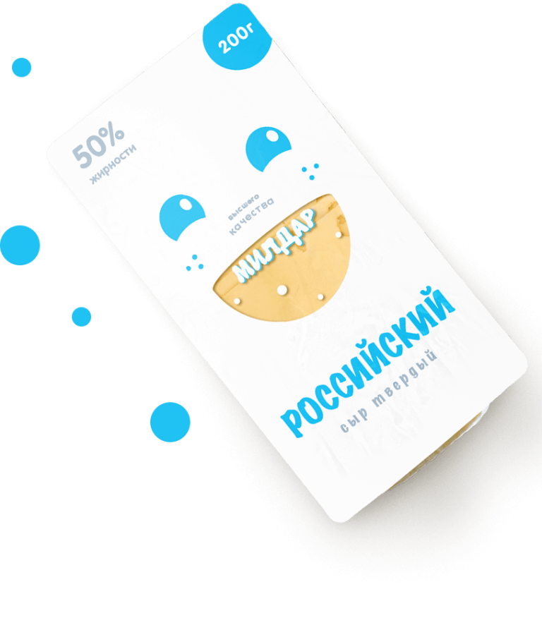
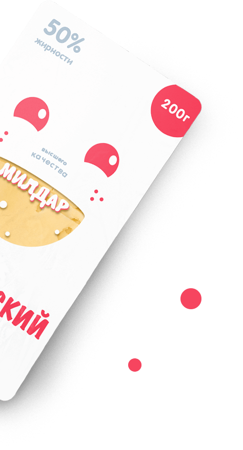
Concept 1. Cheese that brings happiness!
Legend: at Mildar, all cows enjoy life, e.g. listening to music, going for massages and spa treatments. This caring attitude makes the cows smile and give special milk, which fills everyone who drinks it with joy and positivity. Cheese from such milk is concentrated happiness.
White colour is traditional for dairy products
- Smile on the packaging attracts attention and evokes positive emotions, making consumers smile.
- Viewing windows allow to make sure of the product quality and freshness.
- The overall minimalism of the concept makes the packaging stand out on the shelf
- Identification of the range – colour of the name
Concept 2. The perfect proportion of useful elements!
Legend: Mildar cheese contains a complex of vitamins and microelements that help all family members stay healthy. Mums buy this cheese so that their loved ones are not only nourished, but also get the substances their bodies need.
Mums choose Mildar!
In this concept our designers staked on the European, or “flat” style of design.
- Circular multicoloured infographics unique for each name are the main object of attention and identification of the product line
- Against the background of “Mildar”, the consumer feels that the other cheeses are less “healthy” and less wholesome
- The writing of the name emphasises the colours of the infographic
- The concept is designed in a minimalistic style, so that the information is well perceived by the consumer
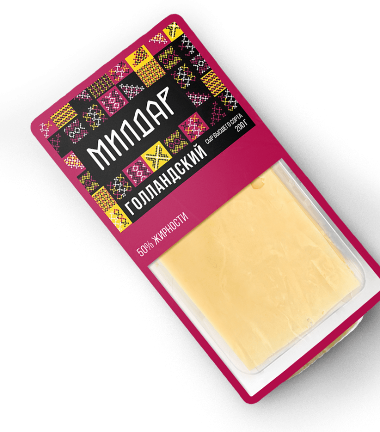
Concept 3: Cheese worthy of a king’s table!
Legend: our products are made according to ancient recipes that have come down to us. “Mildar” from ancient times was famous for its products and was available exclusively to tsars and nobles. Chronicles have been preserved, where it is said that Mikhail Romanov himself asked to serve only “Mildar” to the table. Today you can try the “royal” products too.
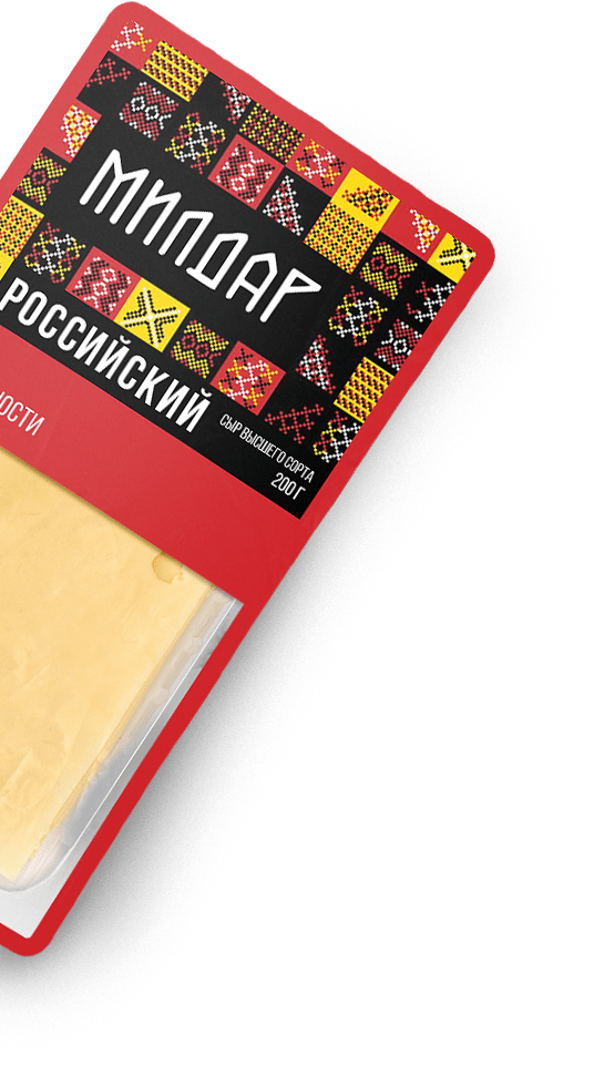
- Brand identification is due to a bright, complex and memorable ethnic pattern
- Identification of the range is due to the colour gradation
- The design makes a direct reference to origins and traditions
- Eye-catching colours make the product stand out on the shelf
- Large viewing window allows you to recognise the benefits of the product
Concept 3: Cheese worthy of a king’s table!
Legend: our products are made according to ancient recipes that have come down to us. “Mildar” from ancient times was famous for its products and was available exclusively to tsars and nobles. Chronicles have been preserved, where it is said that Mikhail Romanov himself asked to serve only “Mildar” to the table. Today you can try the “royal” products too.
- Brand identification is due to a bright, complex and memorable ethnic pattern
- Identification of the range is due to the colour gradation
- The design makes a direct reference to origins and traditions
- Eye-catching colours make the product stand out on the shelf
- Large viewing window allows you to recognise the benefits of the product
Stage V. Development of a unique selling proposition
Our UTP includes these approaches to brand positioning:
- To be useful and beneficial to the consumer.
- To be original, to stand out among competitors with additional options, ideas or bonuses.
- Be open to changes that will help attract new audiences.
TSS options
Based on the main trends of a good selling proposition, our marketers together with designers have developed 3 concepts
Final concept approved by the customer
Our UTP includes these approaches to brand positioning:
- To be useful and beneficial to the consumer.
- To be original, to stand out among competitors with additional options, ideas or bonuses.
- Be open to changes that will help attract new audiences.
TSS options
Based on the main trends of a good selling proposition, our marketers together with designers developed 3 concepts.
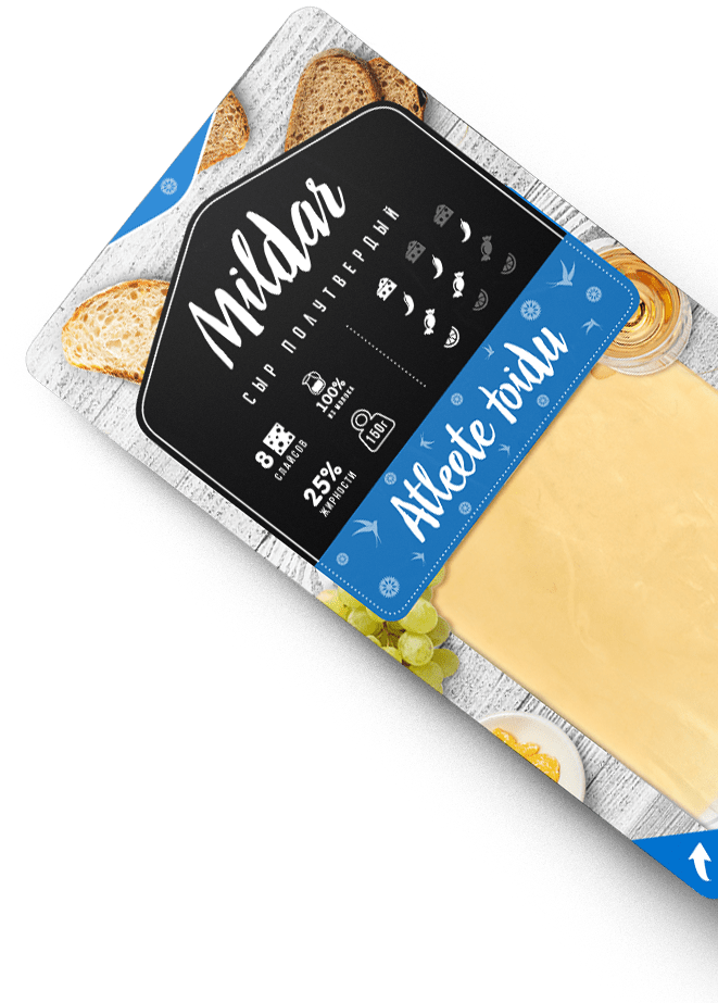
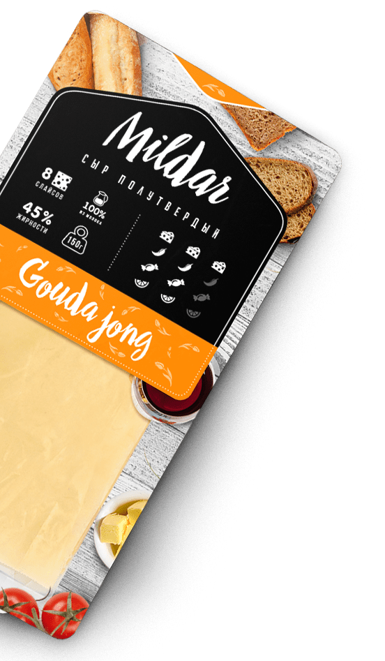
Transferring the concept to other packaging formats
Mildar plans to add several types of butter and milk to its product portfolio, so our designers initially focused on developing an adaptive label that would organically fit the product line.
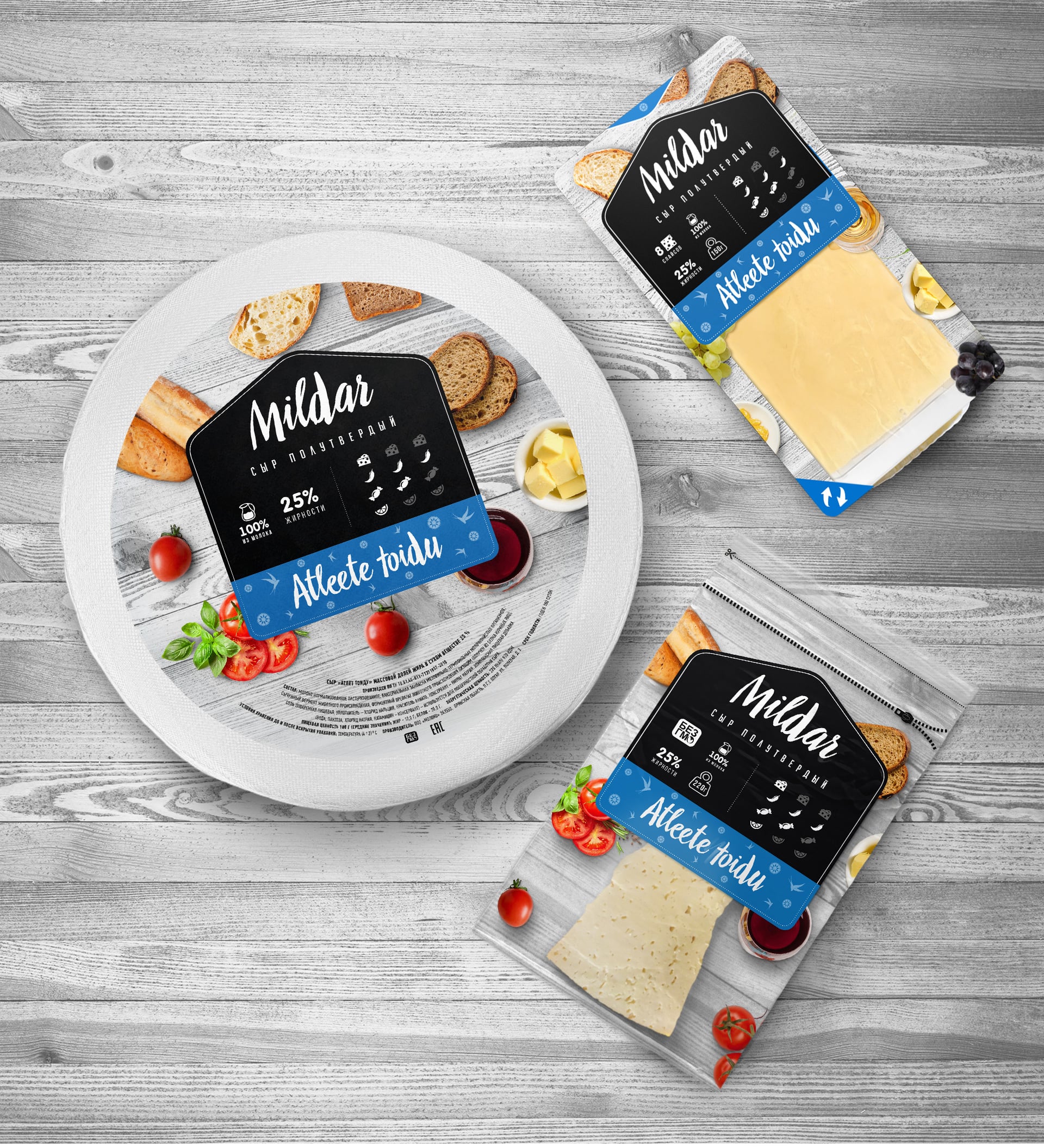
In addition, the corporate identity can be easily adapted for:
- packages;
- price tags;
- corporate transport;
- staff clothing;
- other merchandise.
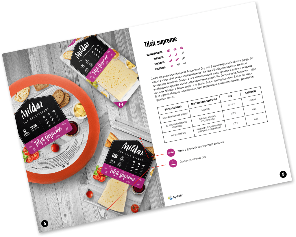
Project outcomes
In order to create a successful brand from scratch, our specialists developed a marketing strategy, which included market research and multi-directional brand development recommendations. After that, work was done to create naming and original packaging design. Also our marketers created an interesting UTP, which is aimed at increasing interest in the product.
As a confirmation of our agency’s effective work, Mildar requested additional services to create a product line catalogue and develop its own website.
Translated with www.DeepL.com/Translator (free version)


