UMBRELLA DAIRY BRAND GLOBINO
"More milk than milk"
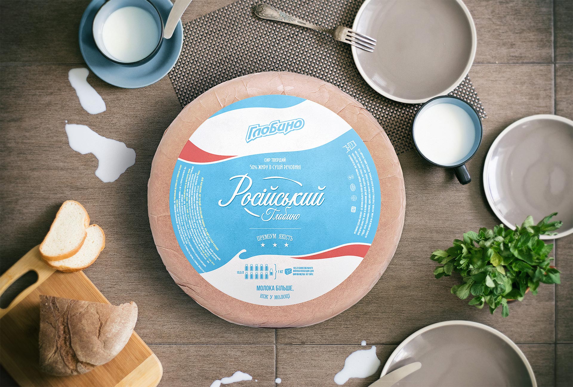
In co-operation with Globino Group and for their dairy brand, KOLORO branding agency created positioning, UTP, corporate identity, and packaging design. The project lasted more than 4 months. It was based on the information that it takes 10.5 litres of milk to produce 1 kilogram of cheese.
This is how the slogan “Milk is more than in milk” (“There is more milk than in milk”) appeared. When choosing a style for the packaging design, we opted for Flat or European style. It helped to distinguish ourselves from competitors and emphasise the “dairyness” of the product. Thanks to the updated design and a coherent image, the brand managed to increase sales and recognisability. Read more about the stages of creating the dairy umbrella below.
How did the Globino dairy brand come into being?
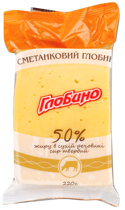
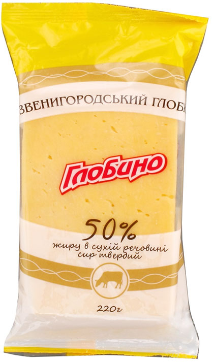
In Ukraine, Globino is primarily a meat brand, and Globino Meat Processing Plant is among the top three leaders in the meat market of Ukraine. The company also produced dairy products under the Globino brand – hard and processed cheeses, butter. Hard cheese without packaging was sold successfully, while the packaged version did not have a special identity and lagged behind the top players in sales (primarily the brands “Komo”, “Zveni Gora”, “Club Siru”, “Farm”). Therefore, it was decided to create a more recognisable brand face.

Task: to develop a brand of Globino dairy products
Should have been combined under one umbrella:
- hard cheeses;
- processed cheese;
- butter.
Redesign of the packaging: objectives
Establishing communication with the consumer;
Increasing brand recognition;
Formation of the whole dairy image of “Globino” in harmony with the meat direction;
Increase in sales as a consequence of all of the above
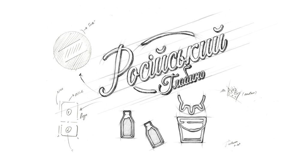
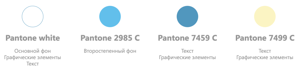
One of the main difficulties was to keep the new dairy umbrella linked to Globino’s meat division. It was necessary to distance ourselves from meat, taking the best from the recognisable brand. Milk colours – white and blue, infographics and supporting texts, logo modification (moving away from copying the sausage logo) helped in this task.
Before KOLORO marketers started working on the idea of positioning, the dairy brand did not have its own zest and UTP. To come up with a unique brand pitch, we studied competitors and their approach to branding in detail. We started developing the umbrella dairy brand with hard cheese. When developing the design for the range, it was important to unite the series with one common motif and highlight the difference of each product.
Phase I. Analysing the hard cheese market
Internal brand audit: conclusions
According to the results of the audit the following conclusions were made:
Price segment – medium, among cheeses produced according to DSTU;
Sales market – the whole territory of Ukraine;
Places of sales – large and small retail.
Trend analysis: cheese packaging design
White is directly associated with milk and is present on all dairy products. It is common practice to use white as the primary colour for mid-price segment milk. Incorporating dairy symbols into the story on the packaging. They should be an organic extension of the packaging and not cut the eye. Utilising the entire packaging to capture the attention of consumers. This is expressed in infographics and supporting text.
Consumer portrait
The target audience of Globino cheese is women from 30 to 55 years old, their income level is 3000 UAH and above, the average number of family members is 3 people. Thus, we have determined that the price segment of cheese is medium.
Phase II. Creating a brand of dairy products: design concept for hard cheese packaging
We were tasked with designing for 3 packaging formats:
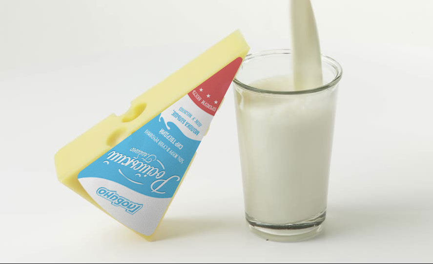
- 220 grams;
- 2kg;
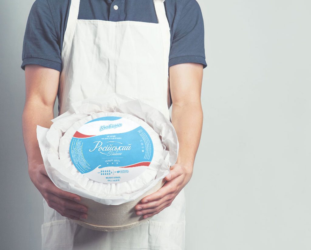
- 10.5kg.
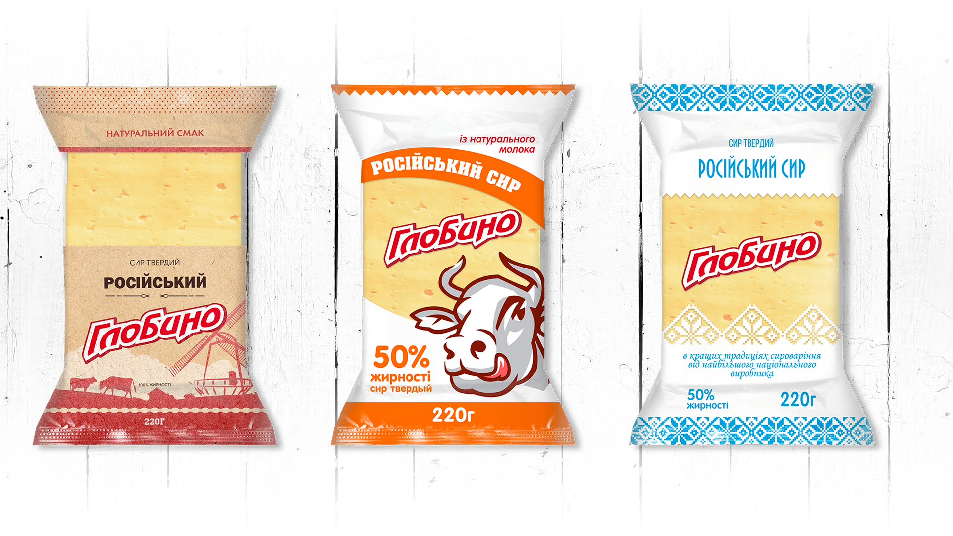
We started our work with the 220 gram pack, as consumers encounter it more often than other formats. The first ideas were stereotypical and banal. Trying to tie dairy images to the pack, we experimented with images of cows. To emphasise local traditions, we decorated the packaging with Ukrainian landscapes and embroidered patterns.
The development of the packaging design ended with the presentation of several concepts.
Design Trends:
Concept 1: Nature
Associations: countryside, nature, home production, environmental friendliness. On the packaging we depicted a meadow, grazing cows and a rural landscape. It refers us to our childhood in the countryside at our grandmother’s house, the aroma of steamed milk, and shows the naturalness of Globino dairy products. The colour of the package should reinforce this image and confirm the impression of the product’s environmental friendliness. On the upper part of the package we have placed a pattern – a small red dot. It will make it easier to find the product on the shelves in the shop.
Corporate identity development: insights
Our main challenge was to build off the competition and not lose the fresh dairy image we wanted to convey to consumers. So we kept the colour scheme from concept number 3 and changed it to suit our specific brand. During the design of the cheese packaging, we came to the conclusion that a European or flat style would help us stand out.
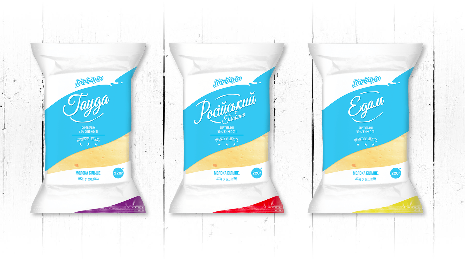
This is how our dairy cheese concept “Splash” was born.
Design Trends:
Concept 1: Nature
Associations: countryside, nature, home production, environmental friendliness. On the packaging we depicted a meadow, grazing cows and a rural landscape. It refers us to our childhood in the countryside at our grandmother’s house, the aroma of steamed milk, and shows the naturalness of Globino dairy products. The colour of the package should reinforce this image and confirm the impression of the product’s environmental friendliness. On the upper part of the package we have placed a pattern – a small red dot. It will make it easier to find the product on the shelves in the shop.
Corporate identity development: insights
Our main challenge was to build off the competition and not lose the fresh dairy image we wanted to convey to consumers. So we kept the colour scheme from concept number 3 and changed it to suit our specific brand. During the design of the cheese packaging, we came to the conclusion that a European or flat style would help us stand out.
This is how our dairy cheese concept “Splash” was born.
Creation of Globino cheese packaging design - main elements
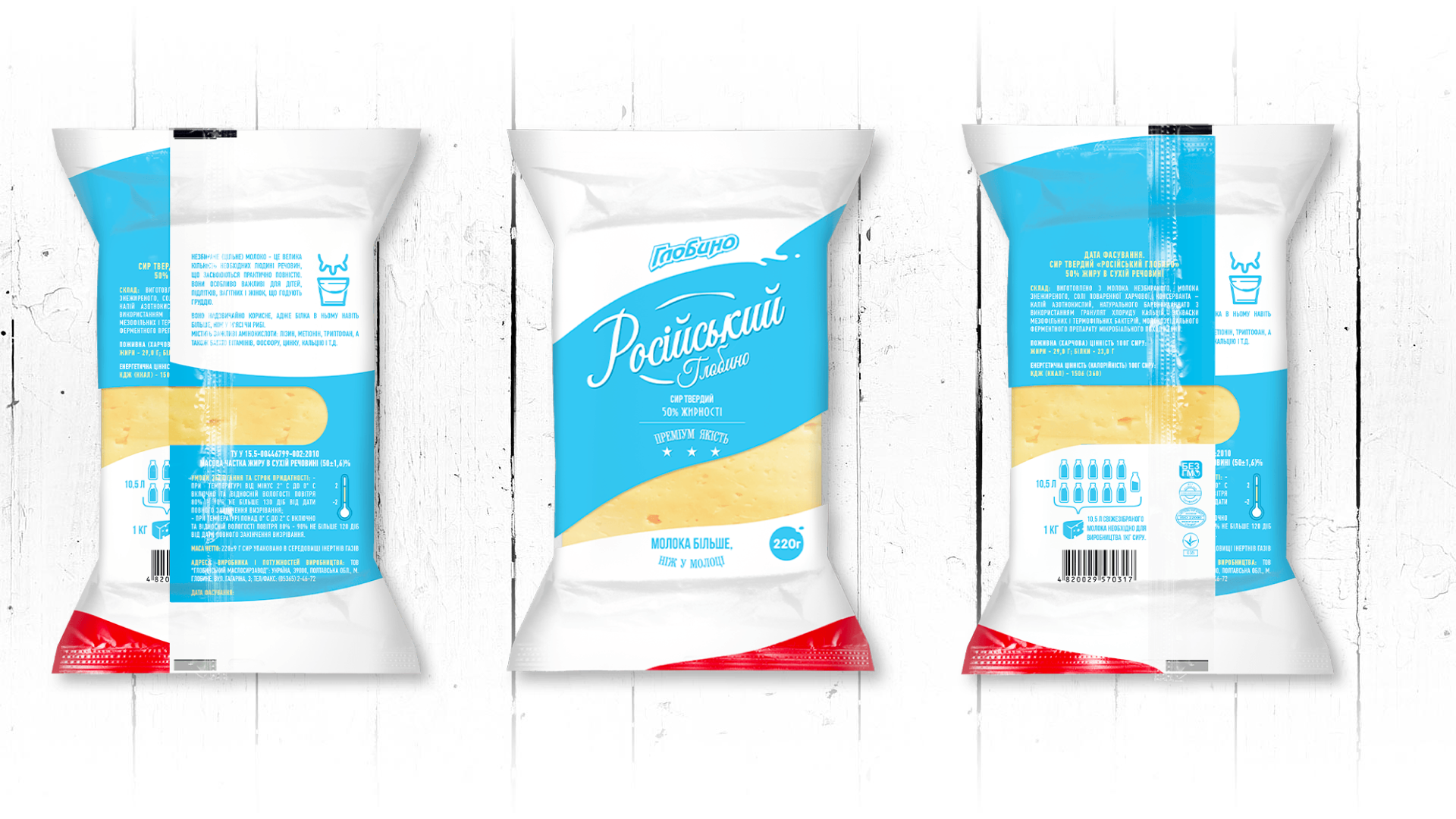
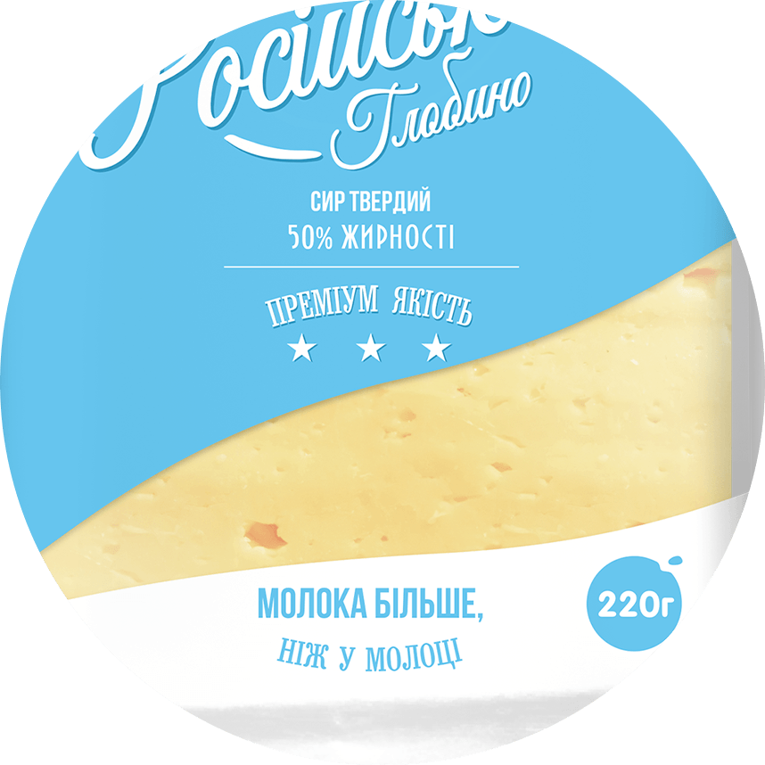
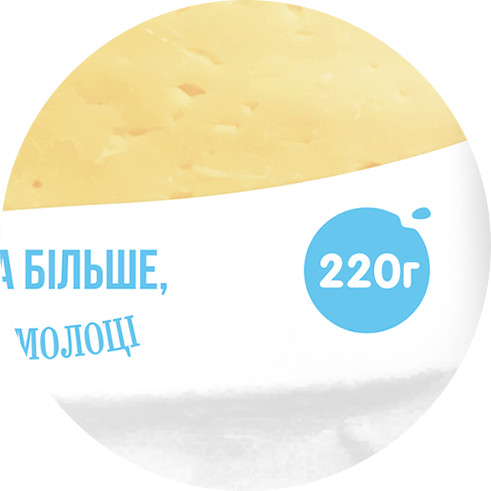
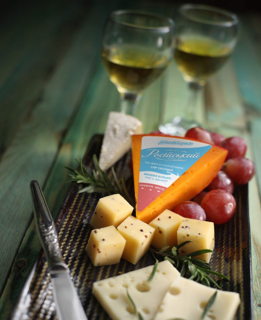
Viewing window. This element allows the consumer to check the quality of the product. Through the transparent window he can clearly see the cheese, its colour and consistency.
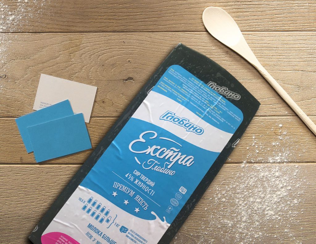
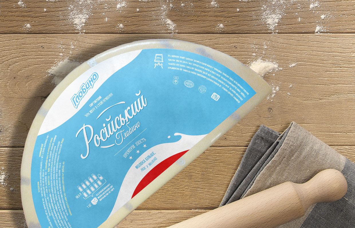
Milk splashes. The whole package is built around milk rivers – flowing white waves on a sky-blue background. They create a sense of freshness and reinforce communication (read about it below).
Supporting text and infographics
They ensure repeat purchase, complement positioning, improve product perception. Buyers trust such phrases if they do not see obvious comebacks.
Development of a unique selling proposition
A unique selling proposition should be based on 3 points:
Be based on direct and obvious benefits for the customer.
Be unique: competitors don’t have a similar option or they do, but they don’t talk about it.
Be strong enough to engage new buyers.
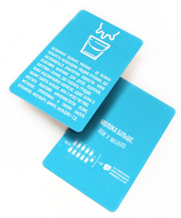
At the heart of our UTP is a contradiction. An interesting fact that is disbelieving and memorable helps leave a mark in the consumer’s mind. And a detailed disclosure on the back reinforces belief in the product and brand and builds customer loyalty.
Our concept was built around the naturalness of the product and the fact that 10.5 litres of milk must be processed to produce 1 kg of cheese. This rule is relevant for any hard cheese that is produced according to DSTU. However, no one before us had built their positioning on it.
Author's supervision over the production of the first print run
Printing method: gravure printing.
We have chosen the gravure printing technique for the production of packaging and prepared the original layouts for submission to the print run. We control all our work during the first print run. This allows us to print everything correctly the first time.
Transferring the concept to other packaging formats
Development of other elements of corporate identity
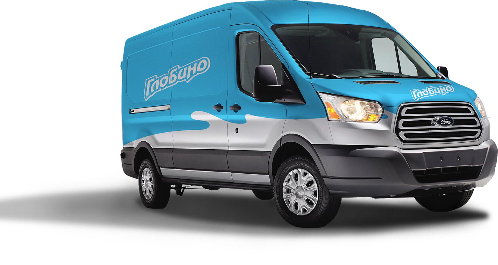
A ready-made and adaptive corporate identity is not difficult to transfer it to the main media the consumer encounters. For example:
- Price tags;
- Packages;
- Corporate transport;
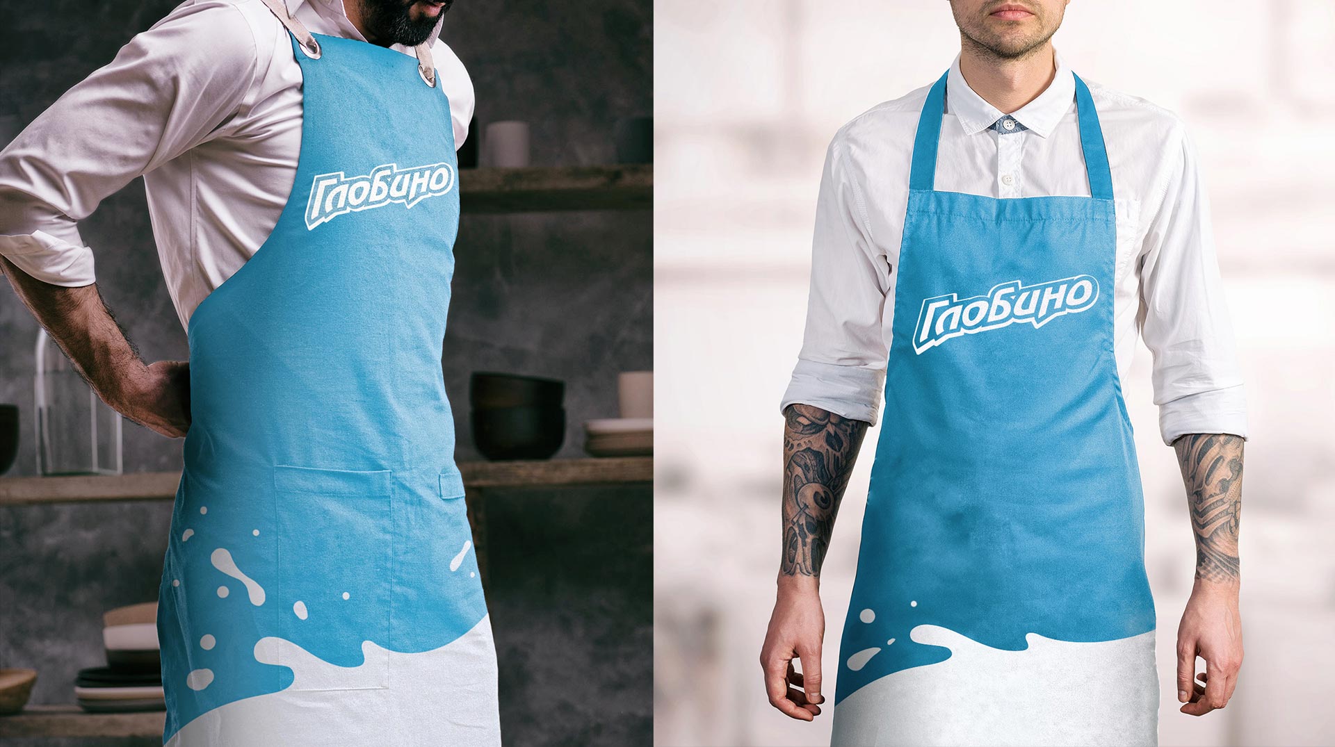
- Staff clothing.
Project team
From the side of KOLORO branding agency: project manager, account manager, 2 designers, 2 marketers and a copywriter. On the client’s side: designer, technologist, technical control department and 2 top managers.
Project realisation period from TOR discussion to packaging printing – 4 months.
Project outcomes
After the launch of the products in the updated packaging, sales began to grow. We managed not to lose loyal customers and to acquire additional ones, who were attracted by the new packaging design and catchy PIT.
The dairy division developed its own corporate identity, which does not conflict with the meat division, but at the same time has points of contact with it.