
INDELICA
"TURKEY MEAT PRODUCT"
Background
The trademark “Indelika” has been represented on the Ukrainian meat market for not the first year. The company produces products from turkey meat, which is considered to be the healthiest and dietary poultry. Production under this trade mark is carried out by a subdivision of Ramburs Group – Brovarsky Plemptitsesovkhoz, located in Brovarsky district of Kyiv region.
Task
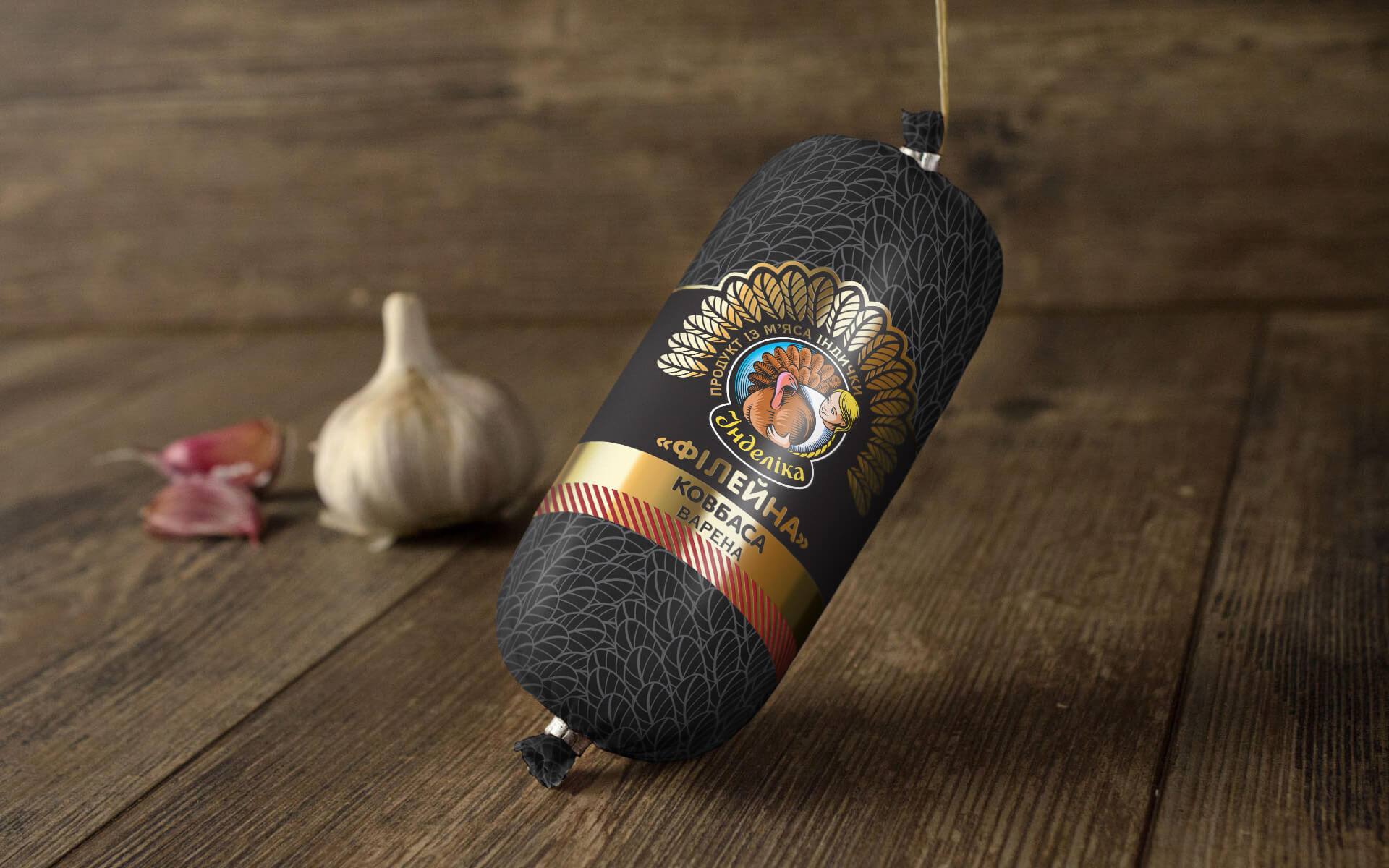
The task of our company was to develop a new design of packaging and label for TM “Іndelika”, which will not only correspond to the corporate style of the brand, positioning concept and translate the key communication message to the consumer, but also favourably distinguish the company’s products from competitors.
Decision
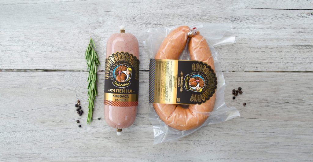
Before creating the packaging and label design, KOLORO marketers and designers analysed the brand platform of TM “Іndelika”. The brand positioning is based on preservation of naturalness and usefulness of meat products, high quality of products without loss of flavour.
“Іndelika” positions itself as a producer of natural products, which taste and quality are not inferior to home-made products.
Label fonts
Variations of Concepts
Having generated and coordinated all the ideas with copywriters, marketers and psychologists, the designers of KOLORO brand studio started drawing the logo. Here are 5 variants that were sent to the customer for selection and approval.
Concept #1 - "America."
Key words: softness, down, kitchen, home comfort, cleanliness, lightness, freshness.
The second concept is based on a pattern of multicoloured peas on a white background. The round logo with friendly hugs (a girl and a turkey)
prompted the development of a kind, simple and understandable concept. It creates an image of cosiness, tenderness and calmness. Such a pattern evokes
у потребителей ассоциации с детством, детским садом, домом, транслирует сообщение о безопасности и натуральности продукта. It is important,
that this approach is non-standard for the design of sausage product packaging.
Основной цвет в этом концепте — белый. Логотип контрастирует с фоном, что создает дополнительный эффект
притягательности, ловит взгляд потребителей. Красный, голубой, и зеленый узор в горошек находятся на нижней
части каждой этикетки. Each colour corresponds to one of the ranges.
Минимальное количество объектов на этикетке способствует концентрации внимания на названии. Большое
light colour spot and noticeable font for the name and ruler allow to easily distinguish the names and provide intuitive recognition of the sausage on the shelf.
and ensure that the sausage is intuitively recognisable on the shelf.
The chosen sausage label design is gradient-free. Идентифицирующая текстура легко запоминается,
поскольку имеет уникальную слоенную комбинацию. Она проходит через всю этикетку. Даже не читая лицевую
it is easy to recognise the producer, and the colour tells you which type of sausage is in front of the consumer.
We have envisaged possible directions for revision – applying a light pattern on the white background with matt or glossy varnish.
The concept is completed by the slogan: “Indelika – the cosiness of a warm kitchen!”
Concept #3 - Peacock Tail.
The minimal number of objects on the label helps to focus attention on the name.A large, light colour spot and a prominent font for the name and ruler make it easy to differentiate between names.
light colour spot and noticeable font for the name and ruler allow to easily distinguish the names and provide intuitive recognition of the sausage on the shelf.
and ensure that the sausage is intuitively recognisable on the shelf.
The chosen sausage label design is gradient-free. Идентифицирующая текстура легко запоминается,
поскольку имеет уникальную слоенную комбинацию. Она проходит через всю этикетку. Даже не читая лицевую
it is easy to recognise the producer, and the colour tells you which type of sausage is in front of the consumer.
We have envisaged possible directions for revision – applying a light pattern on the white background with matt or glossy varnish.
The concept is completed by the slogan: “Indelika – the cosiness of a warm kitchen!”
Concept #2 - Childhood
Keywords: grill, rest, heat, retro, fresh meat, wave effect, hypnosis, right on target.
The first sausage packaging and label design concept is based on the American holiday, Thanksgiving,
который устойчиво ассоциируется с индейкой. The label design reveals motifs of the American flag and family picnic.
The main colours are burgundy, brown and white. The rich red colour creates associations with fresh meat.
The centre of the label features the company logo, which is highlighted with contrasting circles. Thanks to the use of
The concept breathes heat and hypnotically attracts attention. The lettering is large and easy to read.
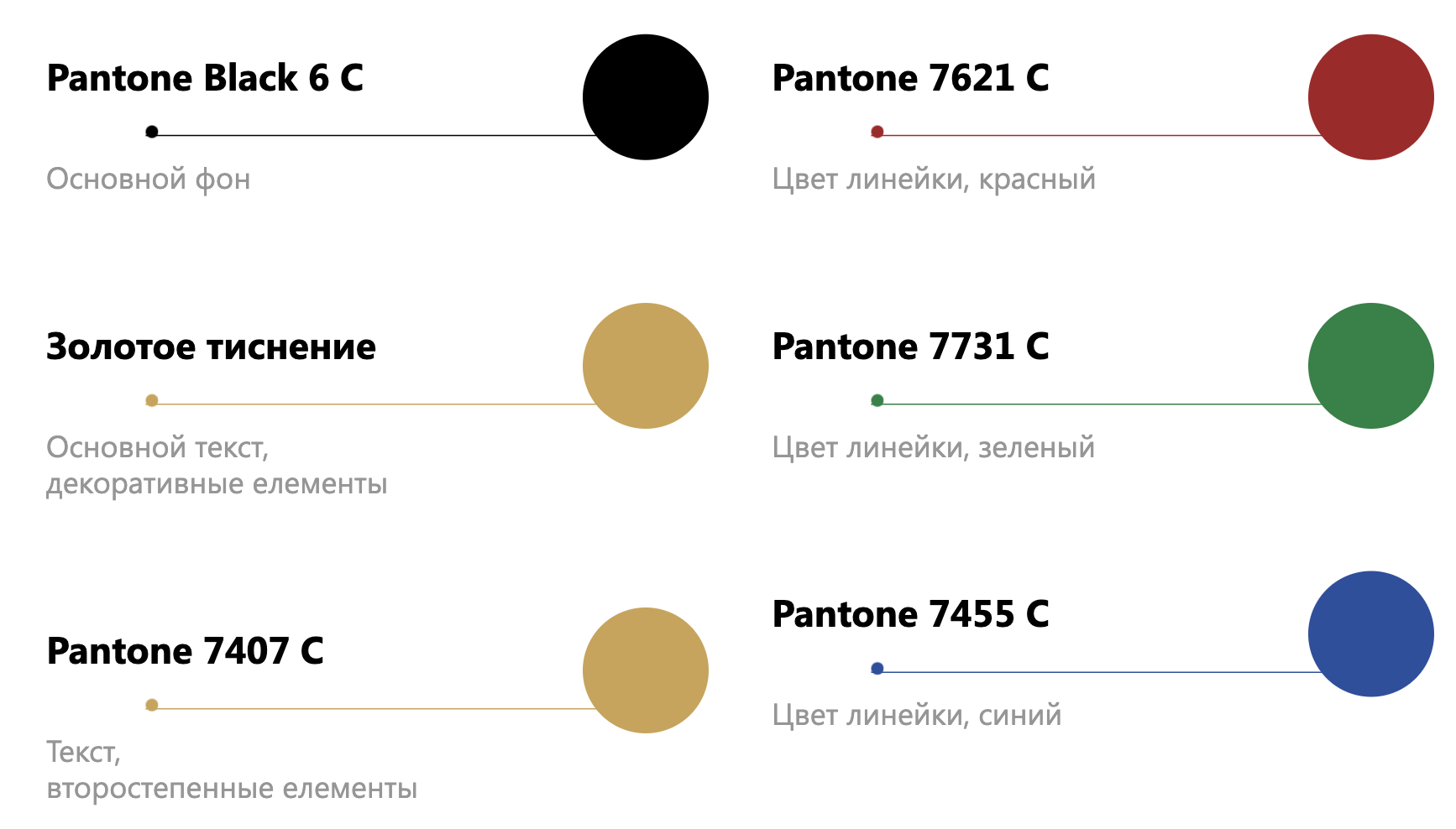
There are three types of sausage products in the range of TM “Іndelika”, so additional colours (yellow, blue and green) were used in the label rim.
This helps the consumer to quickly find the right product on the shelf.
This concept proposed transparent packaging for sausage products, which is traditional for the Ukrainian sausage market.
We decided to apply a coloured pattern on the entire surface of the plastic wrapper. The contrasting pattern makes it stand out among competitors.
The slogan that summarises the concept is “Indelika – the best tradition!”.
The client thinks for a long time... and finally chooses one of the options.



