
SRETENKA VODKA
"A classic Russian drink for a hearty feast."
Background
The autumn of 2010 was marked by the expansion of the assortment portfolio and the introduction of a new brand of vodka, Sretenka.
Sretenka TM is a table drink emphasising the originality of Russian cuisine and reminiscent of the traditions of vodka drinking in Russia.
Not long ago, in order to strengthen the market position of the new vodka brand, Rodnik decided to update the design of vodka and redesign the label of the Sretenka brand.
Translated with www.DeepL.com/Translator (free version)
Task
The main task of the project was to find unique identifying elements necessary for the redesign of the product. As well as the development of a unique label printing technology.
Decision
Work on the project began with marketing research of the market, analysing competitive brands and their packaging design concepts, as well as studying the preferences of the target audience.
The design of Sretenka vodka is in a retro style and refers to Russian traditions of a hearty feast, traditions of Russian cuisine – “a drink that gives a special flavour to hearty snacks”. This concept of vodka brand positioning had to be preserved during the redesign. It was also important to keep the main image – the illustration of a “festive feast” and the text reflecting the unique selling proposition of the vodka brand.
Before the redesign, Sretenka vodka had the following look:

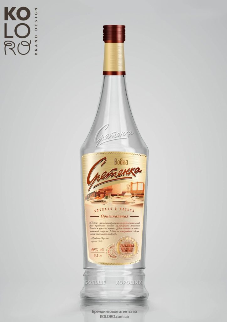
New label design for a vodka brand
The restyling was to update the presentation of identification elements in the label composition, select and apply new unique design elements.
Thus, the vodka restyling included the following:
Development of unique fonts;
Changing the pattern to a “dotted” pattern, replacing the previous vertical lines;
Adding a new identification element – medals at the bottom of the label – the “deserved award” of the traditional Russian drink, a guarantee of product quality and a pleasant feast. In the composition of the label the medals replaced the former “sandwich-canape with herring”.
Addition of gold stripes above and below the label, decorating and increasing in height its size.
Translated with www.DeepL.com/Translator (free version)
Label printing technology
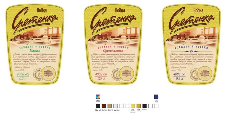
In addition, the customer was offered a special label printing technology.
The gold background can be brightened and made slightly lighter by adding transparent white colour – white varnish and toner. Or by underpainting the pattern dots with translucent white or matt varnish.
Dots and medal elements (stripes) can be made by:
Congreve;
Congreve with underpainting of the element (on gold areas);
Congreve with matt varnish.
Result
The new label design did not change the essence of the product, kept its positioning and main identification elements. The design concept received approval and was approved by the customer.
Summary
Brand design can be simple, but still attractive and recognisable. Individual elements and small details add up to a unified image of your product and contribute to its quick memorability by the target audience. That is why it is important to think through every detail and the packaging as a whole. And it is better if professional designers and marketers take care of it.


