SEREBROFF
«Водка с крепким «характером», эталон благородного стиля и вкуса»
Background
The Serebroff vodka brand is the brainchild of Belvino, a 45-year-old alcoholic beverage producer. Starting its work in 1960 as a secondary winemaking plant, today JSC “Belvino” has become one of the most technologically equipped enterprises, using the latest advanced technologies of alcoholic beverages preparation, constantly increasing and developing its production. Serebroff vodka was launched by the enterprise as a local Belgorod brand and today required rebranding.
Translated with www.DeepL.com/Translator (free version)
Task
Developing a beautiful image for the brand, redesigning the logo and designing labels for Belgorod vodka “Serebroff” became the main task of the project.
Decision
Stages of brand development. Brand strategy
A special purification technology makes Serebroff vodka an original product – a standard of courage, self-confidence, noble style and taste.
It was these qualities that the designers needed to emphasise graphically. To convey this information to the customer, the designers were entrusted with logo redesign, bottle design, label creation and visual brand development.
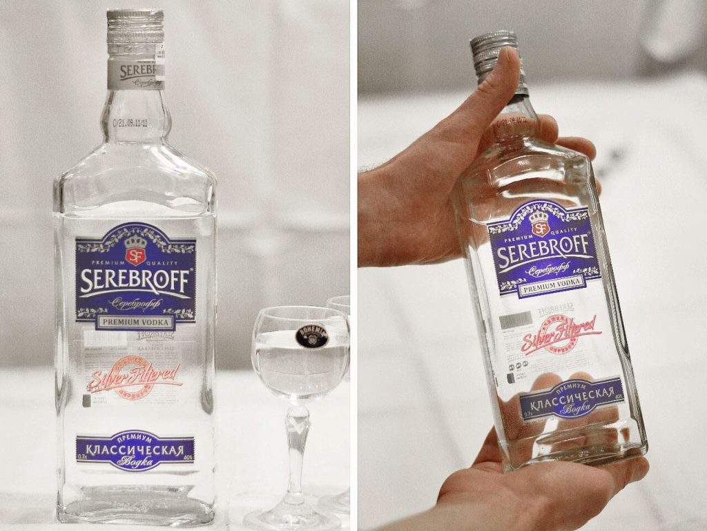
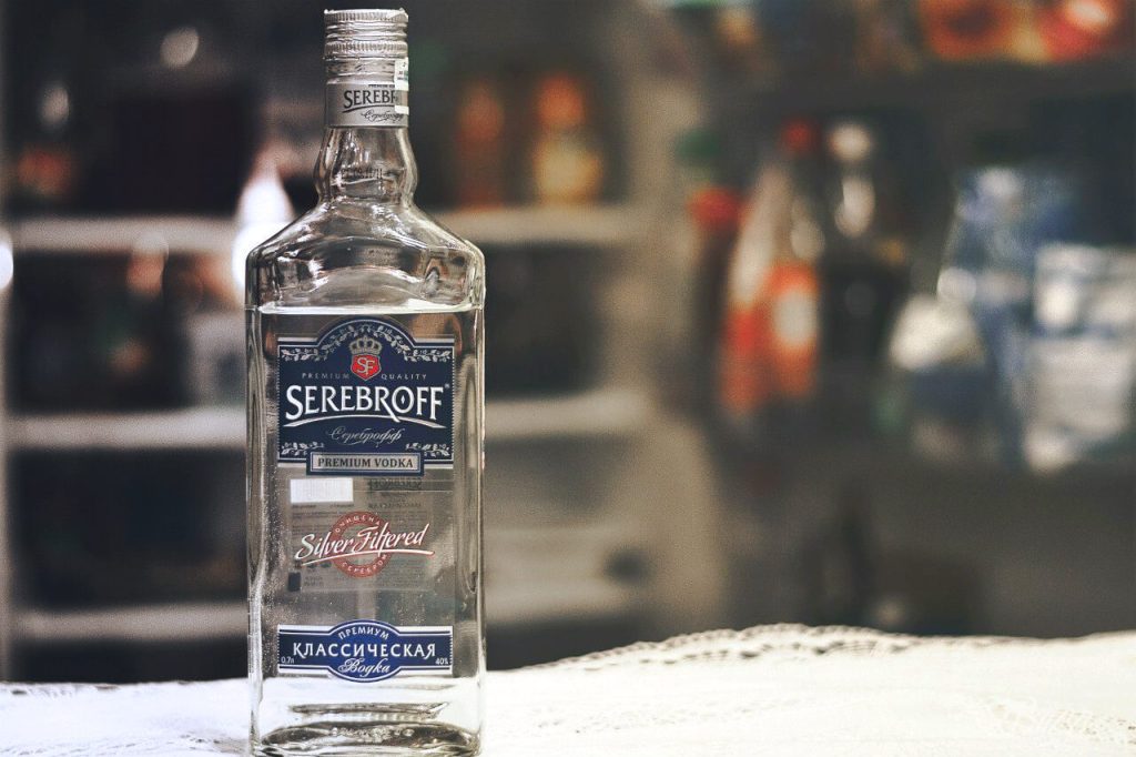
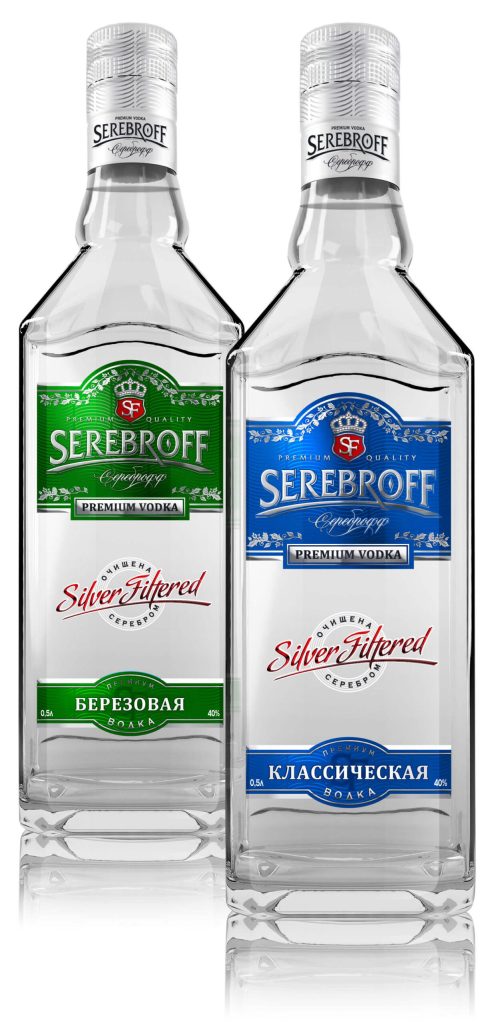
Upon completion of the bottle geometry, the original, slender, light and stylish bottle design was obtained, emphasising the nobility, masculinity and aristocracy of the brand. The redesign of the bottle is status and fundamental. This communicative image perfectly reflects the strength and purity of the drink.
Translated with www.DeepL.com/Translator (free version)
Logo
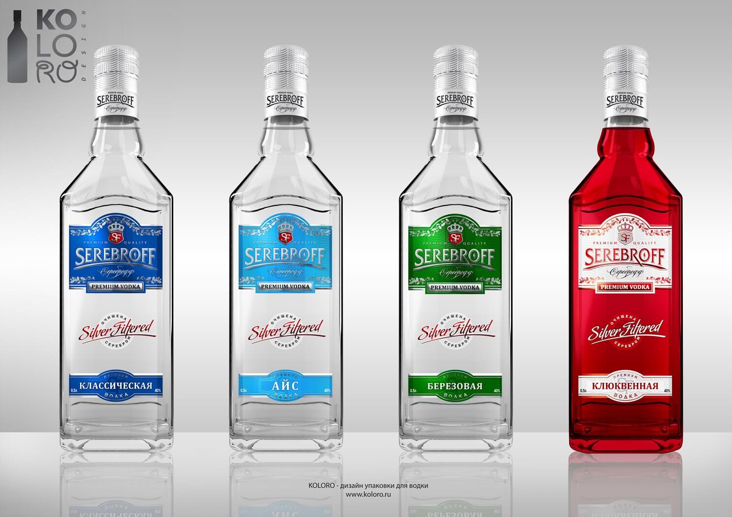
The redesign of the brand logo also deserves special attention. After all, the new logo – the anagram “SF” adorned with an imperial crown – is a cornerstone of the arched decoration of the label and bottle of the brand. In addition, the creation of the label using a special technology did not require a huge amount of money from the customer, while allowing to convey absolutely all the ideas of the brand design!
Translated with www.DeepL.com/Translator (free version)
Redesign of Serebroff vodka label
Most of the transparent label is covered with diffraction foil, on top of which five colour names are applied. The translucent colours covering the foil provide a special glow and depth to the background. This makes the fonts, logo and ornamentation of the label appear three-dimensional and literally floating above the background.
When you pick up such a bottle, your thumb is right on the “button” with the inscription “Silver Filtered”, which resembles a fingerprint on the glass. The same embossed “button” on the label serves as an additional lock for the bottle in the hand. This makes the idea of reliability and convenience of premium packaging even more realistic in this case.
Corporate identity
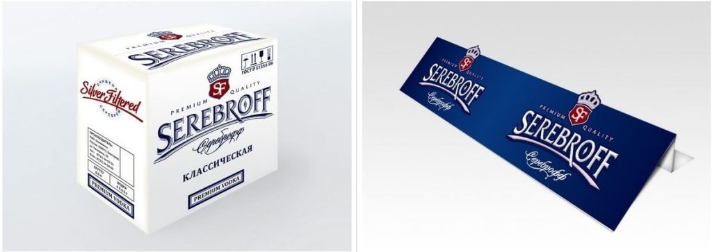
POS-materials for Serebroff vodka
Result
As a result, our customer received a repeatedly counterfeit-proof, beautiful packaging that favourably emphasises the brand’s legend and improves its communication. Therefore, the vodka immediately appealed to people of strong and determined character – leaders, for whom this premium segment is designed. Now “Serebroff” is not only successfully sold in Russia, but also, and since recently, regularly imported to the United States. We are particularly pleased that the client has not only gained experience and pleasure from co-operation, but also a steadily growing income from sales.
Translated with www.DeepL.com/Translator (free version)
Rebranding of TM "Serebroff"
Serebroff vodka
Summary
Over time, every brand successfully “ruling the market” and for a long time “holding the royal crown”, requires rebranding, due to the obsolescence of packaging design and loss of former attractiveness. You can order high-quality redesign of packaging and complex rebranding from us.