
RUSSIAN ELEMENT
"A traditional, skilfully crafted and clean product with no frills"
Background
One of the best producers of quality vodka products in the Belgorod region is the Lux distillery. This title the plant has received first of all due to the high quality of products made only from “Lux” class alcohol and vegetable raw materials. Not so long ago Luxe Distillery decided to enrich its product portfolio and launch a new trade mark – Russian Element vodka.
Task
Our contribution to the emergence and development of the new brand was the complete creation of the trade mark, from start to success. That is, from the concept of product positioning on the market to the development and printing of corporate identity elements such as the original patterned cap, label and related POS advertising materials.
Decision
Analysing the market situation. Drawing up a consumer portrait
Before starting the vodka design project, a marketing research was conducted to study the preferences of Belgorod consumers. According to the results of the research it turned out that for the domestic consumer there is nothing more pleasant for the soul and more native than “true Russian vodka”. Vodka is a Russian drink, and it should remain so in everything, including positioning and design. In addition, the name of the trade mark once again emphasises this concept.
Stages of brand development. Price segment - Economy
Since the new vodka brand was planned to be launched for consumers in the Economy segment, the creation of the trade mark and its design was carried out with minimal costs:
The bottle was selected from the free range of the glass factory. Consequently, we did not need an individual mould kit, which saved us a lot of money.
The universal cap for the whole range of names also reduced the cost of vodka, and therefore the amount of its stock!
The design of the bottle labels was made using elements of Old Russian ornamental ligature, which undoubtedly adorns any Russian product.
Design of the new Russian Element vodka brand
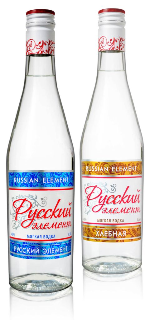
Design of the new Russian Element vodka brand
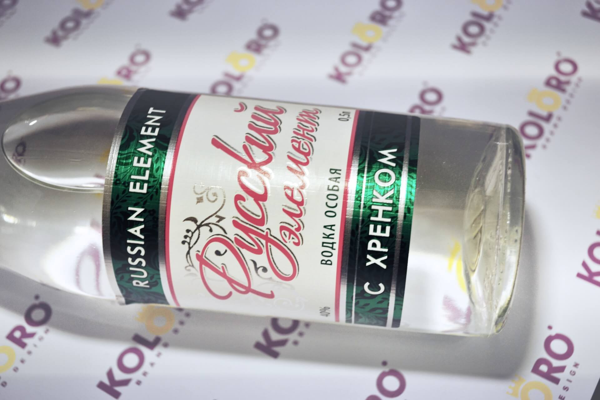
The unique printing technology, realised with minimal costs, allowed to create a textured and emotionally filled label, forming a positive image of the brand in the imagination of the target audience.
Corporate identity
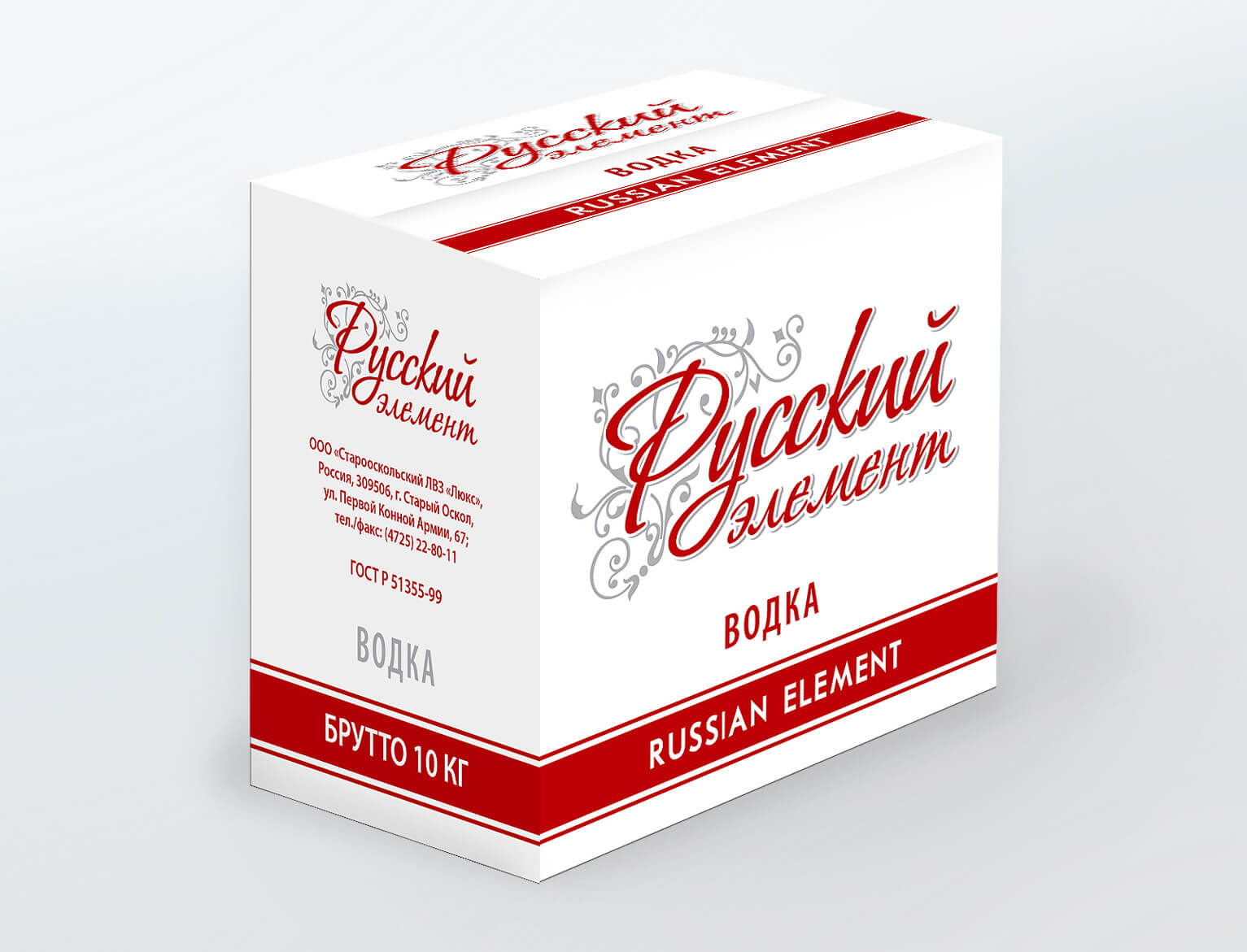
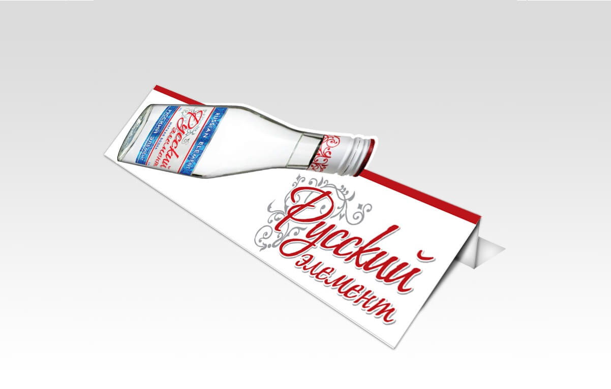
POS-materials, the production of which was also entrusted to us, successfully completed the creation of the trade mark. Let us remind you that the abbreviation “POS” defines advertising printing for placement at the point of sale – direct points of sales (wobblers, stoppers, price tags, shelf talkers, etc.).
POS-materials for TM "Russian Element"
Result
As a result, the customer was presented with a traditional, skilfully executed, clean and beautiful product without frills. Thus, the Old Russian ornament, inscribed in the design of the bottle label and cap, as well as emotionally directed technology of sticker printing – became a winning mixture for the success of vodka in the economy segment.
Having appeared on the alcohol market, the new brand – “Russian Element” – overtook all local brands in the economy segment by the number of sales in the first months. And the “Russian” motifs used in the design received a significant positive response from the target audience.
Russian Element vodka
Summary
The use of “Russian” motifs in the concept of positioning a vodka brand is always welcomed by the market, despite the huge number of existing interpretations. A brand loved by the people is like a “royal” brand with a “crown” on its head.


