RUSALKA
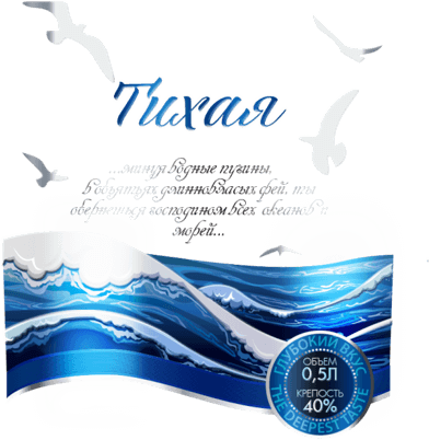
"...BYPASSING THE WATERY ABYSSES, IN THE ARMS OF THE LONG-HAIRED FAIRIES, YOU WILL TURN OUT TO BE THE LORD OF ALL OCEANS AND SEAS..."
Background
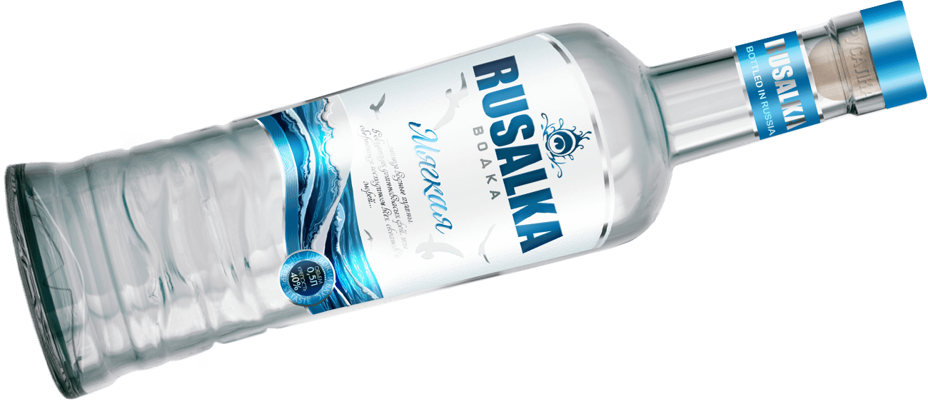
Rusalka vodka is a new brand from LLC Samara Rodnik Plant, the largest producer of strong alcoholic beverages in the Samara region. Unique infrastructure, technological base, and the latest equipment from the world’s leading manufacturers allow SC Rodnik to produce high-quality and promising products.
The new brand from SK Rodnik, Rusalka vodka, is a heritage of centuries-old Samara traditions of alcoholic beverage production.
The products were always produced in state-approved packaging and remained inconspicuous to the target audience. However, the rapidly growing level of competition led the KHS management to the decision to create a trade mark and rebrand the products for export to such countries as Armenia, Kazakhstan, Georgia, Latvia, Germany, Mexico and the USA. In addition, it creates local vodka brands for Samara and Samara region. One of the new vodka brands from OOO SK Rodnik is World Tradition vodka.
Objectives
- Creation of a new vodka brand from scratch
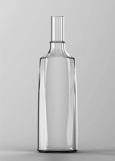
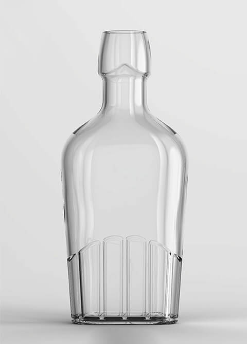
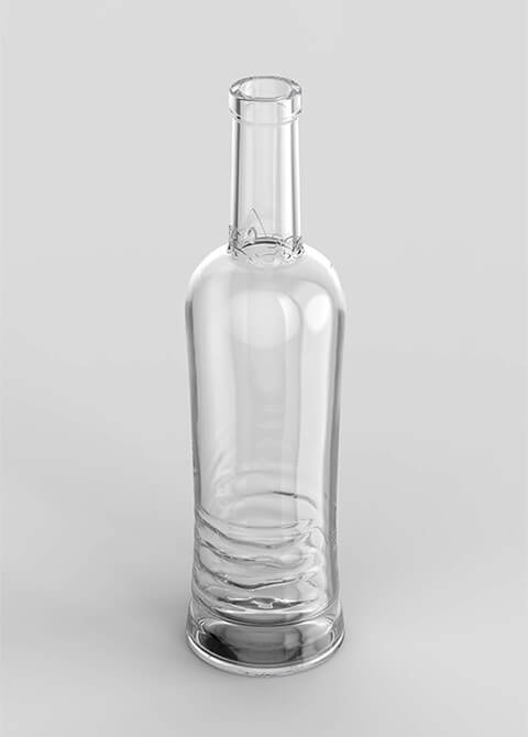
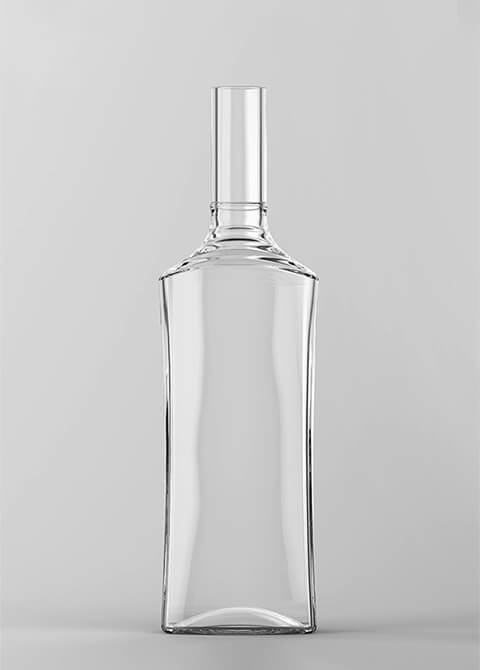
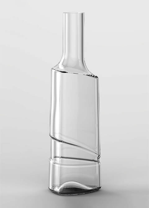
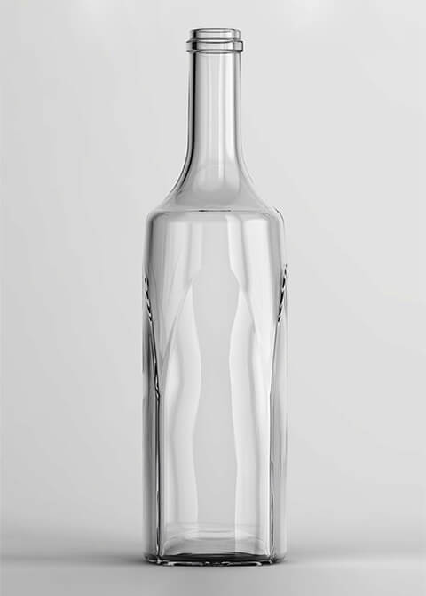
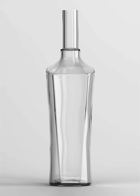
- Development of unique bottle geometry
- Product name line
- Design of the label and packaging of the new brand
- Formation of positioning concept and unique brand proposition
Decision
Analysis of the Russian vodka market
Work on the development of the new brand started with marketing research of the Russian vodka market, analysing the preferences of the target audience (men aged 35-55), as well as studying the vodka brands already present in the mid-price segment.
According to the results of the study it was revealed that most vodka brands in Russia use in the brand design images and identification elements that are directly related to the name of the vodka.
For example: vodka “Dobryi Medved” – image of a brown bear, vodka “Perepelka” – image of a quail bird, TM “Snezhny Bars” – illustrations of a snow leopard, etc.
In addition, the study showed that 90% of vodka brands in Russia use a cylindrical shape. The geometry of the corkscrew also arouses considerable interest among consumers, once again emphasising the positioning of the product as an environmentally friendly product.
Designing the geometry bottle. Vodka label design
When developing the label design and bottle shape, it was important to take into account not only the results of marketing research, but also the customer’s wishes:
- To keep the name of the vodka brand – “Rusalka”, writing the name in English letters;
- The name of vodka should be large and easily readable from a great distance;
- The line of names of the trade mark should consist of three positions;
In the composition of the label there should be a special place for the name of vodka from the line of names – at least 1/5 of the total space of the label;
Each design concept should contain a unique design element that would allow the consumer to easily recognise the brand among competitors.
Specialists of our company developed five unique and completely different design concepts for the new brand images and identification elements that are directly related to the name of the vodka. For example: vodka “Dobryi Medved” – image of a brown bear, vodka “Perepelka” – image of a quail bird, TM “Snezhny Bars” – illustrations of a snow leopard, etc.
In addition, the study showed that 90% of vodka brands in Russia use a cylindrical shape. The geometry of the corkscrew also arouses considerable interest among consumers, once again emphasising the positioning of the product as an environmentally friendly product.
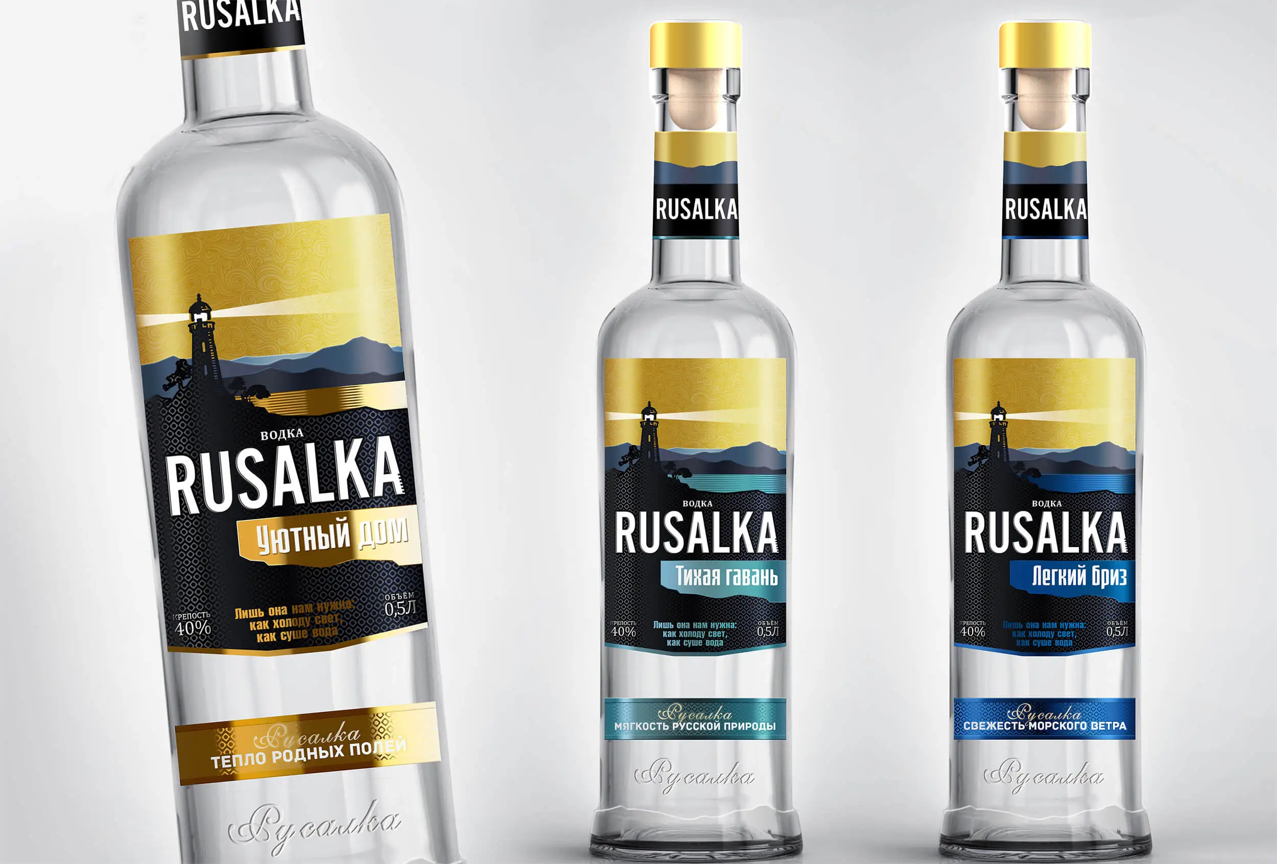
Concept 1 - Lighthouse
Концепт «Маяк»
Главный коммуникационный посыл концепта передан в линейке наименований:
- «Тихая гавань»
- «Легкий бриз»
- «Уютный дом»
Такие наименования вызывают у потребителя следующий ассоциативный ряд:
- душевность
- семейный уют
- спокойствие
- семья
- близкие люди
Keywords
The following were used as the key words of the concept:
- lighthouse
- gold
- sea
- bay
- constancy
- ray
- light
- salvation
- landmark
- thoroughness
- meeting
Communication through a ruler
- cordiality
- family cosiness
- tranquillity
- family
- close people
Elements of packaging
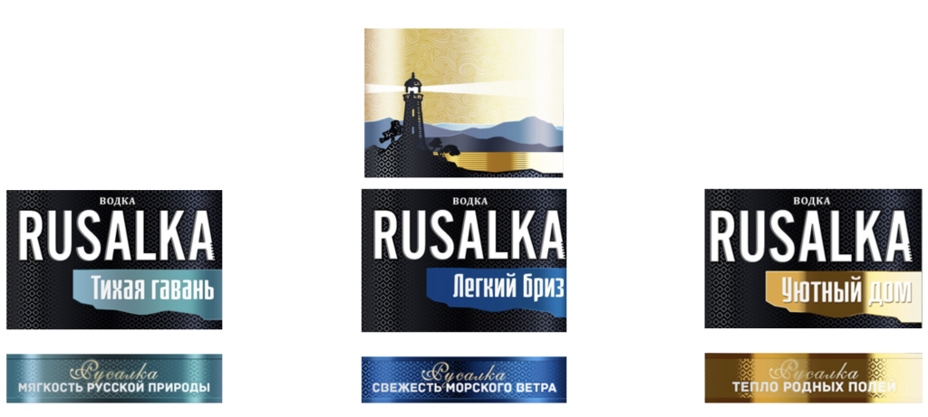
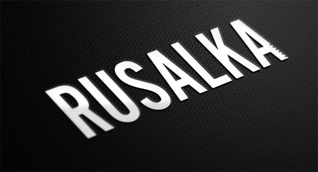
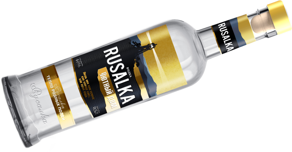
The logo is a tall and unique font. The last letter duplicates the shadow effect on the lighthouse.
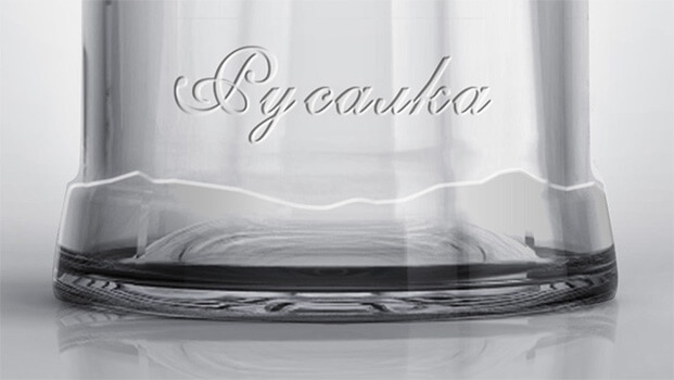
The translation of the name Mermaid is on the glass of the bottle. At the base is a rocky silhouette.
The bottle can be customised. The aim is to resemble a lighthouse (tower).
Lighthouse concept technology
The highlight of the concept is the texture and tactile properties.
Each section is made with a different technology and can be admired and felt for a long time.
Communication lighthouse concept
The absence of the mermaid image and the picturesque landscape make the consumer think and imagine.
The message is not direct and can be perceived differently by everyone, but within the corridor we have set.
Such a game enhances perception and memorability. The consumer can imagine: The lighthouse is a positive object in itself.
Verbal message
RUSALKA – It’s the only one we need, like light to the cold, like dry water!
Concept 2 - Wave
The Wave Concept
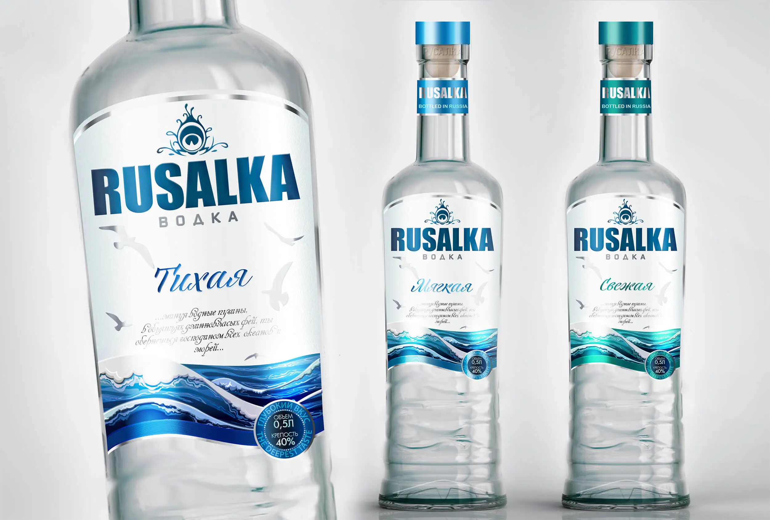
A unique abstract object combining the features of a sea shell with a pearl and a scuba diver’s mask is chosen as the logo in this concept.
The bottle is made in a bluish colour, with a tinge of green.
A starfish is stamped on the bottom of the bottle.
The concept is interesting because the bottle is not transparent, but has a light green tint, which is not typical for vodka brands. This clearly distinguishes the new trade mark among competitors.
The main communication message of the concept:
To make the consumer feel part of the sea element raging with freshness
to feel the purity and lightness of the new brand’s flavour.
Key words of the concept:
wave
lyric
freshness
lightness
purity
crest
surf
force of nature
element
sea bottom
seagulls
pearl
The three-position name line further emphasises the verbal message:
“Quiet”
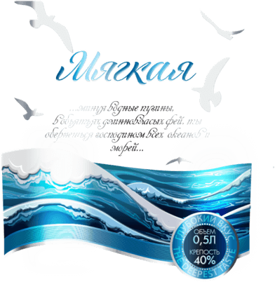
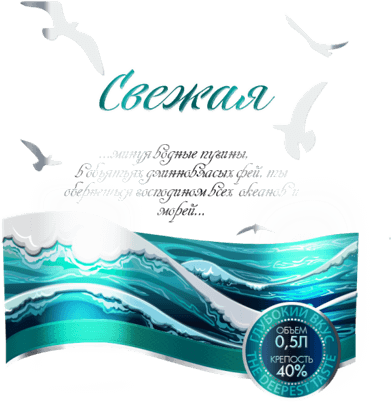
“Soft”
“Fresh.”
Keywords
- wave
- lyricism
- lightness
- purity
- crest
- surf
- force of nature
- element
- sea bottom
- seagulls
- pearl
Name range
Verbal message
Design Elements
A logo is a unique abstract object.
Bottle
The bottle is planned to be bluish in colour, or with a touch of green (like Borjomi).
Waves go all around the bottle, and the wavy bottom of the label emphasises the design of the bottle.
A starfish will be stamped into the bottom.
Communication of the Lighthouse concept
The concept is interesting in that the bottle is not transparent, but a slightly green colour. This is uncharacteristic for vodka brands, which will definitely make the new brand stand out on the shelf among competitors.
Verbal message
RUSALKA – the sound of the surf in every drop!
Concept 3 - Pisces
Pisces Concept
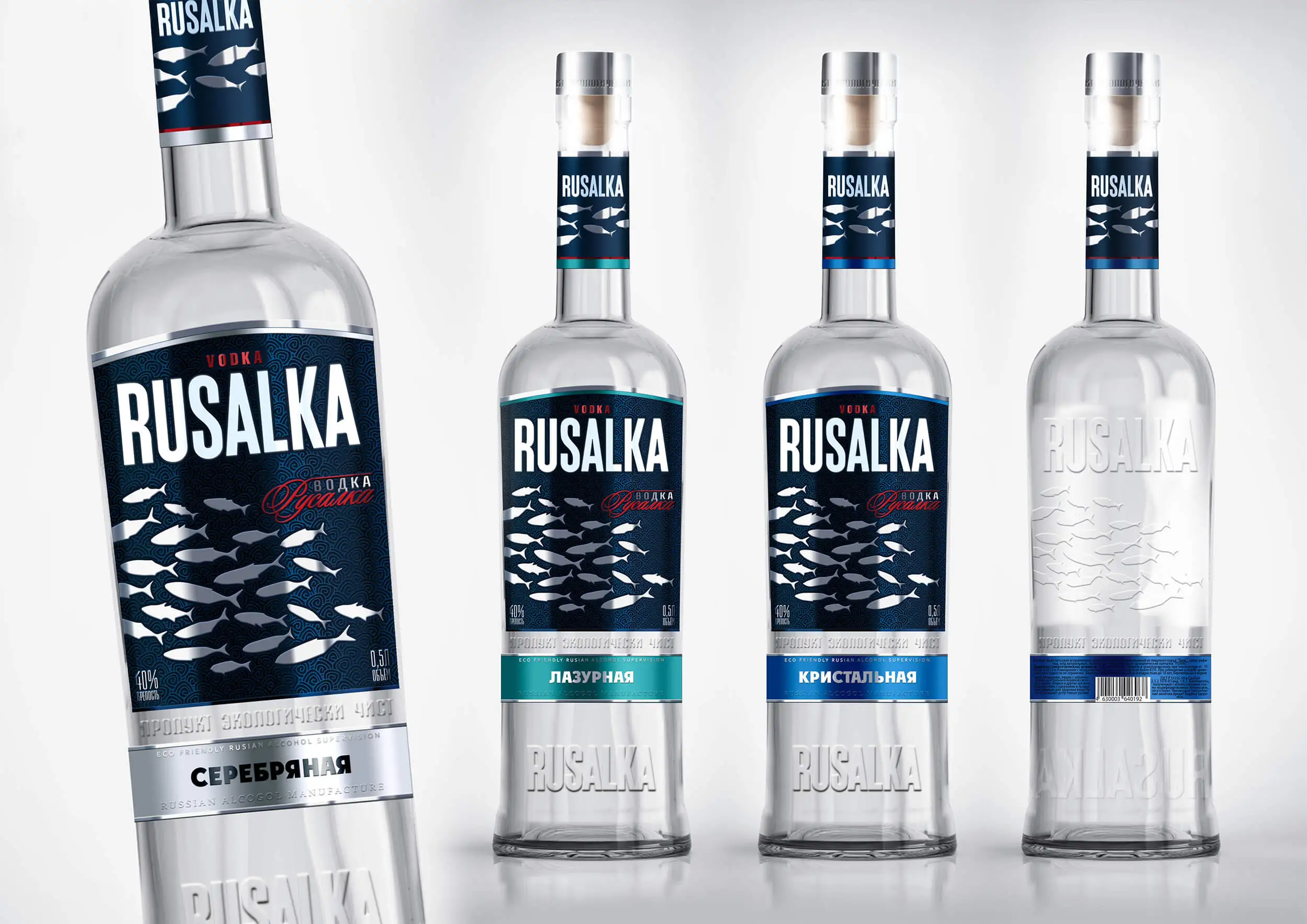
The third concept that was chosen by the customer was the “Fish” concept.
The main verbal message of the concept is to reveal the theme of environmental friendliness and naturalness: “The product is environmentally friendly”.
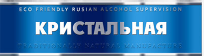
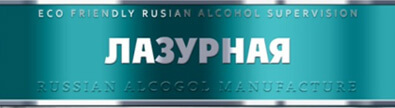
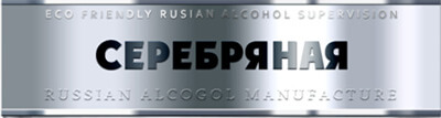
The line of names also speaks about the transparency and purity of water in the base of the vodka:
“Kristalnaya”
“Silver”
“Azure.”
The following keywords were chosen to create a charismatic background for the label:
fish
flock
group mind
impetuosity
current
depth
reflections on the water
severity
As well as identity elements such as:
– Scales;
– Waves;
– Whirlpool.
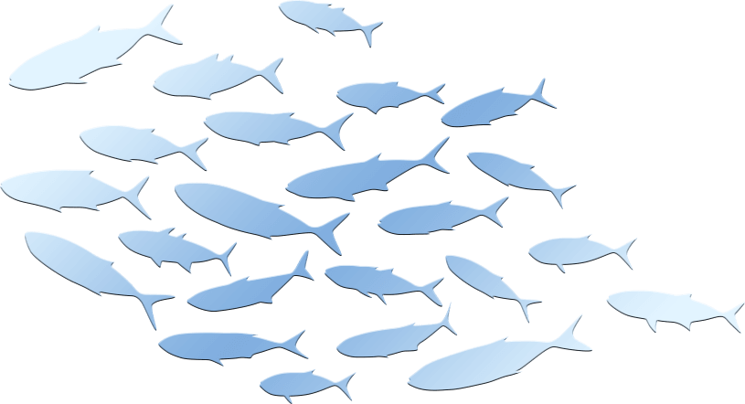
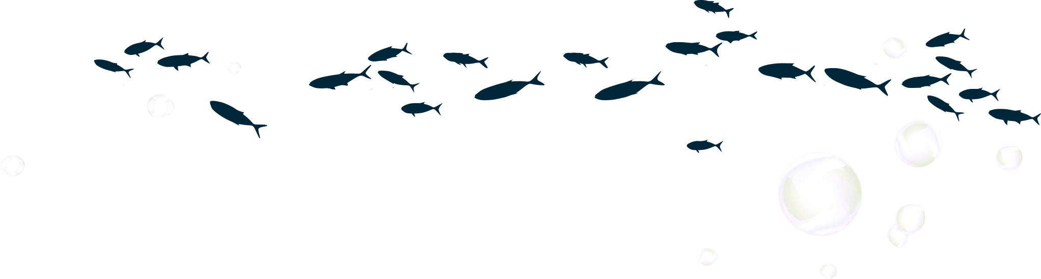
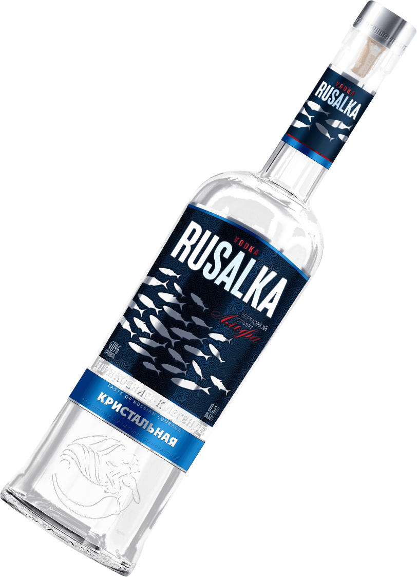
The main element of the label design is the school of fish, conveying a sense of cohesion, unity, and purposefulness. The beauty and richness of the seabed is emphasised by the golden shimmer of the scales of the fish school. “Quiet”, “Soft”, “Fresh”.
Keywords
Clean, eco-friendly, natural, fish, flock, speed, depth.
Name range
speaks to the transparency and purity of the water, the base of the vodka.
Verbal message
emphasises the theme of naturalness and sustainability.
Design Elements
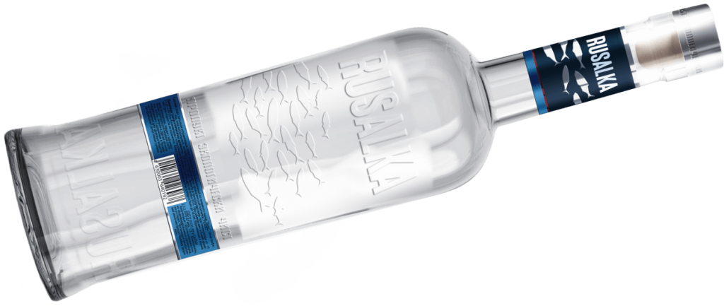
There are convex elements on all sides of the bottle, which is very popular at the moment.
The belt wraps around the entire perimeter of the bottle. It consists of two overlapping labels.
The object of identification is the charismatic background: Scales Waves Whirlpool
Communication of the Pisces concept
Fish, when gathered in a school, become a unified and more intelligent creature. They stick together and thus increase their chances of survival.
Besides cohesion and purposeful movement, people also celebrate this concept by likening it to a successful fishing trip and a good catch. Everyone is pleased to return home with a rich catch.
So, the brand stands out on the shelf among competitors. At secondary contact – tactile contact – the product packaging will evoke pleasant emotions.
RUSALKA - Together we are stronger!
Result
However, the undoubted leader among the concepts was the one chosen by the customer – a concept emphasising the environmental friendliness and cleanliness of KHSZ products.
Summary
The high level of competition in the market of vodka brands forces producers to put a lot of effort into developing the bottle shape, label design, brand positioning concept and UTP. Without experience in the alcoholic beverages market it is almost impossible to create a profitable brand, which is why most manufacturers entrust this work only to professionals.
Did you like the work?