REMBEK
INSECTICIDE REBRANDING
Background
The management of the research and production company Agromat Ltd. approached KOLORO with an interesting complex task. The company specialises in the production of insecticides. We had already worked with the company, and the result of our co-operation was a brand of anti-rodent product “Rattlesnake mixture”. Last time we created the brand from scratch. This time the product already existed and was sold on the shelves. However, the company wanted to expand its audience and refresh the appearance of the packaging.
Task
Conduct market research on insecticidal products, find out consumer preferences.
Develop positioning and create a UTP.
To make a new package design, more attractive for the target audience.
Develop communication with consumers based on insights from the research.
Portrait of consumers of insecticidal products
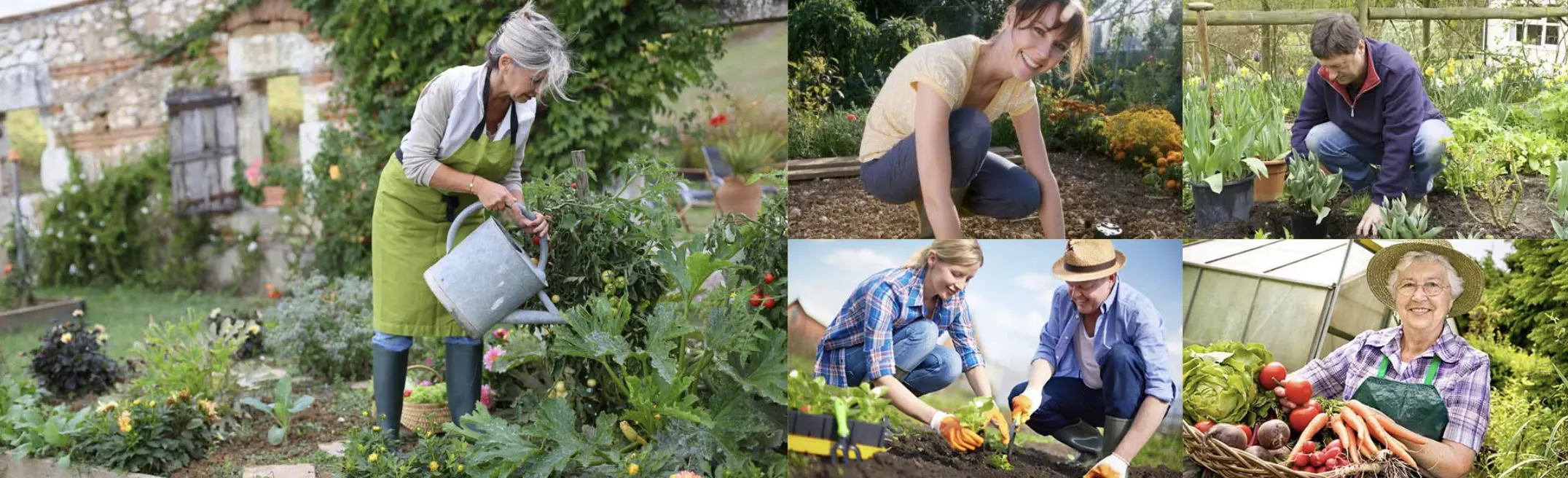
The analysis revealed that our target audience is people 45+, men and women, gardeners and gardeners, dacha growers, as well as farmers with small farms that they maintain with their families. The main requirements that consumers put forward to the insecticide are:
Quick result, which is immediately noticeable;
A lasting effect that does not disappear without a trace;
A safe active ingredient that does not threaten soil and crops;
Convenient form for easy use.
Consumers expect the following characteristics from insecticide preparations:
fast and noticeable results;
long-lasting action without the need to re-treat the vegetable garden;
harmless formula, safe for soil and crops;
ease of use – the poison can be used immediately after purchase.
Points of sale – specialised shops, markets, large horticultural hypermarkets.
The survey confirmed our expectations: the demand for insecticides starts to grow in early spring and is practically absent in winter
Trends in insecticide product packaging design
All packages of insecticidal products can be divided into 2 big directions.
They are made in Ukraine and Russia in a “kitsch” style. They are characterised by images of pests, photos of crops (potatoes, tomatoes, peppers, cucumbers, etc.), lack of a single corporate style.
Preparations that belong to international corporations. More often their design looks better, it is in a unified style.
In addition to the style, which can be called “kitsch”, you can distinguish ecological. It is characterized by neat colours (white, all shades of green and brown). Also, humour is often used in the design of insecticide packaging. Another trend is the military theme. It can be traced in the naming, design and communication of brands.
Creation positioning
After processing the results of the analysis, we started working on positioning. As a result, we came up with a formulation: a fully ready-to-use, safe, long-acting product. If you produce a product but want to change something in it, improve it, contact KOLORO. You can order rebranding from our managers.
Developing communication: Creating infographics
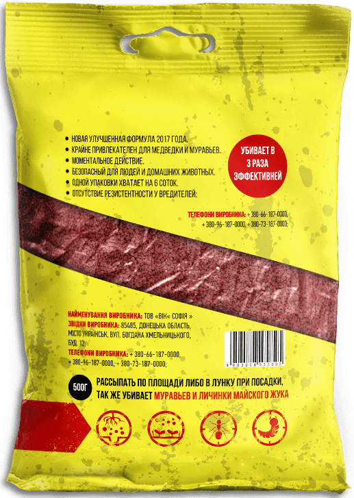
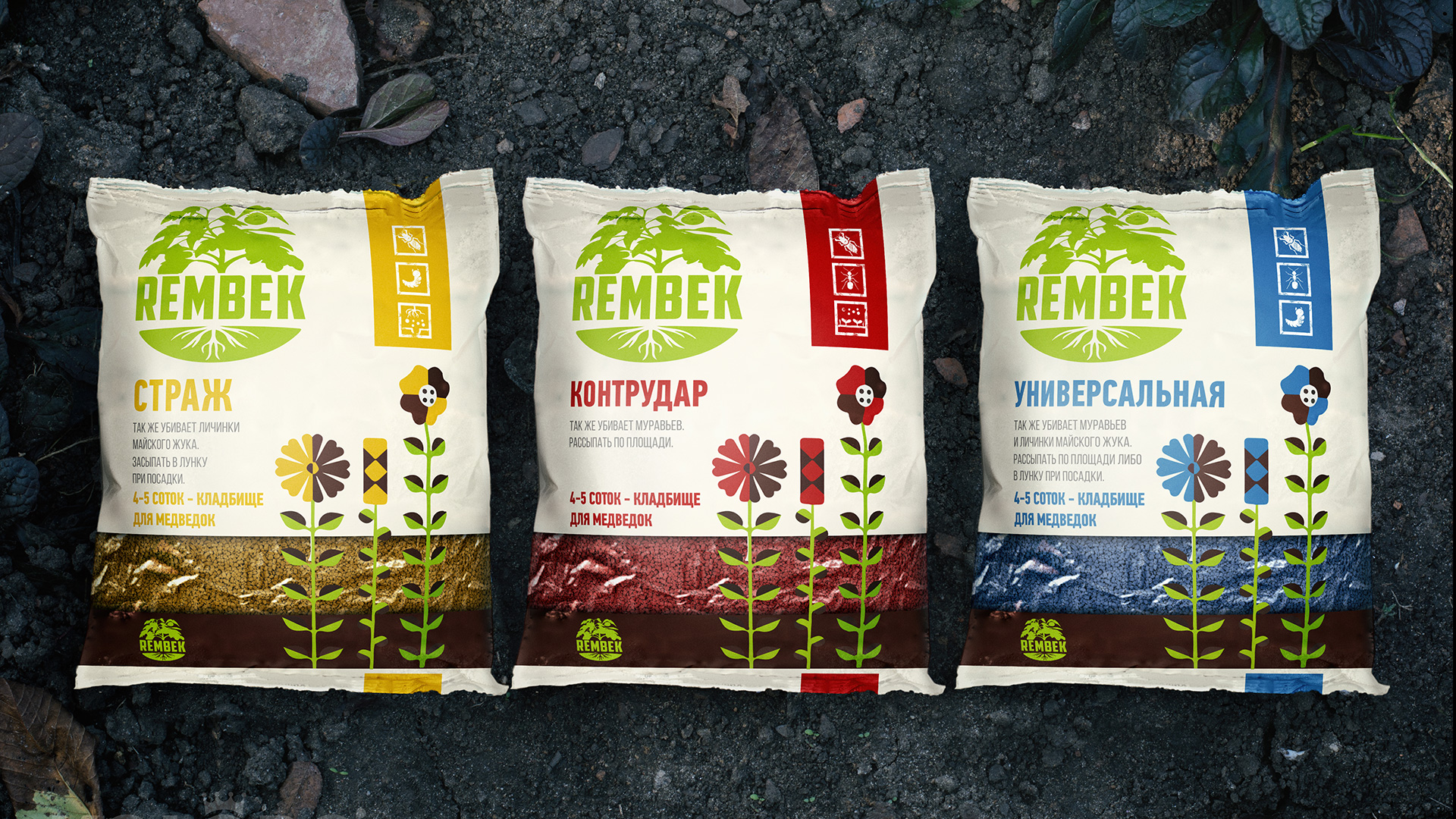
The information icons that we have placed on the packaging tell about the purpose of the product and the way it is used. This is convenient for consumers, it is easier for them to understand the mechanics and principle of action of the product, to understand whether a particular product is suitable for their purposes.
On the icons, the designers displayed the entire path of the consumer in the application of the product, as well as showed the insects against which Rembek works.
Functional and rational differences
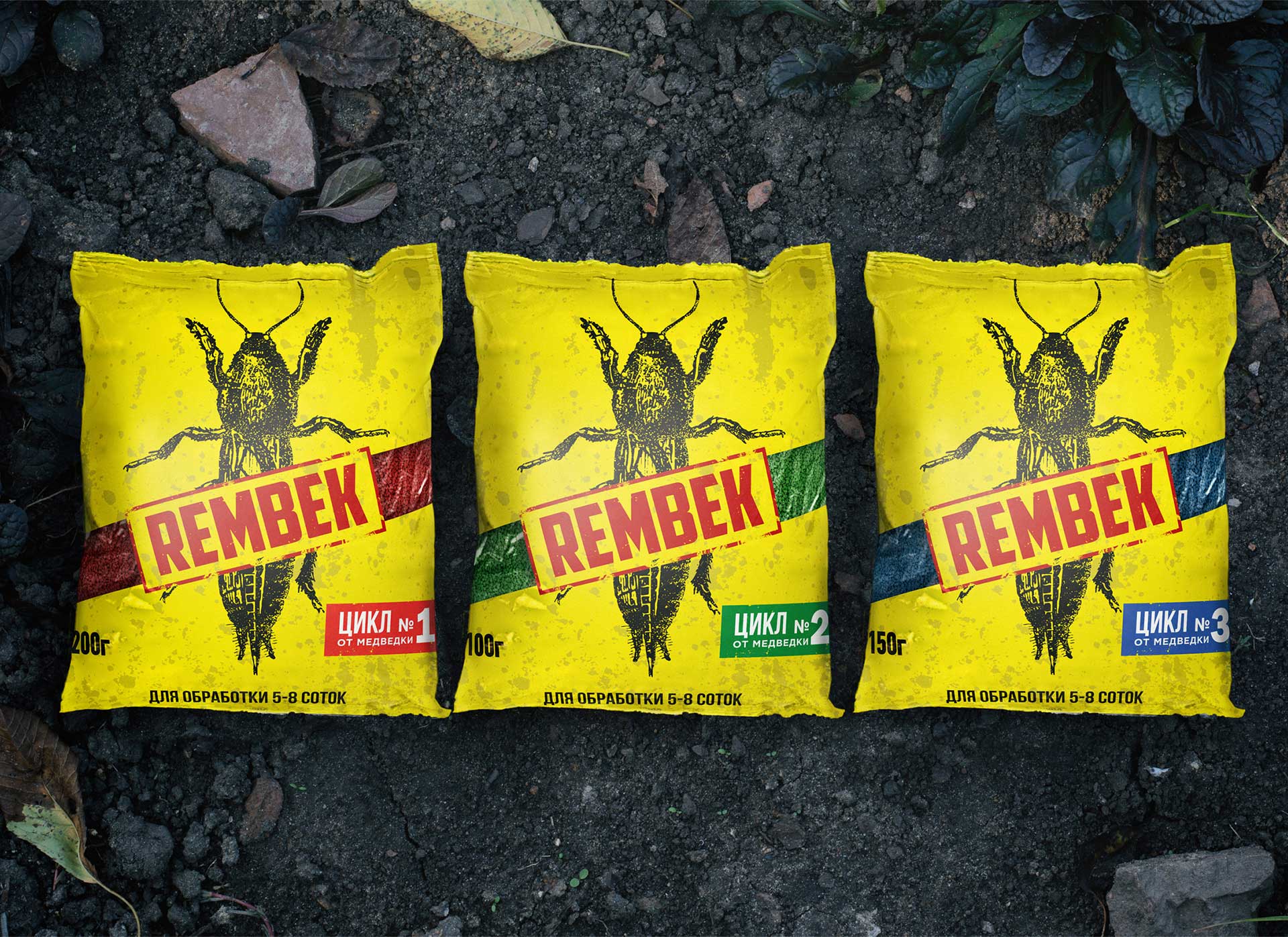
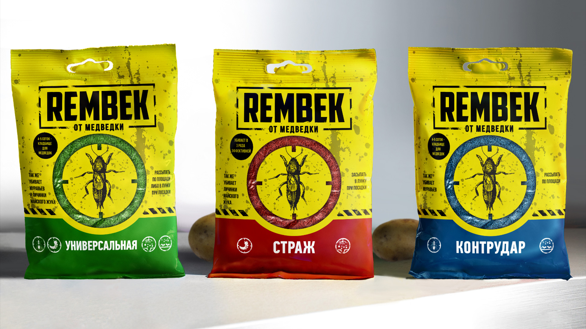
There are 3 types of products in the Rembek series. They do not differ in composition and formula, but they are distinguished by the colour of the granules and one colour segment on the packaging. We decided to promote Rembek as a complete solution for pest control. Cycles are needed to create an imaginary difference that gives consumers confidence in the result.
Development of a unique selling proposition
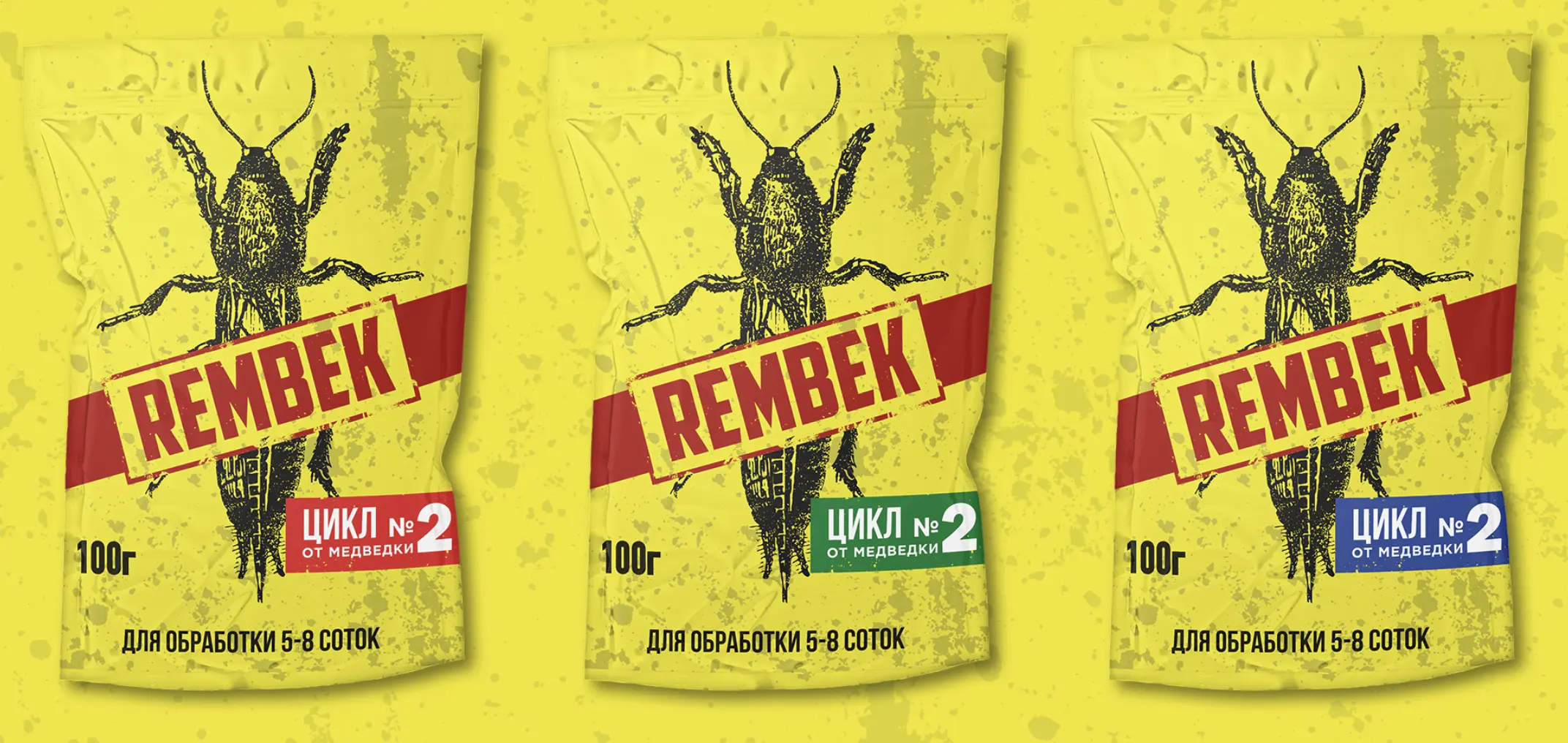
The cyclic nature of the products is a trick we developed when creating the UTP. The fear that pests develop immunity to a product pushes consumers to change brands. And cycles, on the contrary, encourage consumers to stick with a particular brand.
You can order the development of UTP in KOLORO. We endow goods with properties that are important for consumers.
Description of packaging concepts
The rebranding of the packaging is another important stage of Rembek’s renewal. The design was based on positioning and research.
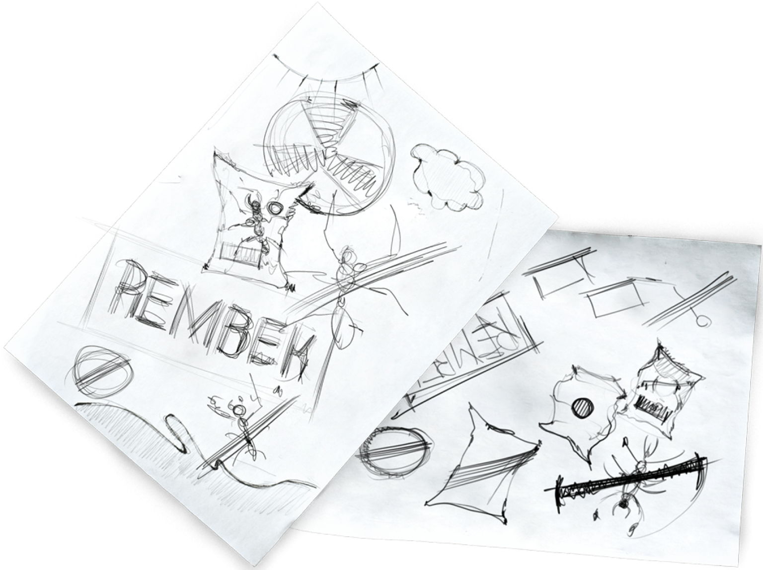
Concept No. 1 – Avenger: the packaging shows a man furiously destroying a bear beetle.
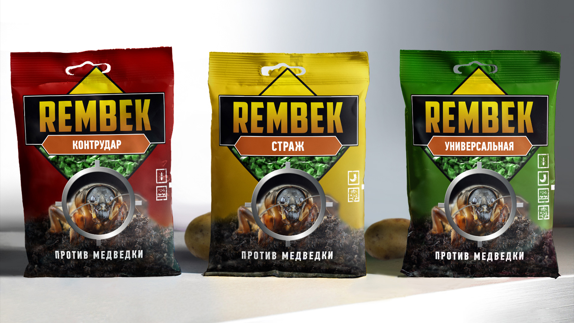
Concept No. 2 – At Risk: the product hits the target. To reinforce the positioning, we used green colour and an image of freshly ploughed land.
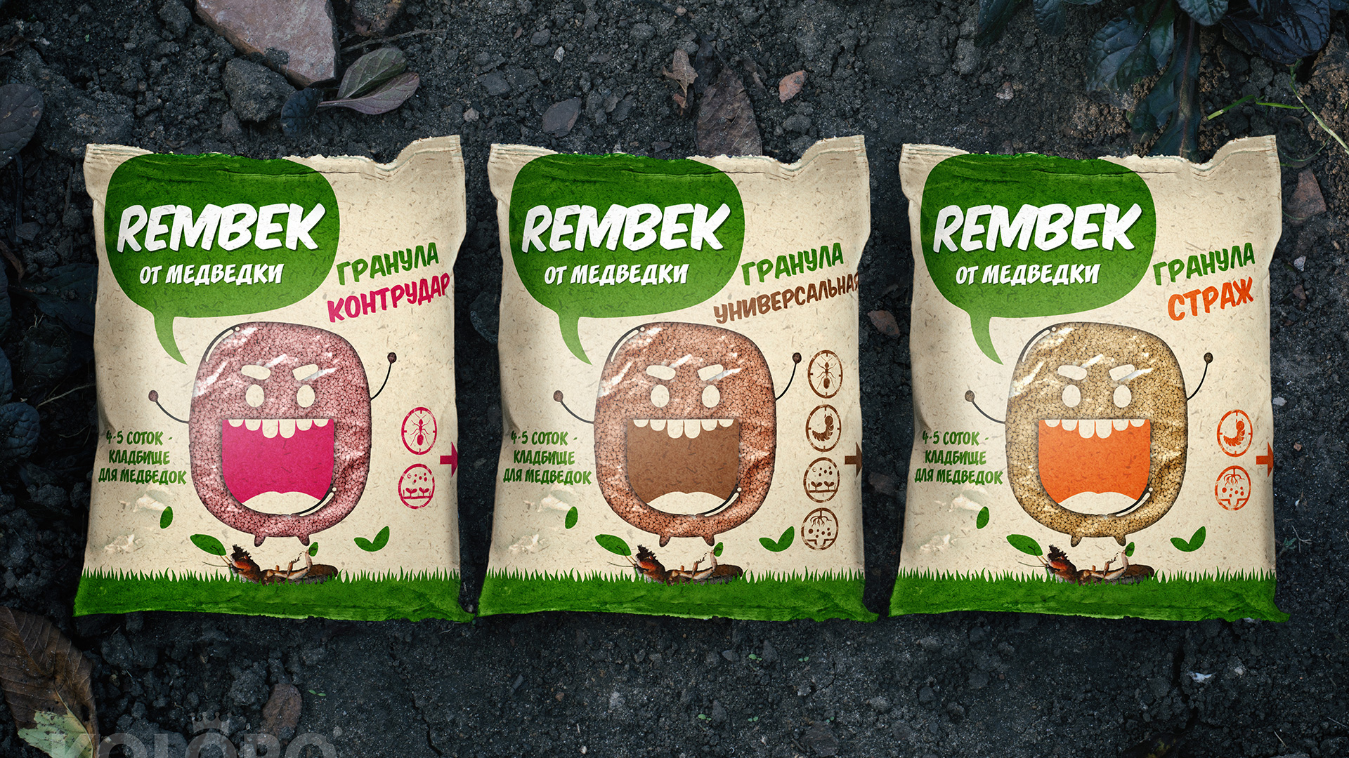
Concept #3 – Ecothematic: white background and maximum associations with safety.
Concept #4 – Bloodstain. In the centre there is a bright spot, which symbolises the death of a pest. On the edges we added transparent inserts that create a sense of curved geometry.
Concept number five – At Risk (flat style). Similar to concept number two, but in flat design style.
The customer chose the 4th design option. We slightly modified the concept at his request by changing the position of the inserts.
Key identifying elements
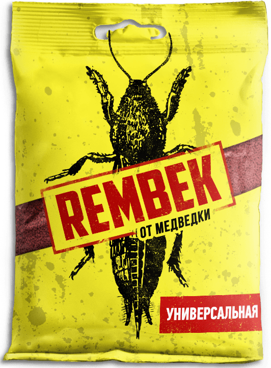
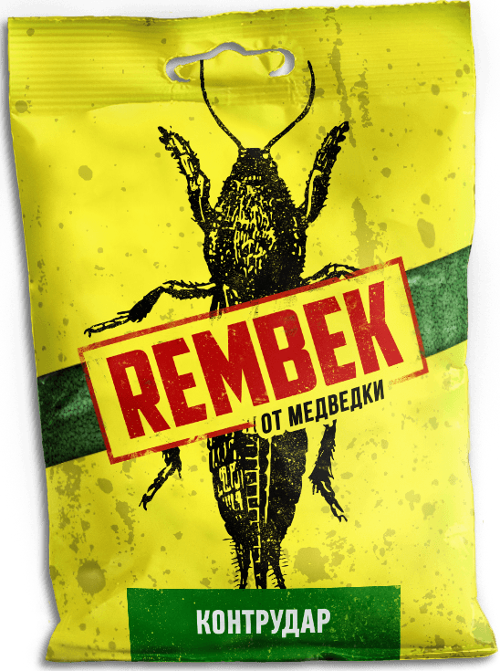
The logo, a red stamp, is placed in the centre of the package. It overlaps the image of a bear. There was a similar image in the previous version of the packaging, where a red lightning bolt pointed at the bear. Continuation of the idea will allow not to lose the audience that used Rembek before. The bright yellow packaging stands out from the competition and looks good on the shelf.
Counter-label design
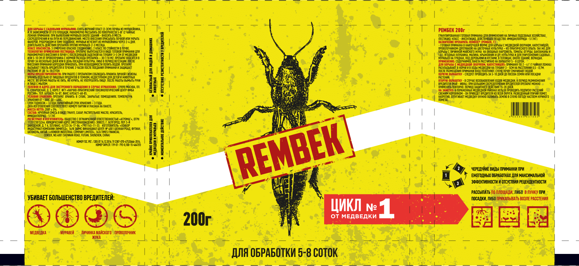
We’ve included an infographic on the back, as well as technical information about the composition. For more information on why you should make the most of the space on the back label and examples of products with interesting back labels, see our article.
Packaging cutting
The cutting was required for a pack weighing 200 grams. We sent all the documents to the printing house with the technical documentation.
Pre-press preparation and printing of the first print run
The printing method we chose was flexography. The choice was based on the type of packaging, which is flexible.
Results
As a result, we got a renewed brand that meets consumer demands and stands out on the shelf. The first slices of sales figures exceeded customer expectations, the new packaging and UTP proved their effectiveness.