REBRANDING OF THE WELMART HYPERMARKET CHAIN

General data

“Velmart” – hypermarkets focused on discount sales. It is one of the five most influential supermarket brands in Ukraine. The target audience is shoppers with low or medium family budgets. The former visit the hypermarket due to affordable prices. The latter are satisfied with a wide range of products.

Case

The client needed to create an updated brand design for the entire Velmart chain. The task is voluminous and complex, consisting of many small stages. The design was required to meet the requirements of the time and increase customer loyalty.

Market research on the market and audience of supermarkets

More than 50% of Ukrainian shoppers take groceries from a supermarket two or three times a week. 32% of customers shop daily. People prefer to visit the same supermarket: 32.7% of consumers make all their purchases in one shop, while 63% go to 2-3 shops.

When choosing a supermarket, consumers are guided by three main parameters:

convenient location (80%);
large assortment of goods (61%);
affordable prices (61%).

Comfort of service is important for 20% of Ukrainian shoppers. Taking into account the information obtained, we rebranded, created a brandbook, a guideline, and a merchandising manual for the Velmart hypermarket chain.


Colour scheme, logo, fonts

Logo

Pros of the new variant
The logo has new lines, which are softer compared to the previous sign. Their number has been reduced, thanks to which the sign has become simpler and easier to perceive. The gamma of the logo is now brighter.

Before

Afterwards

Brand block

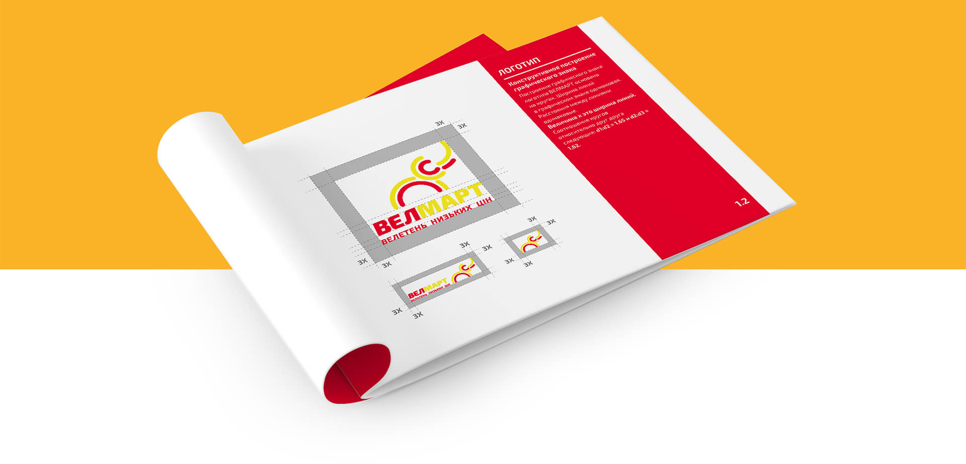
Protected area

the space around the logo where no other elements can be placed. For a new logo, the zone is 3X, where X is the height of the text. The minimum for the block size is 3cm. The maximum can be any size.

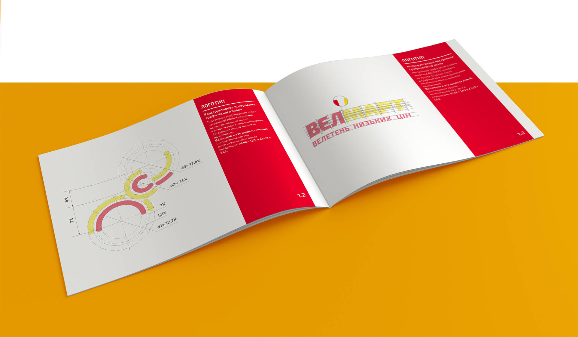
Building a brand block

Gamma

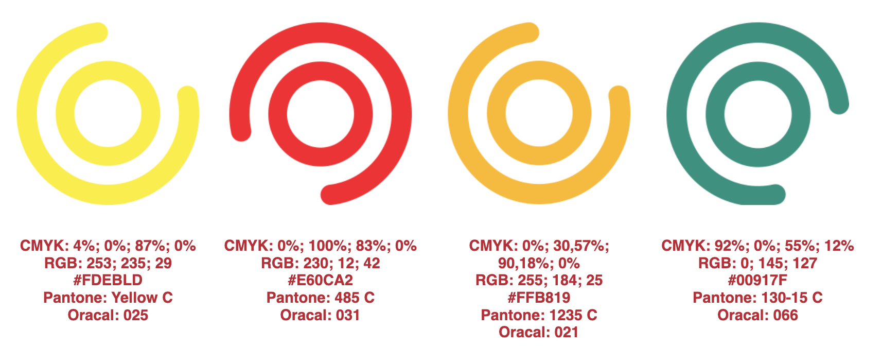
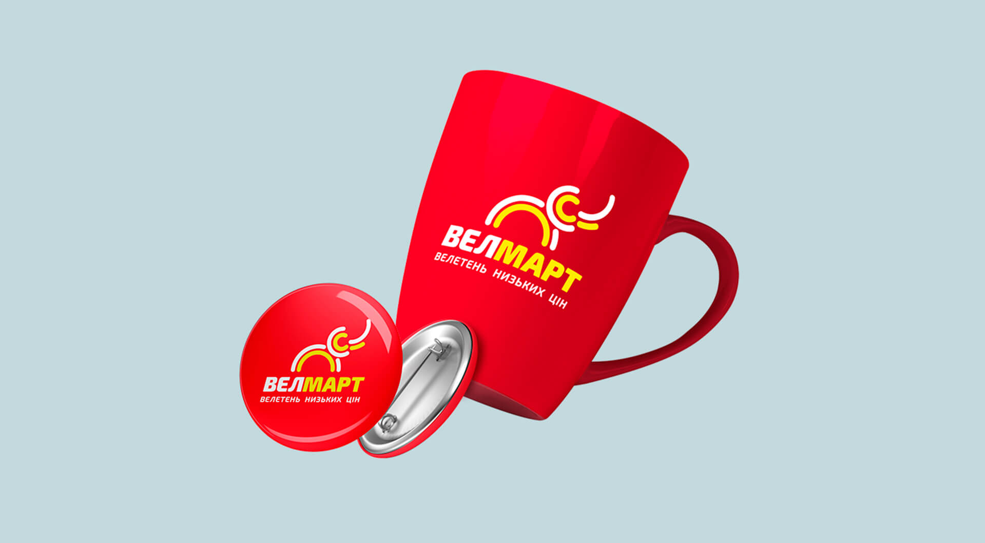
The main corporate colours for the hypermarket chain are yellow, red and white. Turquoise and orange are used for accents. The new colours attract attention well and at the same time do not cause rejection.

Fonts

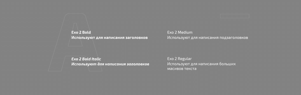
The main font is Exo 2, readable on all media and surfaces.

Exterior design

Wall signs

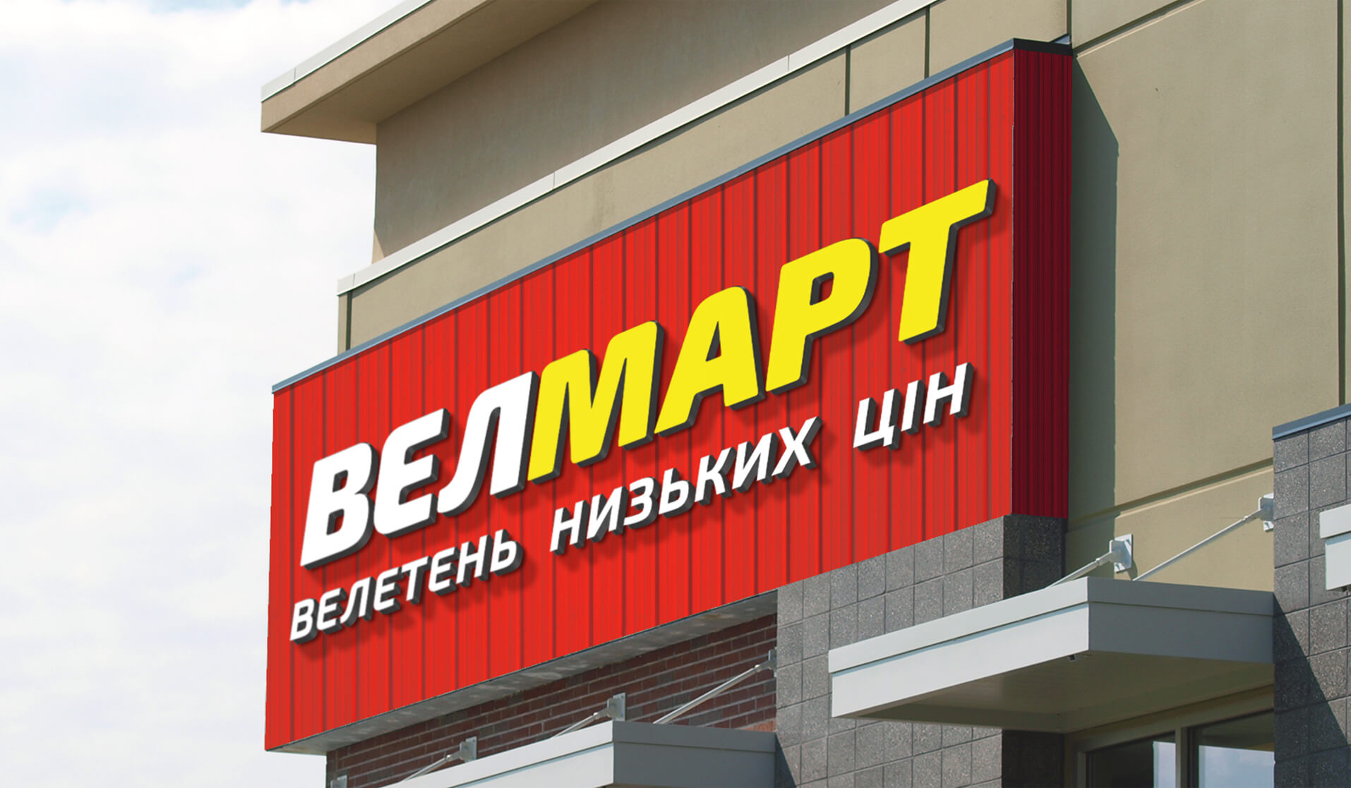
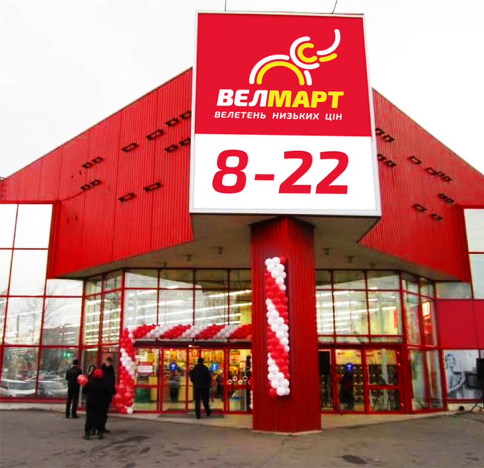
The main sign is located above the main entrance, in the centre of the red frieze. If for some reason the frieze cannot be installed, a wall sign can be placed on a white (light grey) wall.

Banner constructions

Advertising
billboards

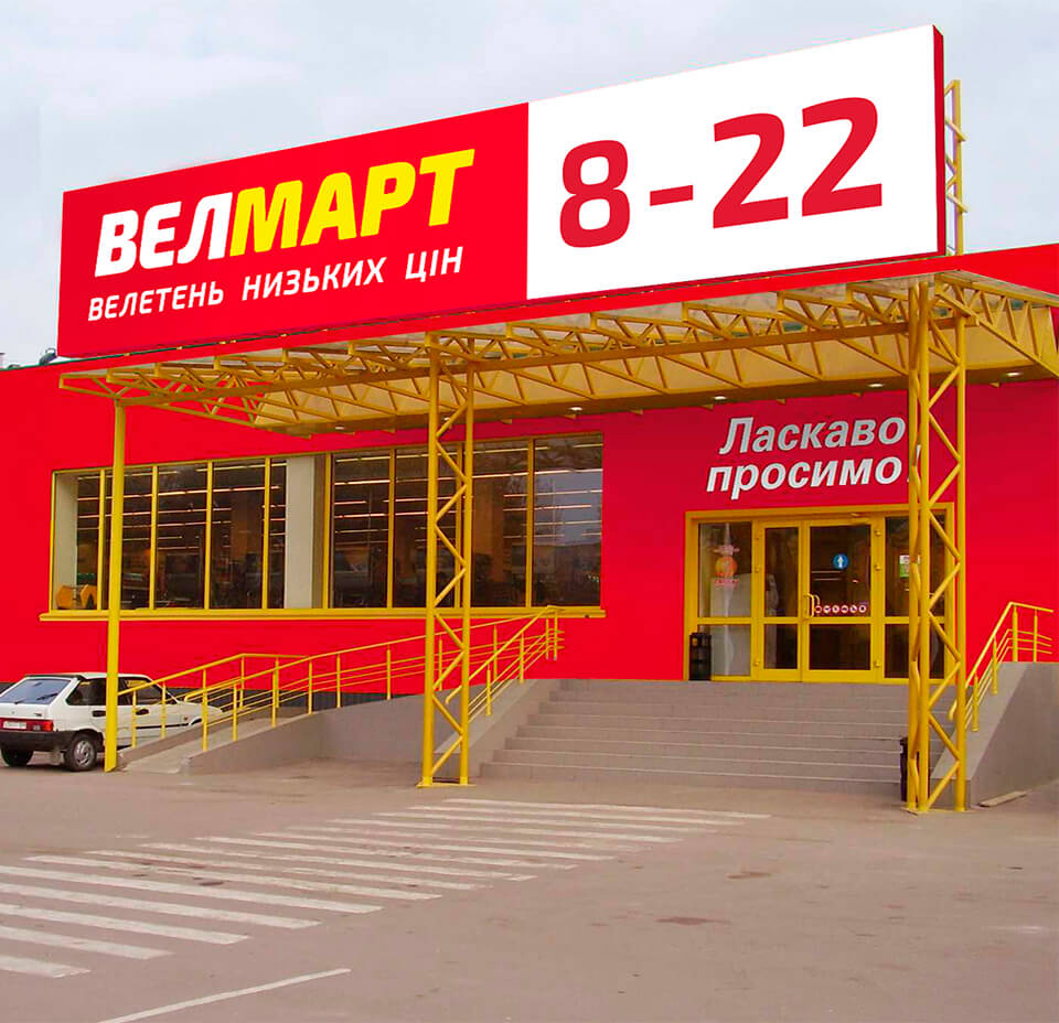
Billboards are designed in two ways:

  • logo plus slogan;
  • brand block, with the
  • graphic sign on the right side.

Billboards

Advertising
billboards

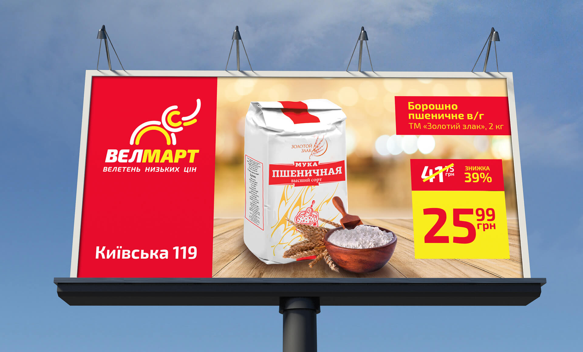
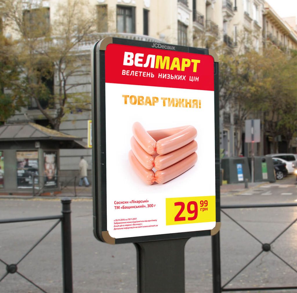
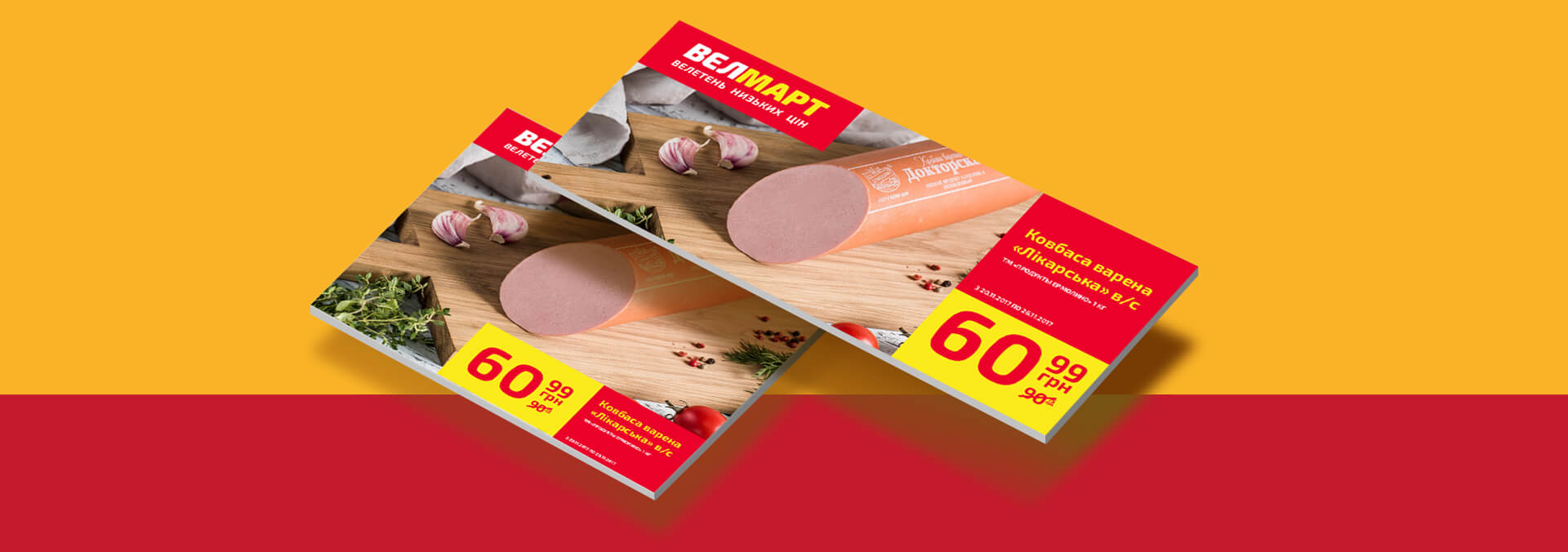
A vertical bar with the brand name is obligatory. On the right side is the location of the market. On the other side – the name and price of the advertised product. Photos have a light and minimalistic background so that nothing distracts from the perception of the product.

Navigation
billboards

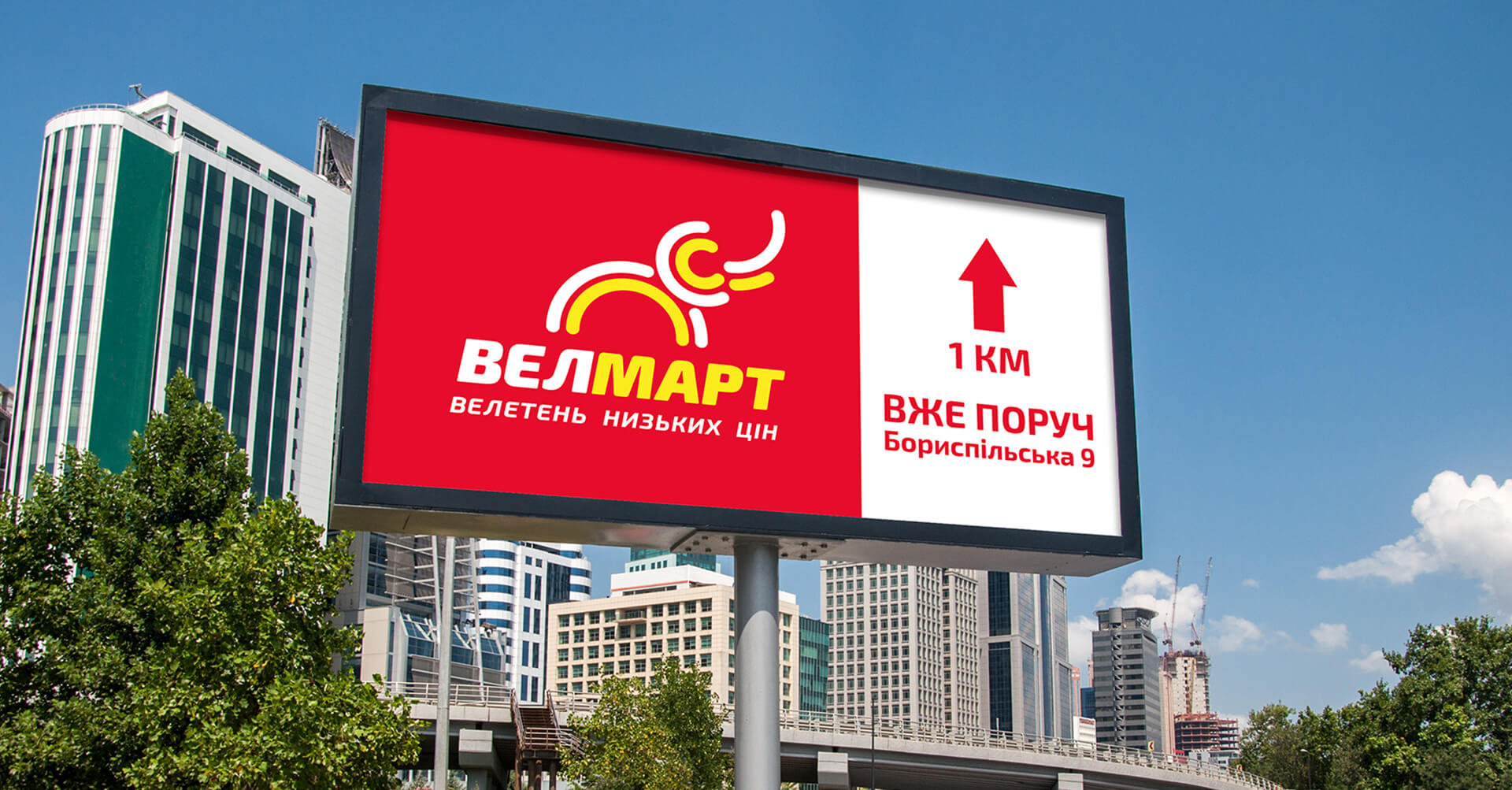
In navigation billboards, the vertical block is on the left and the signage is on the right.

Booklets and posters

Дизайн
полиграфии

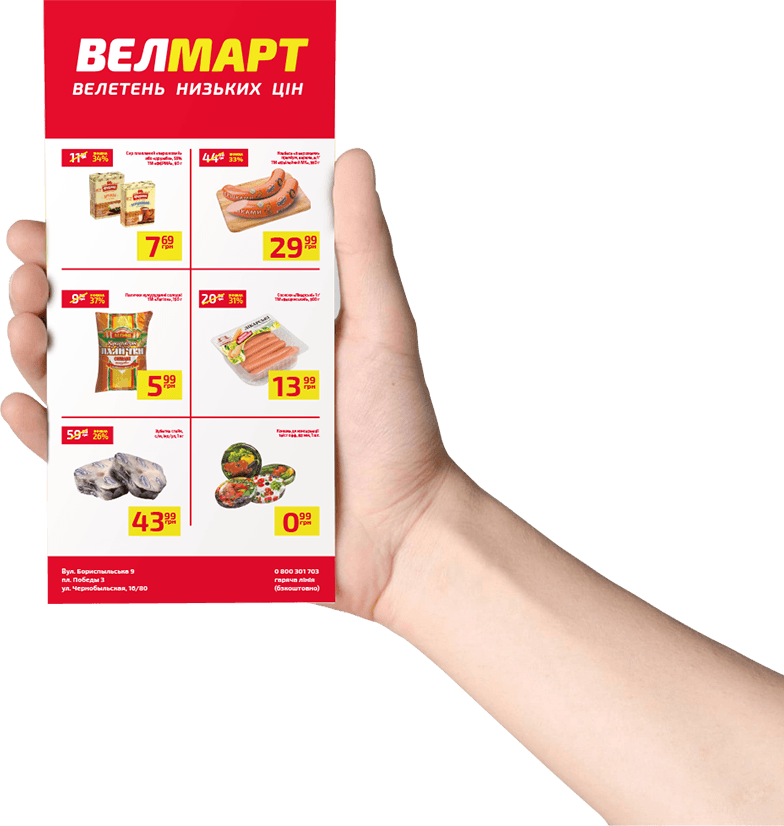
In the brandbook we formed standards for printed products: the size of elements inside leaflets with booklets, their location on the page, the composition of texts and graphics.

Shop floor decoration

Cash registers

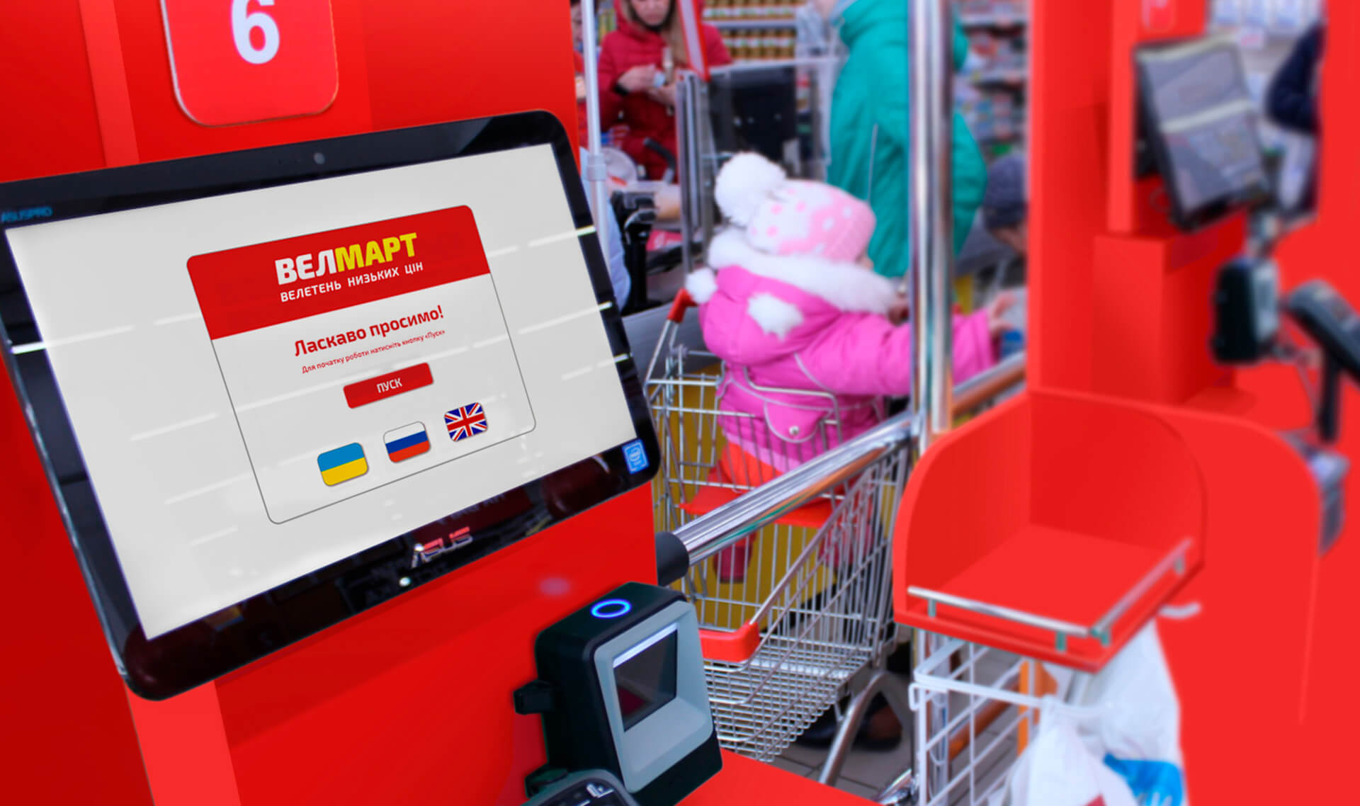
The brandbook also sets out the rules for the design of the areas by the cash desks. The casings of the cash desks are coloured red. Branded decorative signs are placed on the side and front of the cash desk.

Shop navigation

Orienteering
in the hall

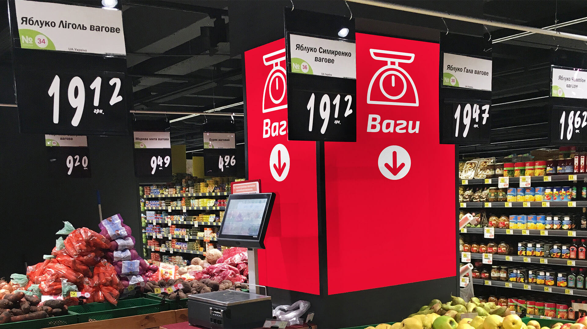
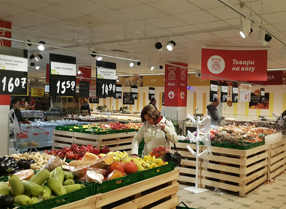
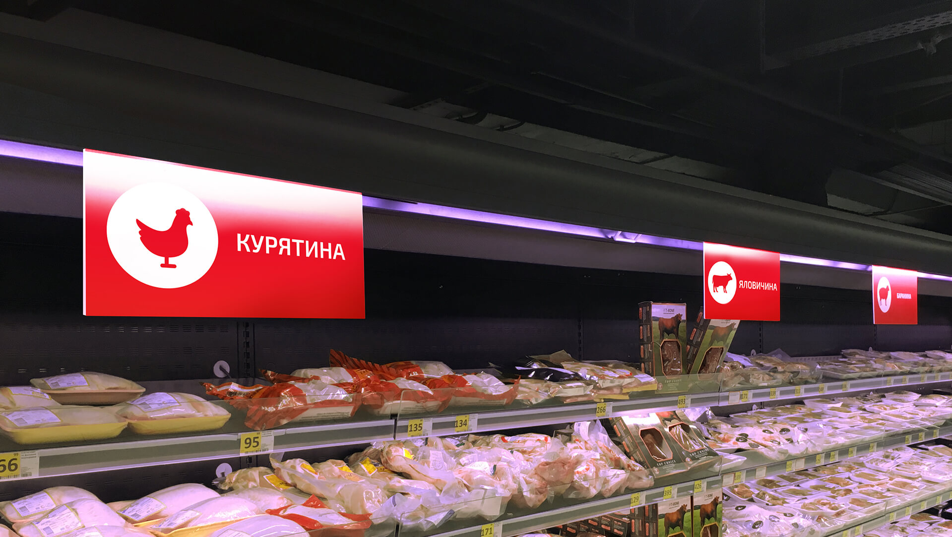
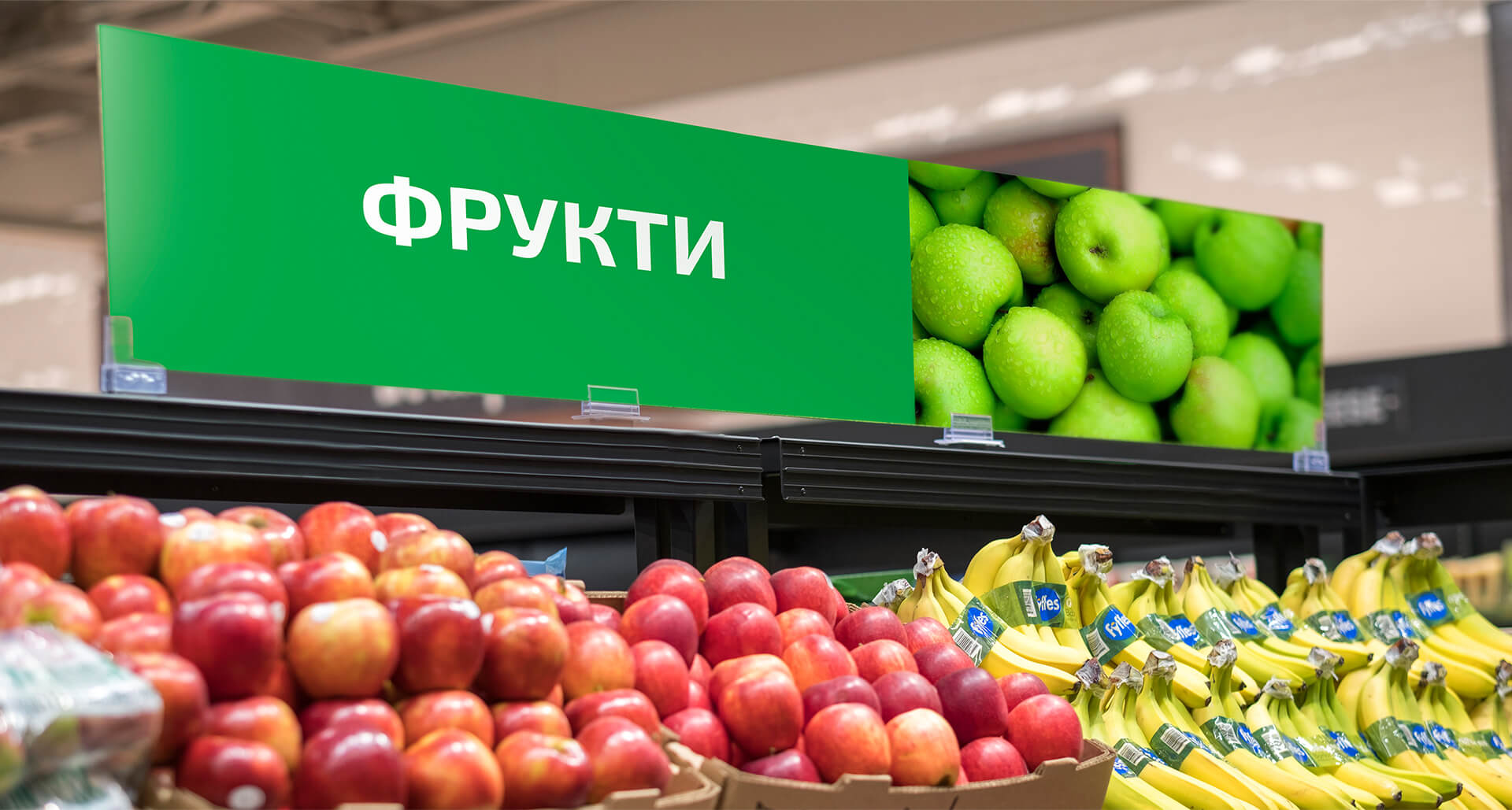
For the convenience of customers there are developed signposts for product zones of the hypermarket and their standards are formulated. Signboards with the names of departments are designed in the corporate colour scheme and appropriate font.

Orienteering
in the hall

The departments themselves also have internal navigators with simple and easy-to-read icons to help customers navigate easily around the shop.

Orientation
in the hall

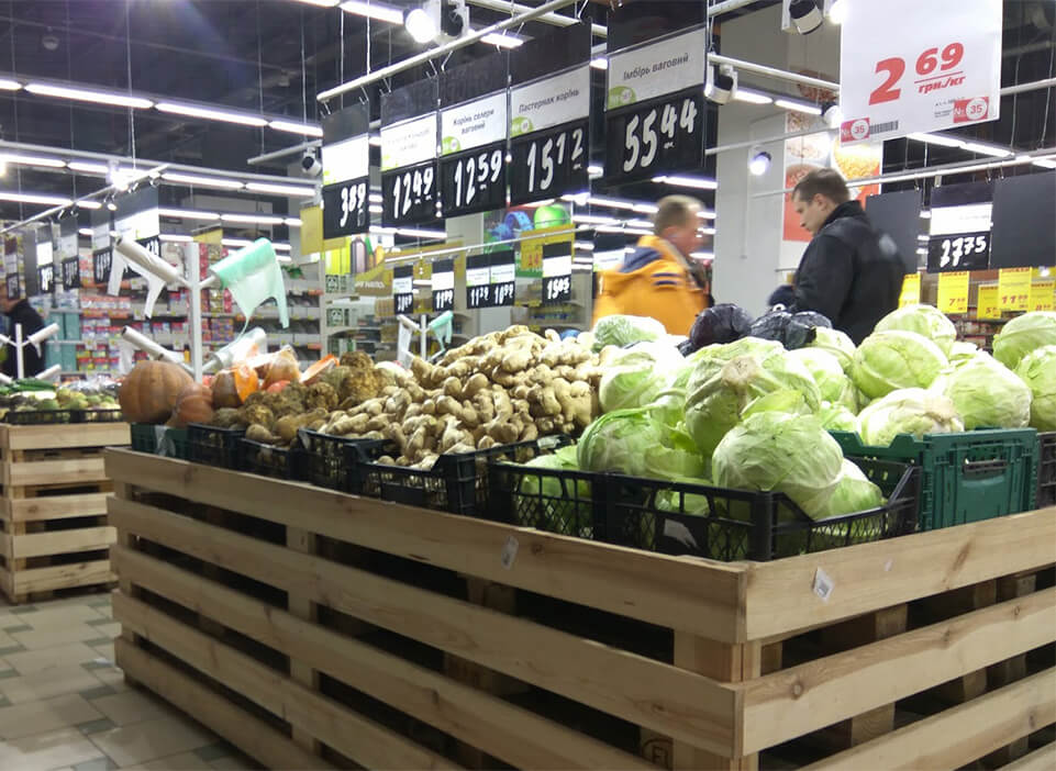
The signage in the vegetable department features appetising photos of fresh fruit.

Price tags

Formalisation
price tags

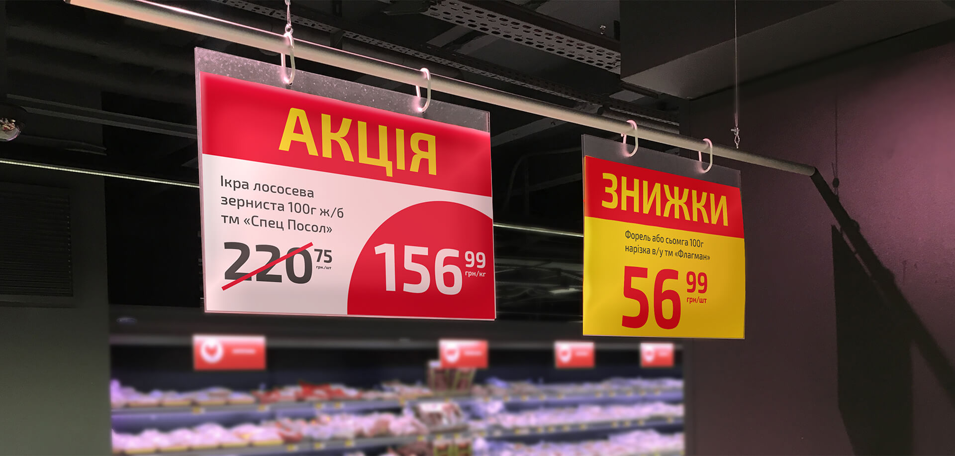
We have created several price tags for different customer purposes:

  • large – promotions and promotions;
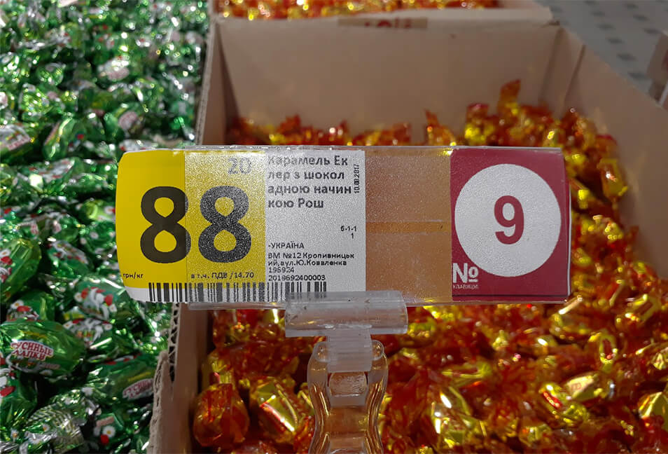
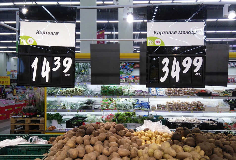
  • smaller – food racks;
  • discount ones.

We have also drawn up standards for their design.

Employees' uniforms

Design
uniforms

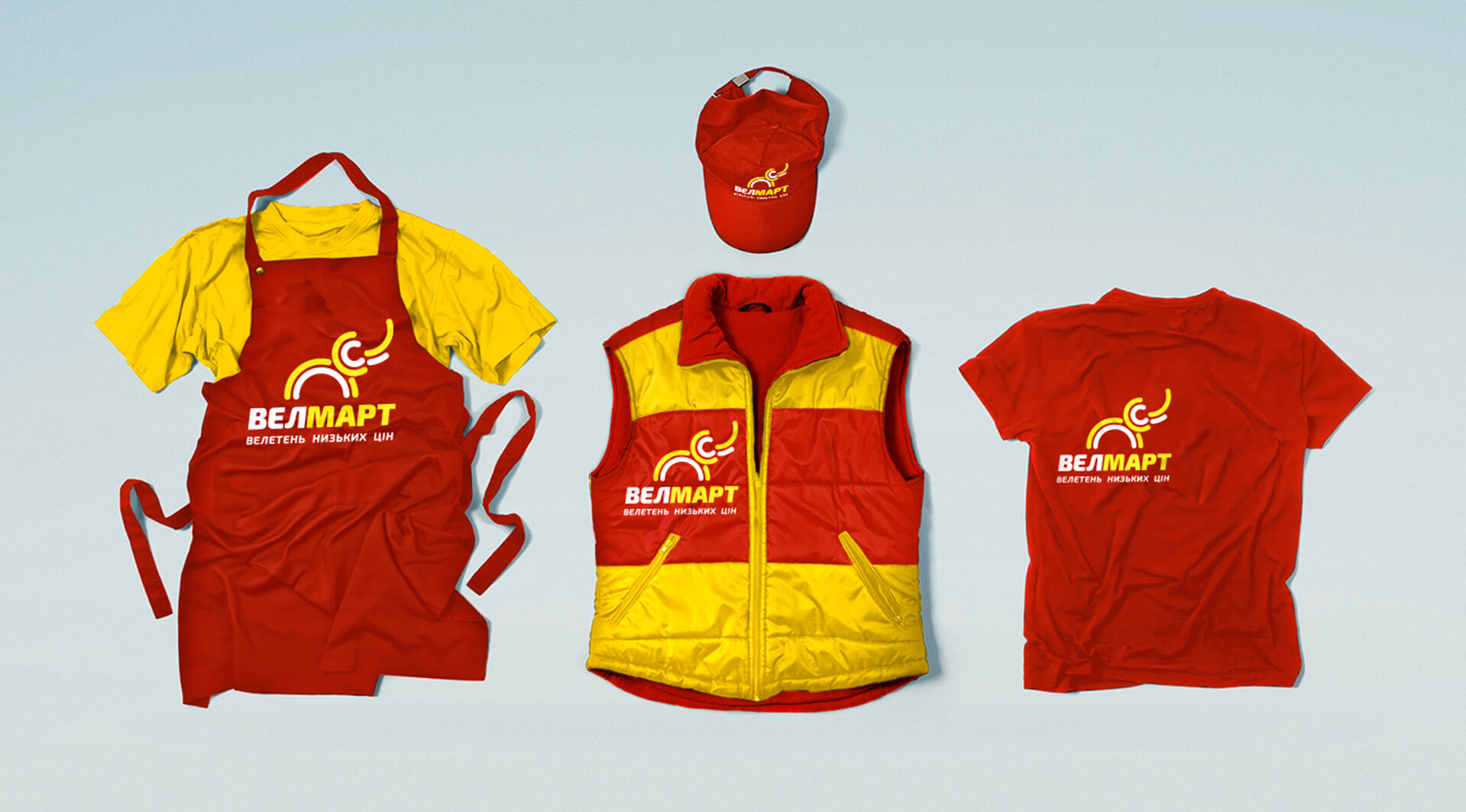
The corporate style is repeated in the uniforms of employees. Standards have been developed on how to design uniforms for different seasons. Employees wear T-shirts, aprons and waistcoats in the appropriate colours.

STM

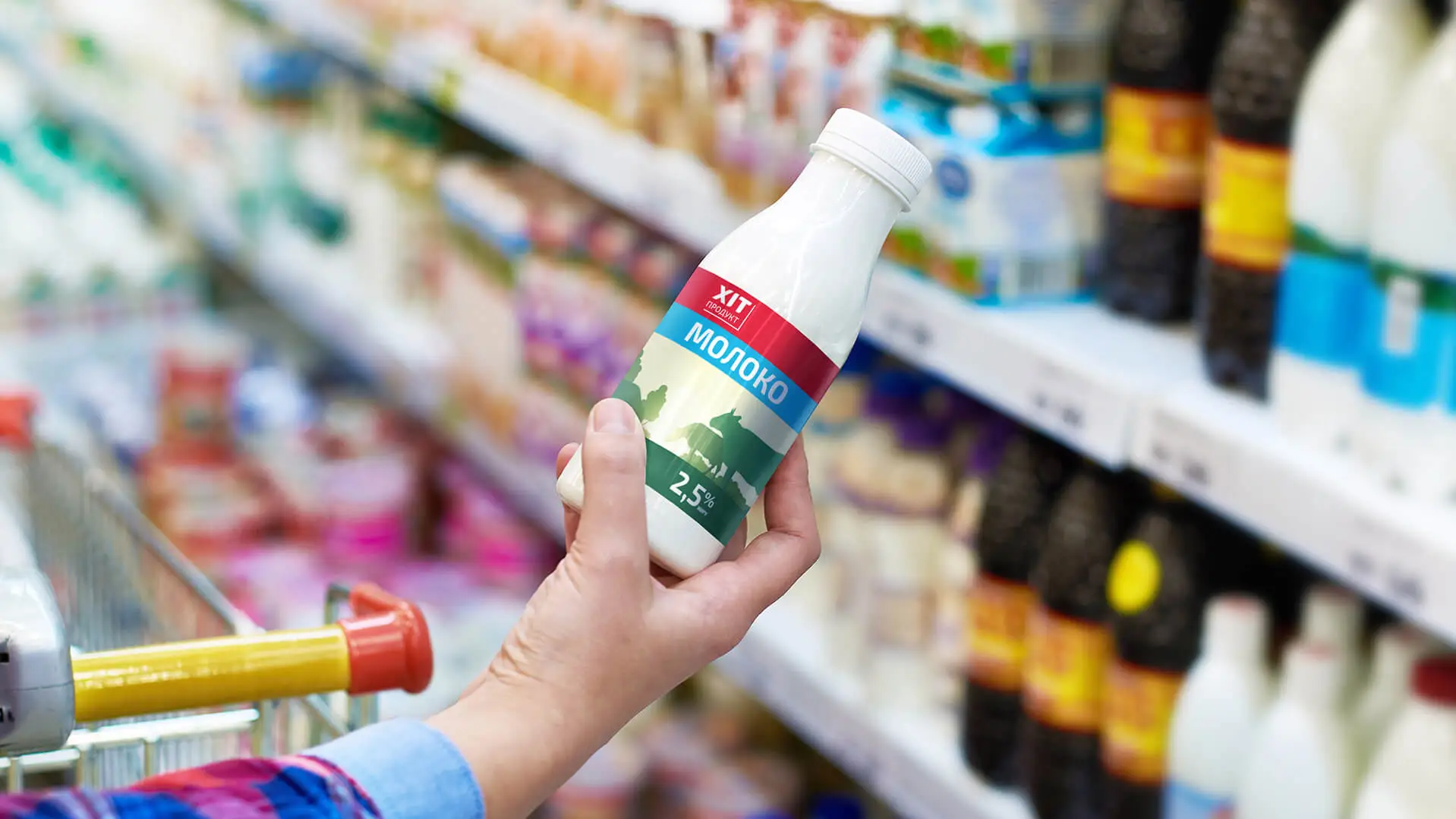
Labels of goods produced by the Velmart chain under its brands “Hit Product” and “1” are also designed according to company standards.

Velmart

Cashiers' call scripts

Instructions-scripts
for communicating with
customers

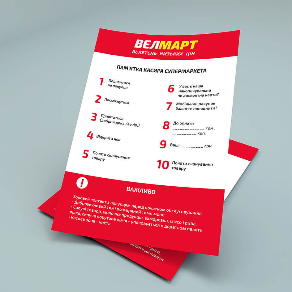
The company’s style can also be seen in the way it communicates with its employees. We have created guidelines for the chain’s employees who interact with customers in one way or another.

Internet promotion

Graphics and standards
for the online space

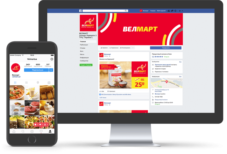
Internet promotion has its own peculiarities. We have created templates for websites, hats and social media logos, and added standards to them by which they should be applied.

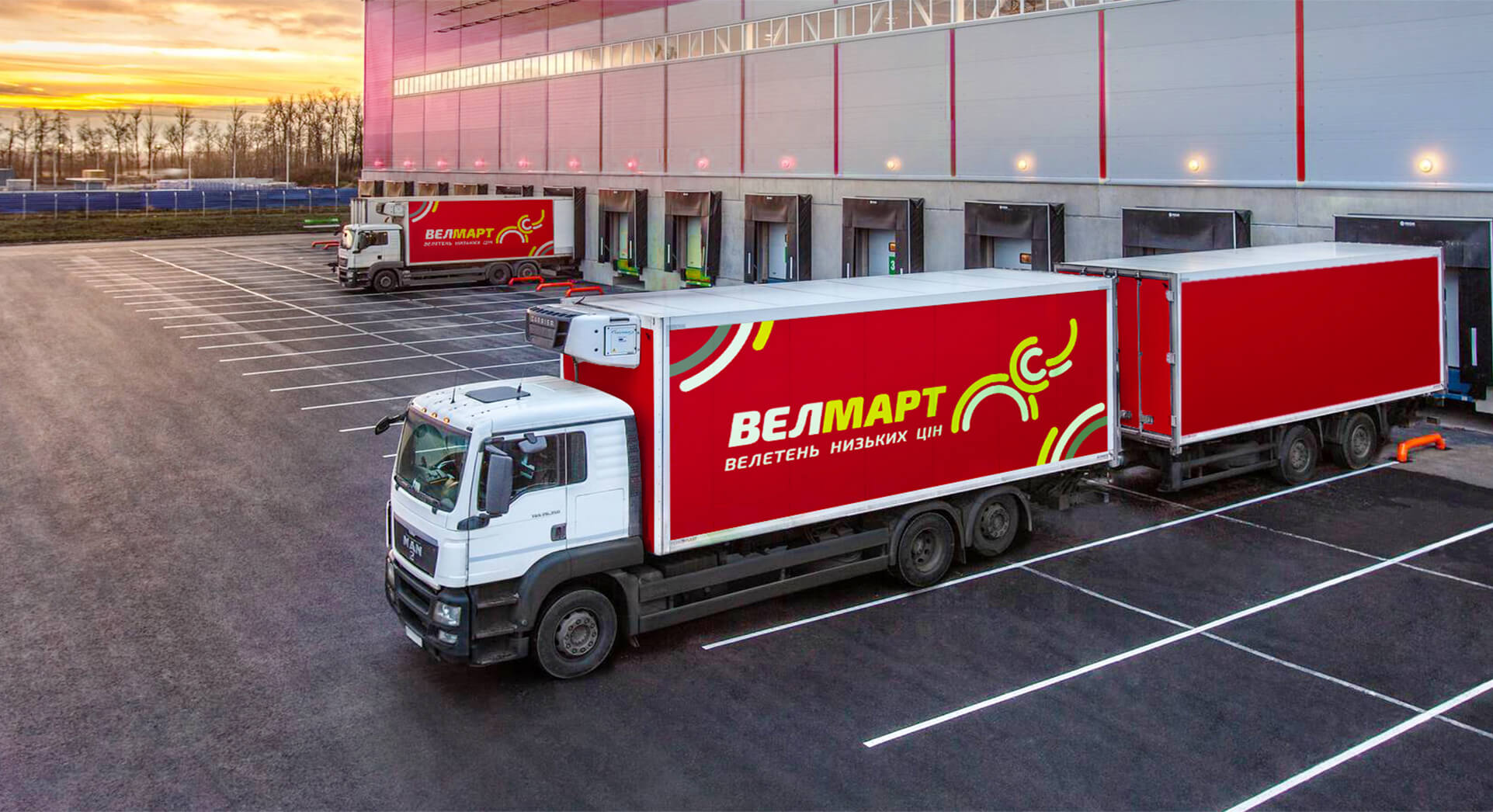
Transport

Result

A new brand looks fresh, attracts attention, creates an atmosphere of cosiness, trust and high activity. To ensure that the corporate style was preserved without distortion, we created a brandbook, a guideline and a book with merchandising standards. All the documents were handed over to the client.

Click to rate this post!
Voted: 0

Did you like the work? Leave your vote:)

Discuss Your Project

Developing the Work Plan

Pricing and Timelines