In spring 2017, we were approached by Terra LLP, one of the largest breeding cattle reproducers in Kazakhstan. The company planned to introduce its product line to the retail market of Kazakhstan and neighbouring countries. In order to make a bright statement about itself, the company together with the branding agency KOLORO undertook to develop a corporate identity and create a new design of the line of meat products.
Our goal was: to launch our own strong brands for further introduction to the domestic and foreign market, as well as to develop the design of packaging and labels for meat products.
Translated with www.DeepL.com/Translator (free version)
MARKET ANALYSIS
Before starting to create positioning and visual concepts, our marketers conducted in-depth desk research, from which we learnt that:
Beef is one of the most popular types of meat in Kazakhstan. The country ranks ninth in the world in terms of its consumption.
The key trend in the Kazakhstani market is rising veal prices and a shortage of meat on the market. At the same time, the country exports abroad, mainly to Russia, and is seeking to enter the Chinese market.
Demand for premium marbled beef is growing in Russia, with local companies unable to cover it on their own.
The main trends in the design of premium meat packaging are: minimalism, invented
NAMING DEVELOPMENT
Naming objective: to reflect the premium and exclusivity of the product.
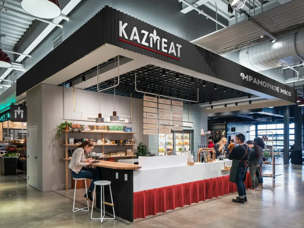
Word form: Kaz (truncated from Kazakhstan) + meat.
The name sounds catchy, memorable and has a reference to the country of the producer, which exactly distinguishes the brand from its competitors abroad.
CORPORATE IDENTITY DEVELOPMENT
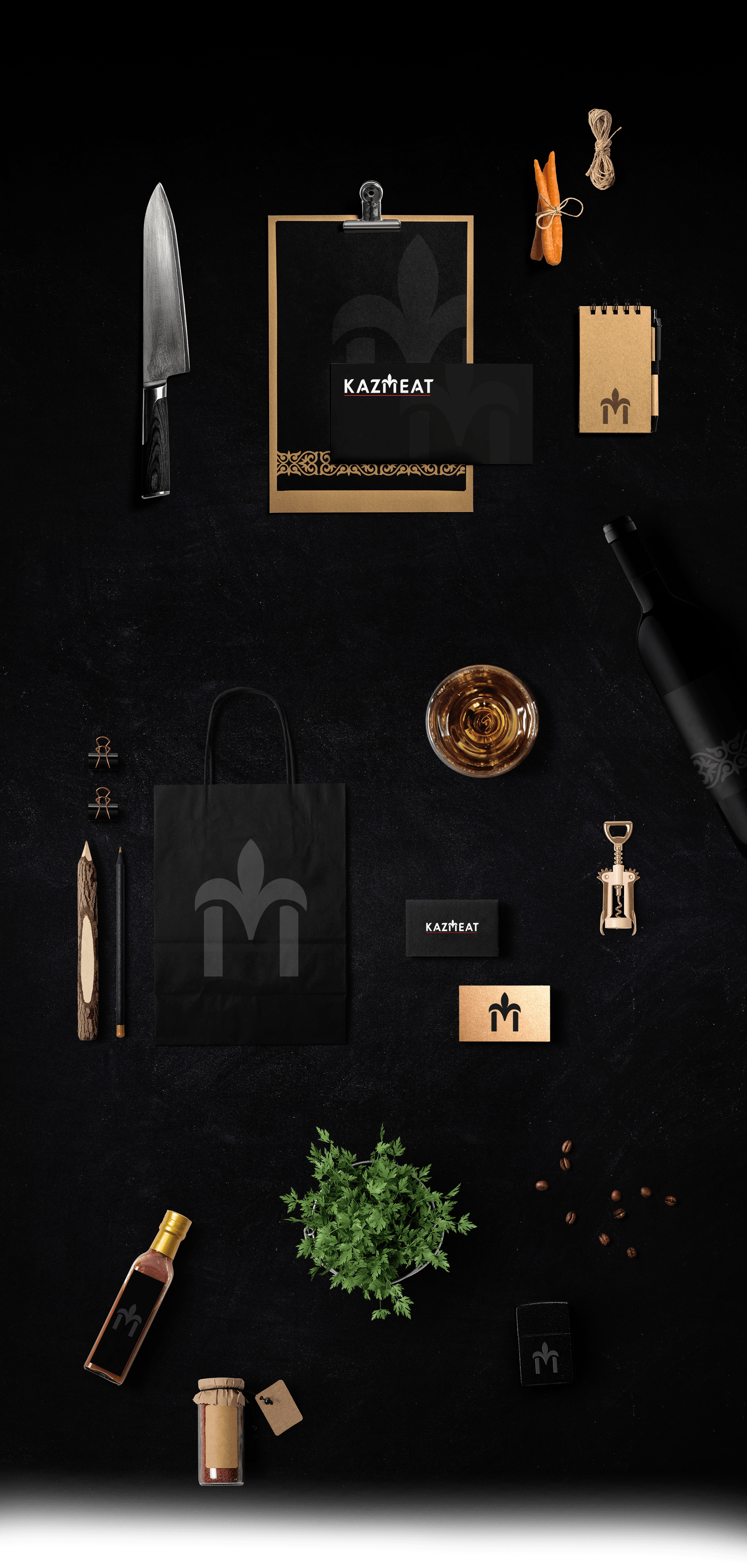
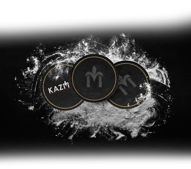
Our designers were tasked with developing a unified logo for the holding and distinctive features for its 4 subsidiaries. The complexity of the task was that the logo had to simultaneously present the four vectors of the holding: cultivation and processing of grain crops, pedigree breeding and cattle breeding.
PACKAGING DEVELOPMENT
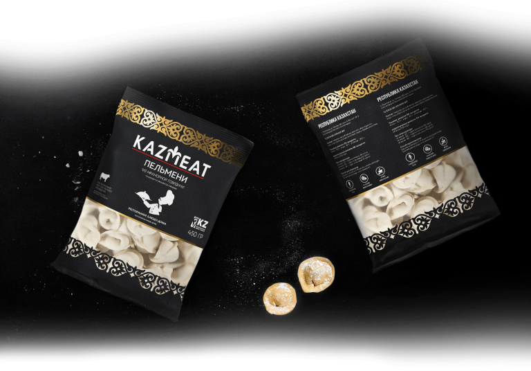
In the final stage of packaging development, the “National” concept won. When creating it, we took into account the following parameters:
presentable appearance of the packaging, as the brand is positioned as a premium segment brand and is export orientated;
the combination of gold and silver in the national ornament, which speaks of
the status of the product and visually refers to its origin;
a well-positioned viewing window that allows a full assessment of the contents of the package;
the presence of a product image on the front of the packaging.