The backstory behind the creation of the coffee brand

KOLORO was approached by a Ukrainian entrepreneur who had decided to launch coffee on the market. His unique selling proposition was craft equipment for roasting beans. The task was to create a brand from scratch. It required naming the coffee, creating the packaging design, developing the positioning of the coffee brand.

Analysing the Ukrainian coffee market

From the research conducted by KOLORO analysts we found out the packaging of competitors’ brands, assortment line.

One of the insights was the information that consumers prefer honest weight of goods, round figures: 500 or 1000 grams.
Advertising campaigns of coffee brands are aimed at playing up the vigour or pleasure that the beverage gives.
Premium segment producers often choose minimalistic packaging design.
The most common images on the packaging are of coffee cups and beans.

Building a market entry strategy

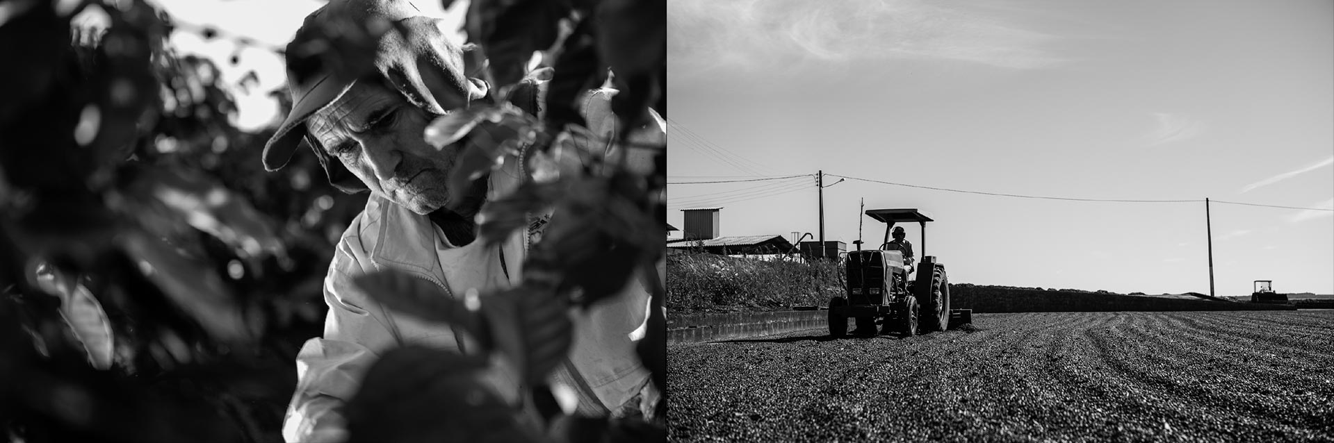
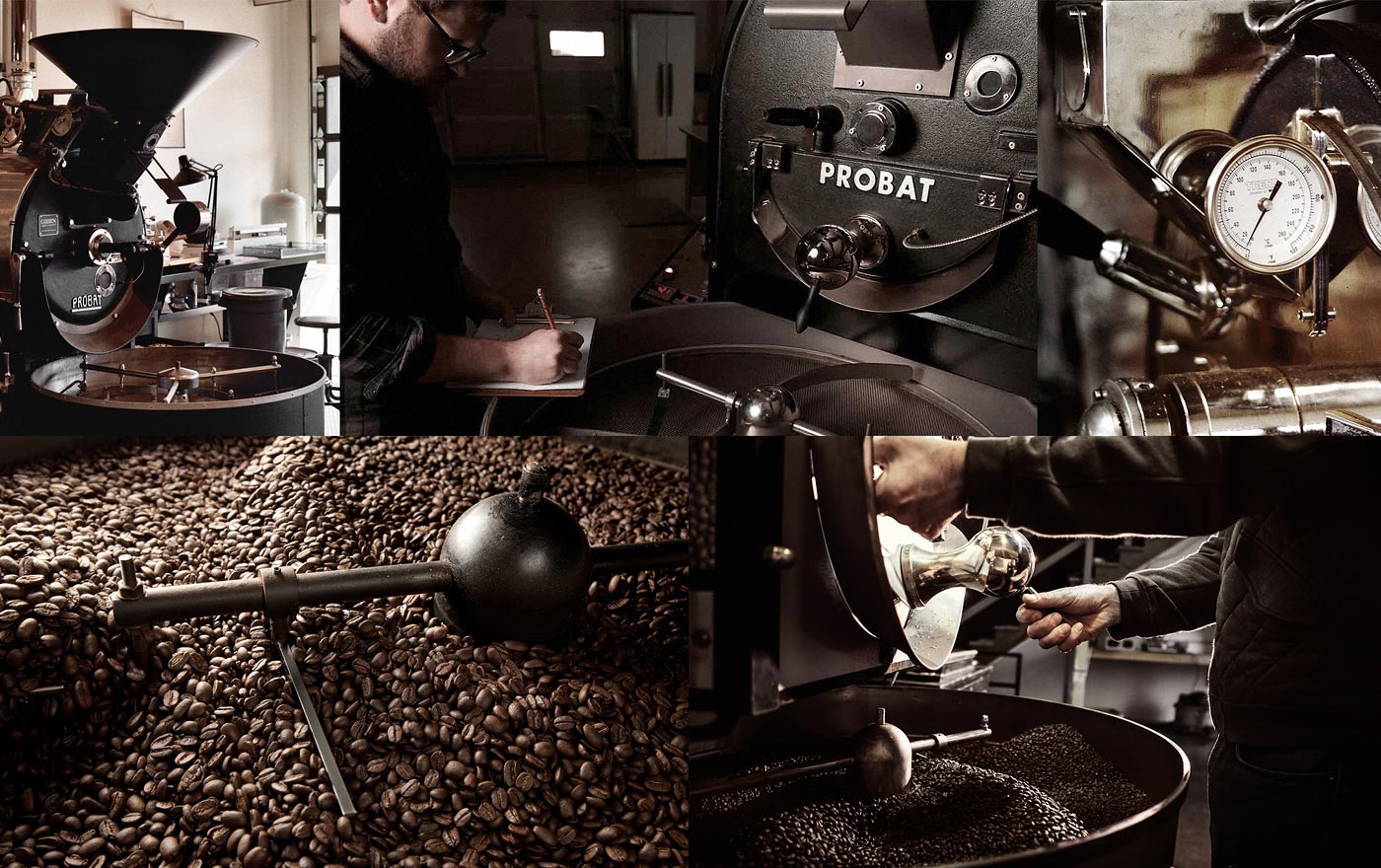
We planned to sell the new product in medium and large retail. We decided to base our positioning on craft equipment and old-fashioned methods of hand-roasting coffee.

Naming for coffee

Brainstorming

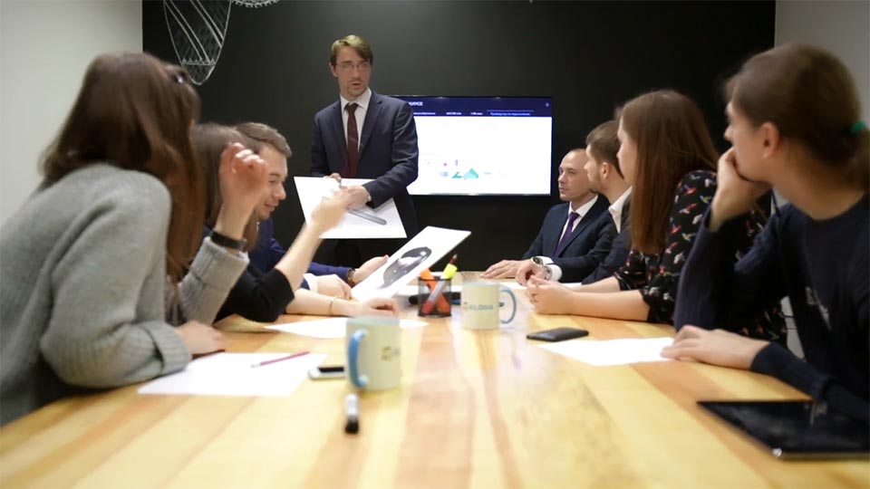
Naming started with collecting an associative range. We once again reviewed the research data, studied competitors’ communication and highlighted the themes and terms that CA associates with coffee:

  • morning;
  • aroma;
  • awakening;
  • vigour;
  • Paris;
  • street cafes;
  • warmth;
  • care;
  • cigarettes.

This associative series became the starting point for the naming.

Coffee naming: the initial stage

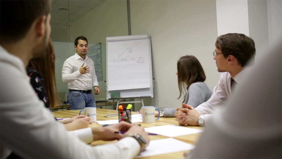
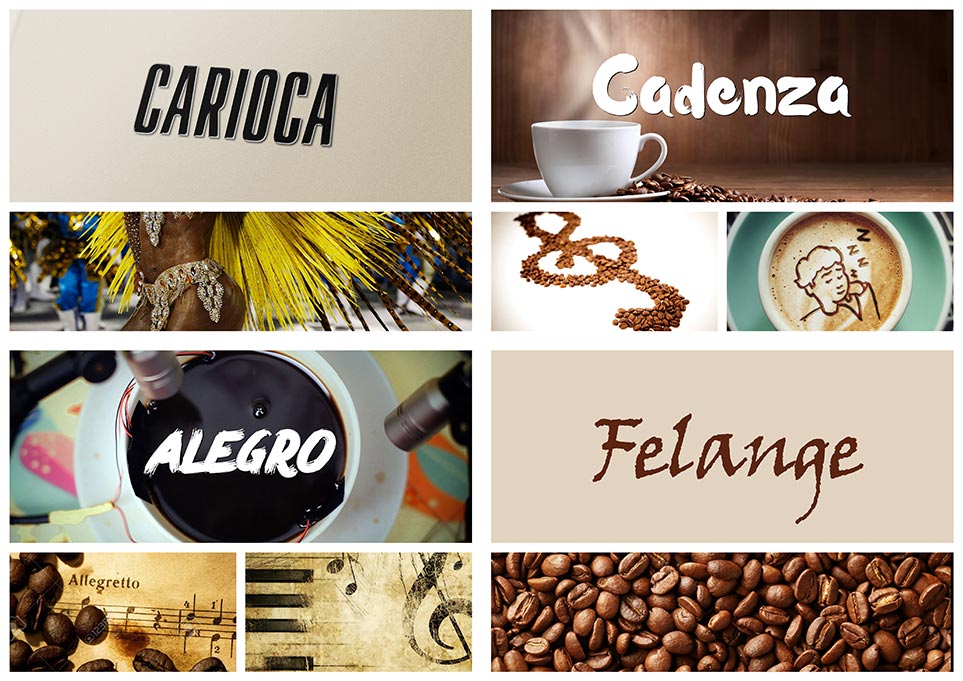
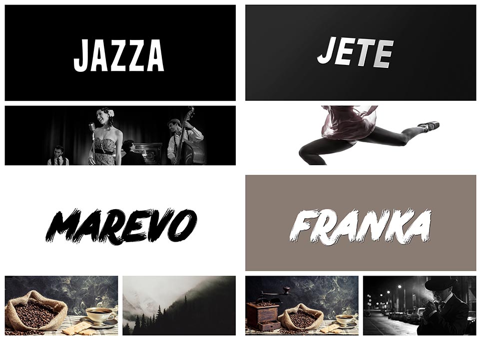
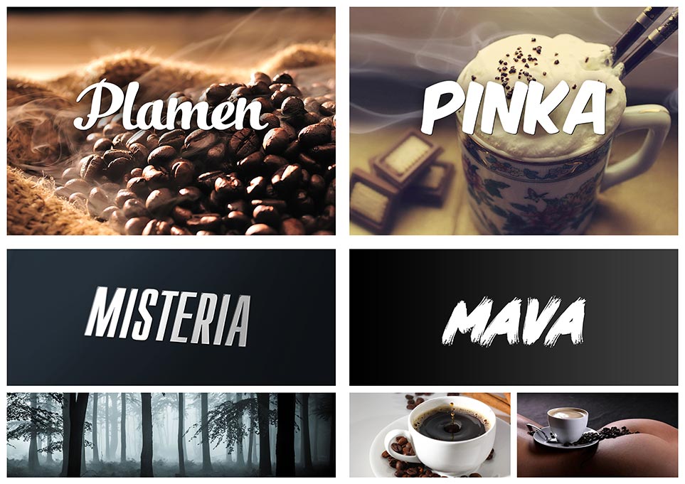
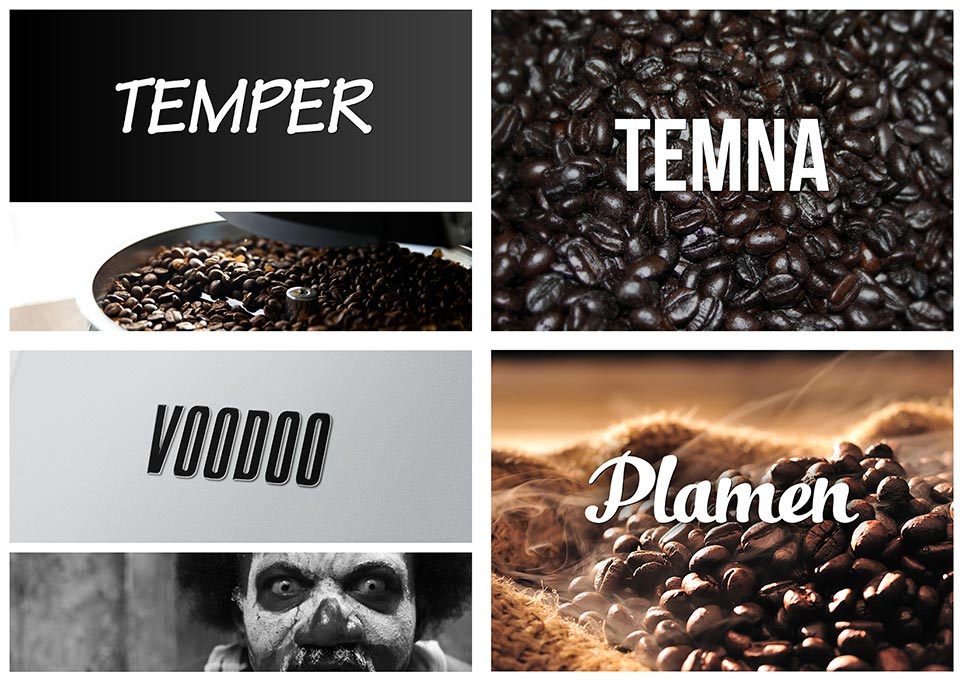
Naming in KOLORO always takes place in 2 stages. At each stage we present to the client 10 variants of names, which are selected from a cohort of 300-500 variants. Among the selected variants, 3 name directions were presented:

related to the premium origin of the product;
Ukrainian dialectisms and obsolete words;
names associated with the place of origin of coffee beans – the territories of South America and the central part of Africa.

Testing on CA

We check the selected variants for uniqueness, sound and associative range. The ToR stated that the customer’s immediate plans included exporting the goods to neighbouring countries. The start was planned from Moldova.
We are testing the names on the target audience. The name MAVA, as well as other presented variants, showed a high level of memorability, and the associations with it were positive.

Presentation

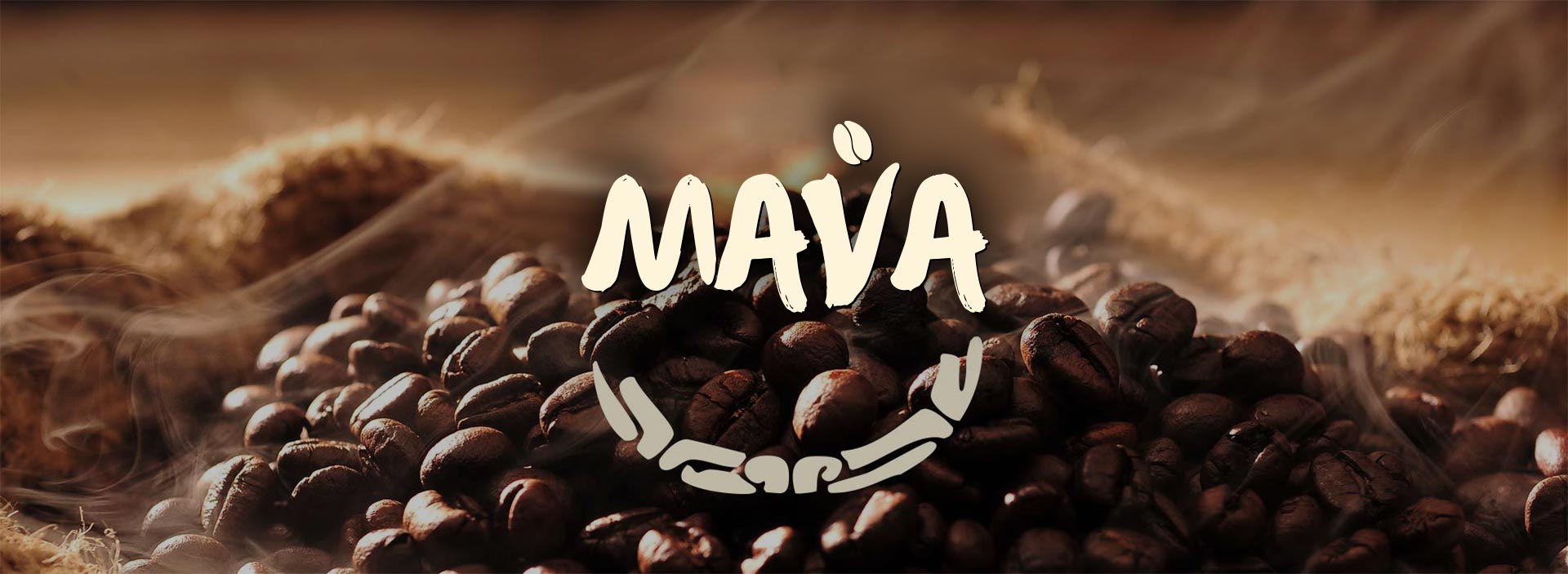
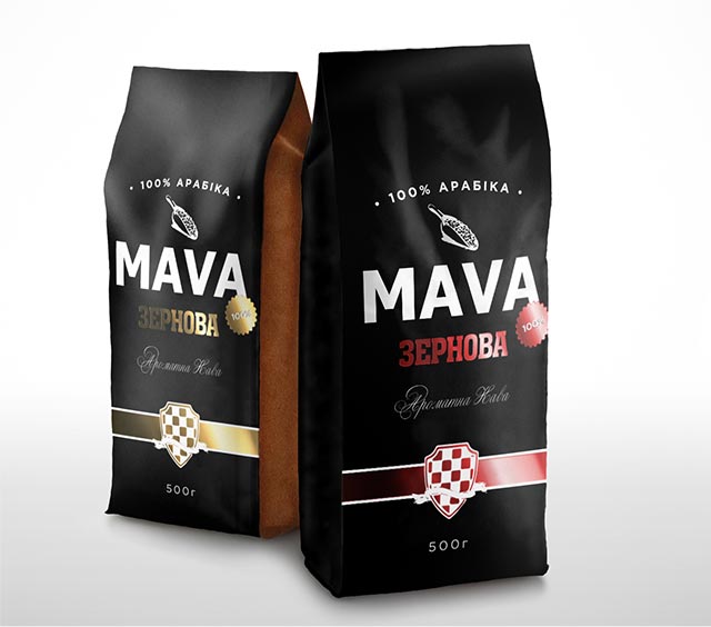
At the presentation stage, the client chose MAVA. In addition to the advantages described above, he liked the brevity of the name and the simplicity of its lettering.

Advantages of the chosen name

The name carries two messages, each of which is read by a different part of the target audience. One segment of the target audience reads in the name the Ukrainian origin of the brand. The second segment saw in the name the root “to beckon” and the word “mania”. This idea is partially reflected in the packaging design, but this is discussed below.
KOLORO provides naming services. Contact us and tell us about your project. Our specialists will do the rest.

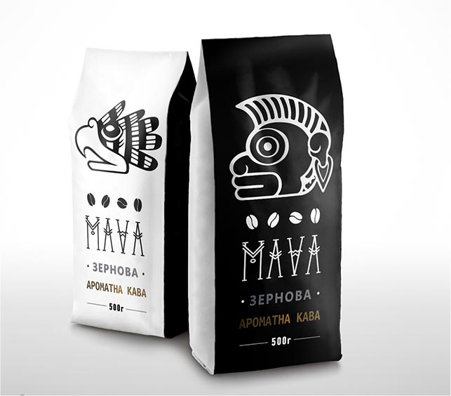
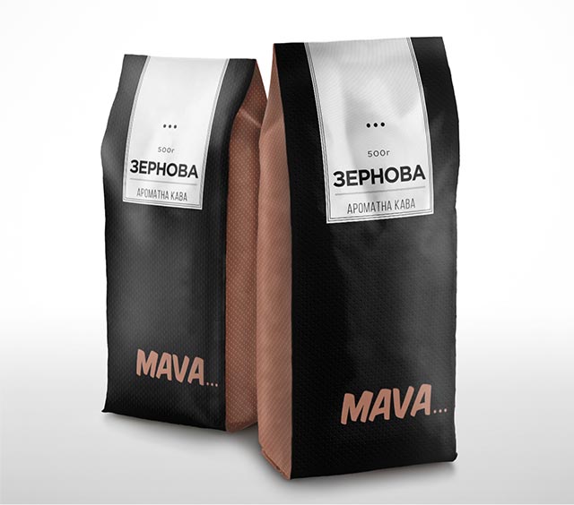
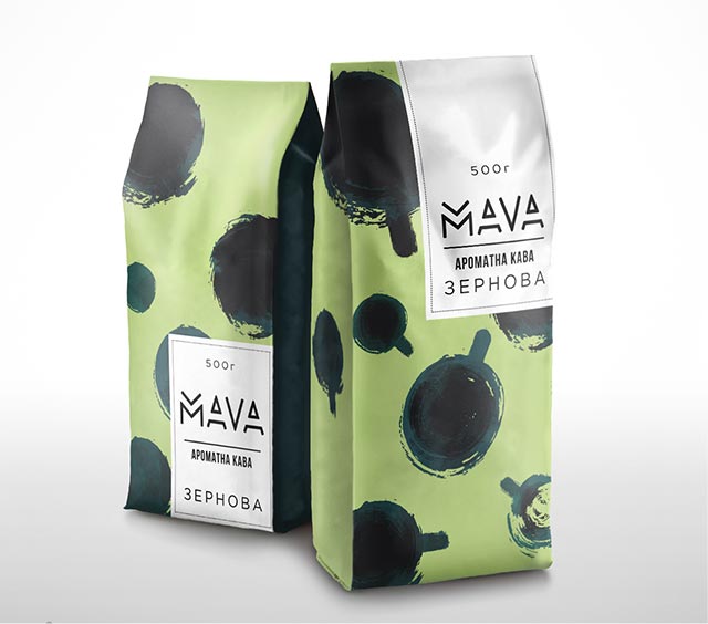
Coffee pack design options

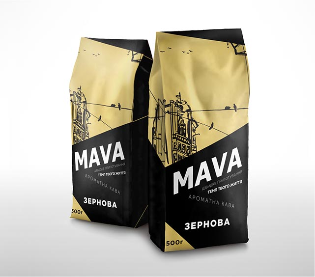
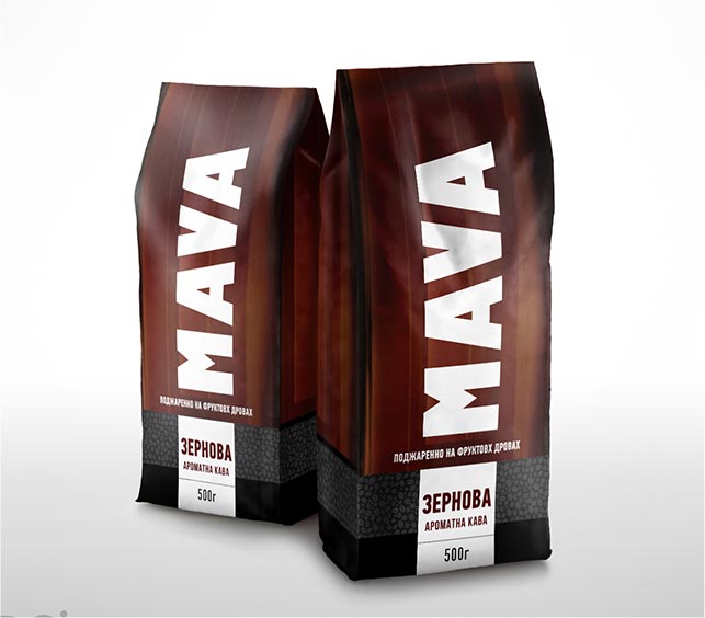
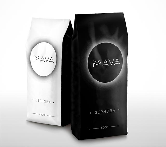
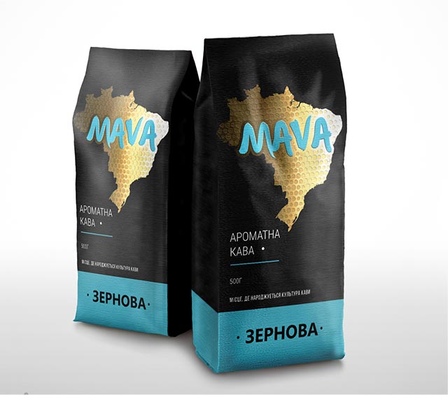
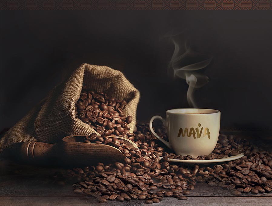
The packaging design had to reveal the name, to complete the image we created at the naming stage. The main goal was to get away from the formulaic associations with cups of coffee, scattered beans and clouds of steam.

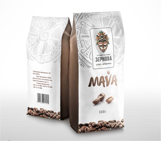
Coffee packaging design

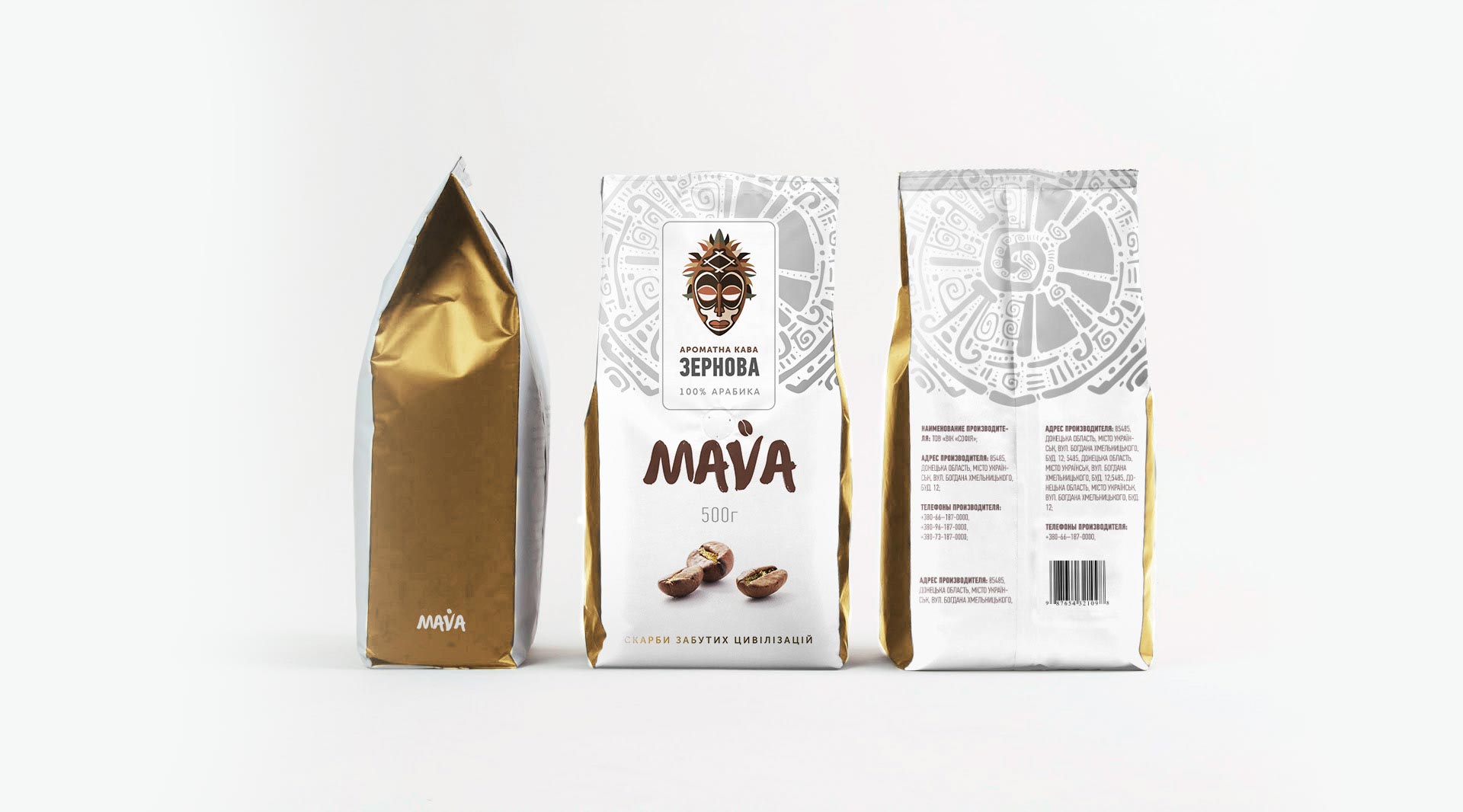
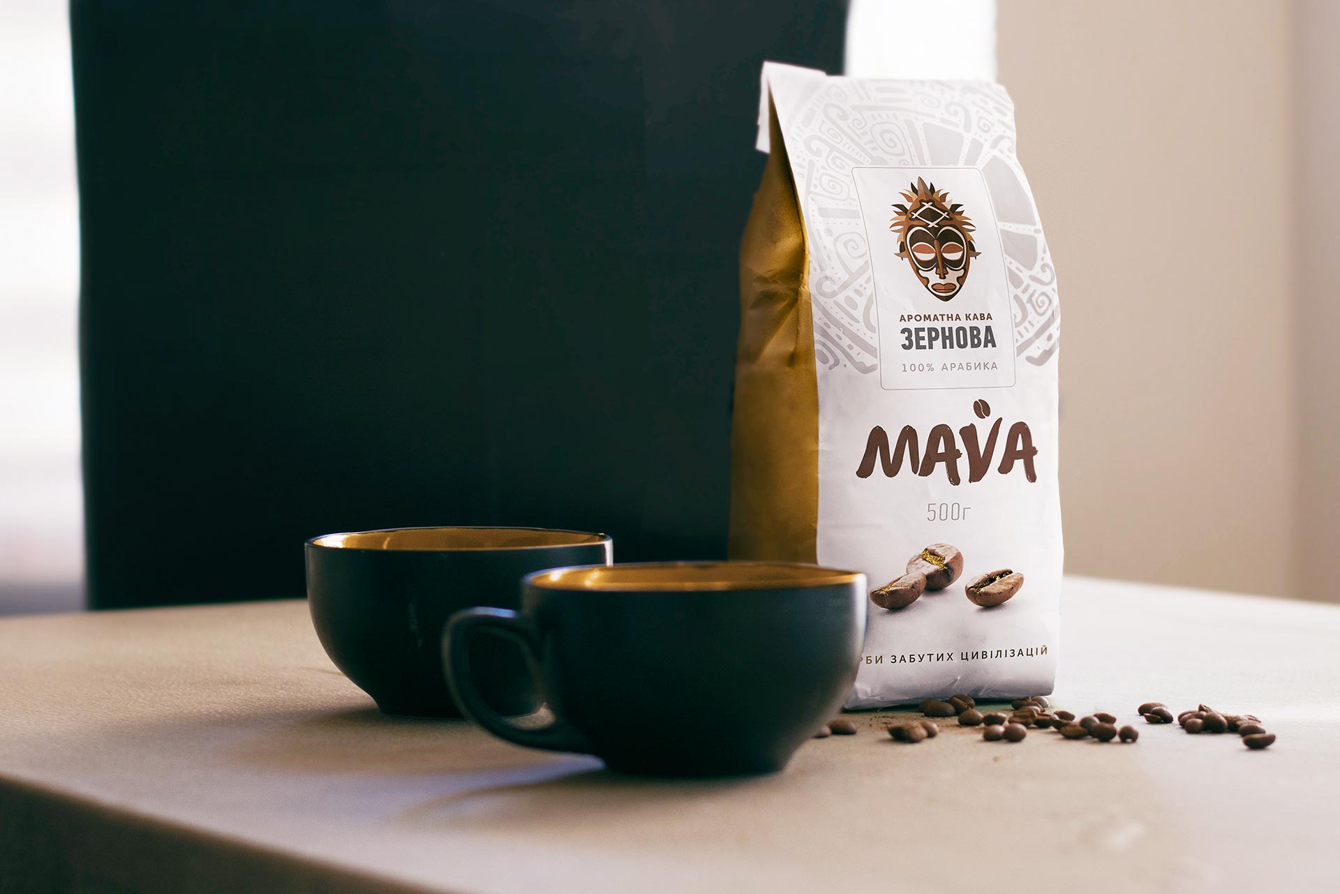
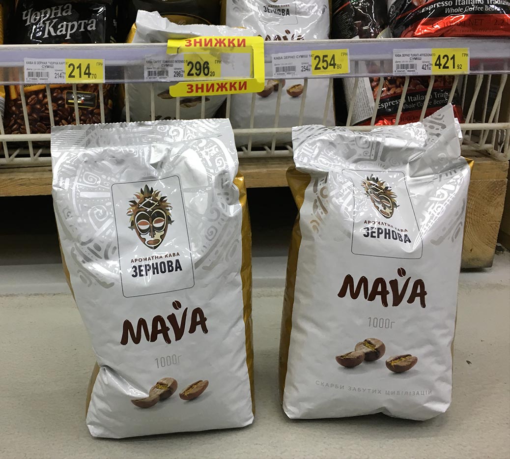
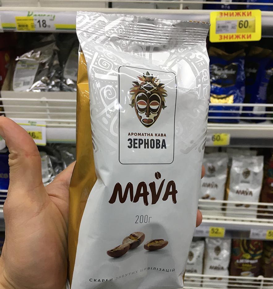
The client chose the concept “Values”. The packaging consists of 2 main colours: white and gold. In the upper part there is a silver pattern inspired by the cultural heritage of ancient civilisations of Latin America.

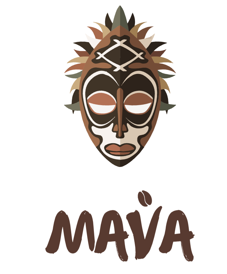
In the centre of the top of the packaging is a flat illustration of a ritual mask, an identifying element. The logo is depicted in the centre and a soft font is chosen for it.

You can order the development of packaging design, logo and fonts in the branding agency KOLORO. Write to the manager in the contact window and he will send you a commercial offer.


Creating a UTP for a coffee brand

UTP is based on the origin of coffee beans – plantations in South America and a special method of manual roasting, which is possible due to the availability of special equipment and the application of methods of European coffee masters of the 20th century.

Developing reinforcing texts

The slogan of the brand is the phrase “Scarbies of forgotten civilisations”. We use it on the packaging and offer to promote it as an advertising slogan.

Creation of the packaging cut-out

We have prepared 2 cuts, for 500 and 1000 gram packs. The material is metallised propylene. The surface of the coffee packaging is matte, with semi-matte metallised inserts.

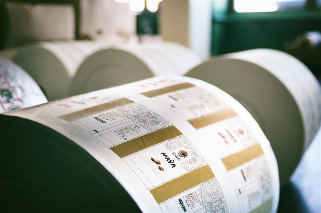
Pre-press preparation of packaging for gravure printing

The gravure printing method allows us to create high-definition images. Thanks to this method, all the colours we have chosen for the packaging are perfectly reflected on the packs.

Author's supervision of packaging production

Every such project is supervised by a dedicated project manager from the receipt of the order to the production of the first batch of packs. He supervises the printing of the batch, can react quickly and liaise with the technologists during the process to ensure that everything goes smoothly.

MAVA is one of dozens of realised KOLORO projects, which you can already find on supermarket shelves, in cafes and restaurants. Read about other successful projects in the portfolio section.

Click to rate this post!
Voted: 0

Did you like the work? Leave your vote:)

DID THIS PROJECT MAKE YOU WANT TO WORK WITH US?

Discuss Your Project

Developing the Work Plan

Pricing and Timelines