Creation of corporate style
for the restaurant L'OMBRE
logo
2017
Background
America is the land of opportunity. But how many people decide to try their luck in the USA? KOLORO was approached by a client who decided to open a restaurant in Myrtle Beach (South Carolina, USA). He had found investment for the project and needed to develop a corporate identity for the future establishment.
Objectives set by the client
Conducting market research on Mertle Beach restaurants, cafes and bars, analysing the market and competitors;
Development of a brand style and presentation of 20 variants of names for the future restaurant with different positioning, based on the collected analyses;
Creation of a logo in 3 variants and development of corporate identity with visualisation on the facade and various media;
Creation of a logo book.
Market Analysis
Market Characteristics
There are over 1,900 restaurants within the county, as well as dinner theatres, nightclubs and 460 hotels. The market is diverse and the flow of tourists is subject to seasonality. Fresh fish and seafood occupy a special place in the menu of establishments and their specialisation. The average cheque in the surveyed area for dinner (without alcohol) is $20-35 per person (middle segment and Cheap meal). In a VIP restaurant the average cheque starts from $60.
Translated with www.DeepL.com/Translator (free version)
Target audience: general data
More than 14 million tourists visit Myrtle Beach each year, with nearly 100,000 coming from Canada, Germany, and the United Kingdom. Myrtle Beach is the second most popular beach in the United States. Restaurant Business Magazine ranks it as the #1 spot in the United States for potential growth.
Also, Myrtle Beach is ranked as one of the top 100 best cities to live in retirement in America, according to Where to Live in Retirement magazine. So in addition to tourists, the target audience for a restaurant in Myrtle Beach will be retirees who have moved here to live.
Translated with www.DeepL.com/Translator (free version)
Naming
Keywords: warmth, harvest, naturalness, vases, garden, blooming, care, glass, stained glass, home cooking.
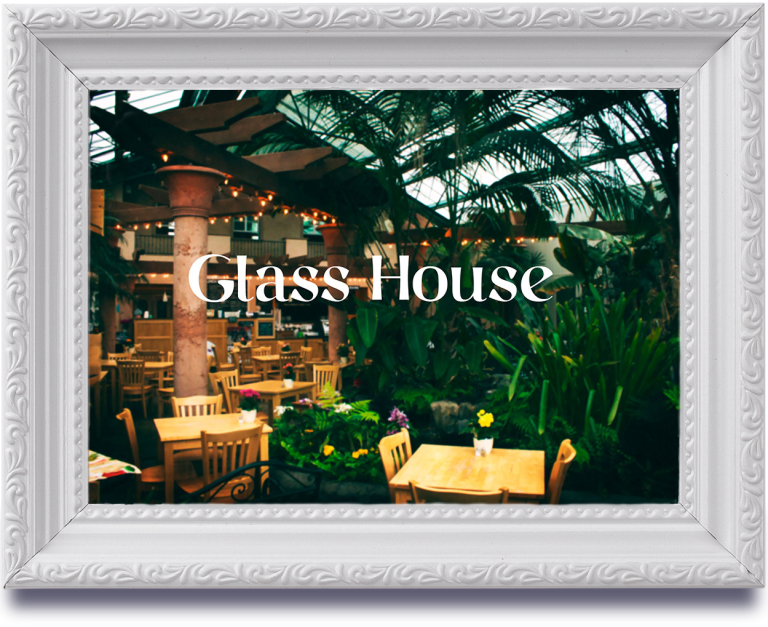
Glass House is a restaurant where all the vegetables are home-grown. A lot of glass in the interior. Simple but comfortable furniture. The presence of a terrace.
Keywords: warmth, harvest, naturalness, vases, garden, blooming, care, glass, stained glass, home cooking.
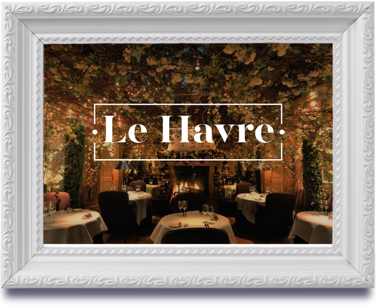
Le Havre is a journey from Myrtle Beach to France: a French port a stone’s throw away (the waves in the background of the second photo are not a trite nautical pattern, nor is the crab in the 3rd photo). A haven for those tired of holidaying. An island of tranquility inside a resort town. Take a break from your holiday, forget about everything, just sit down and eat.
Keywords: shade, rest, relaxation, lounge, in the shade, terrace, respite, pause, transition, degrade, ombré.
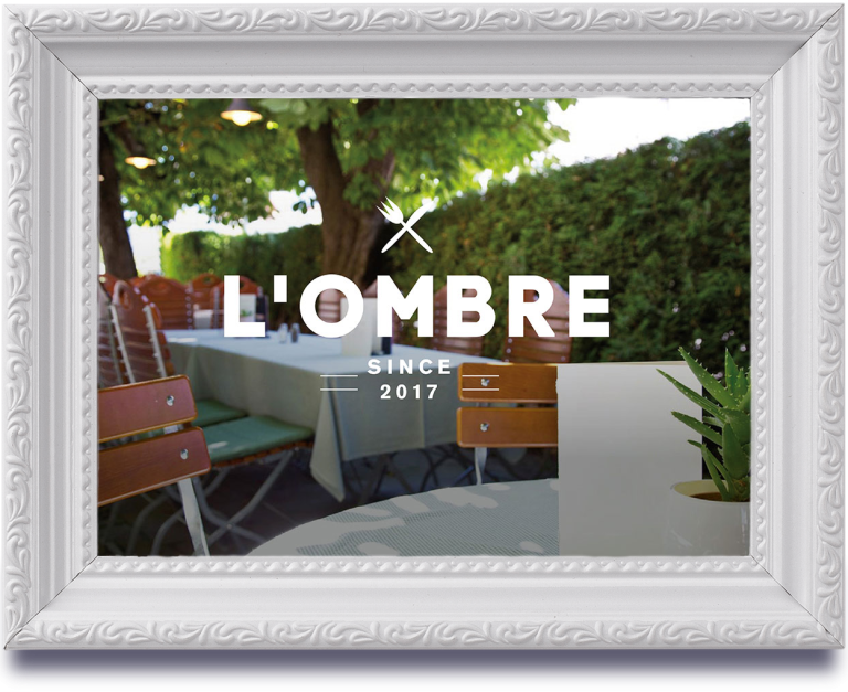
L’Ombre (literal translation: “In the Shadow”). Feelings of calm, weightlessness, coolness, relaxation. You can serve some refreshing water with spices (or even with lavender, there are recipes with its addition) as a UTP. Lots of soft furniture and bedding for the wooden chairs that are placed outside.
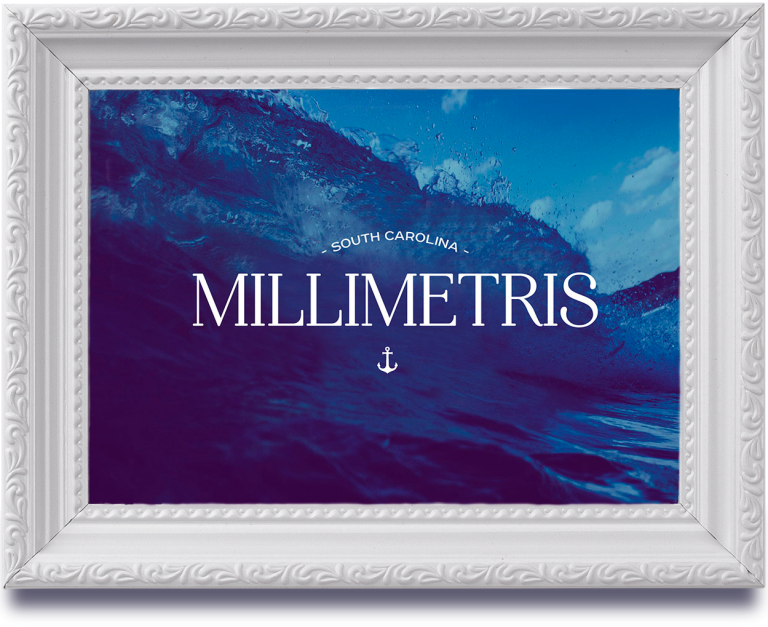
Keywords: trident, sea, ocean, Poseidon, water, foam, sand, crest, nets, fish, shells, ships. Millimetris is a place where you can immerse yourself in a nautical theme. The atmosphere of the seabed, different shades of blue colour in the interior.
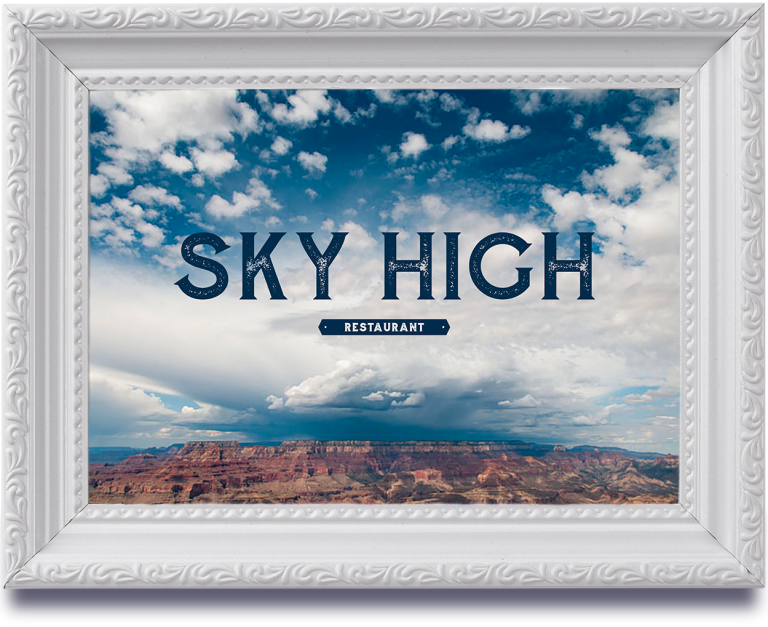
Keywords: height, flight, freedom, clouds, birds, joy, serenity, sun, inspiration, stars, purity, aspiration, depth.
The main idea is minimalism in details and a sense of freedom. Nothing superfluous but delicious food and a state of serenity.
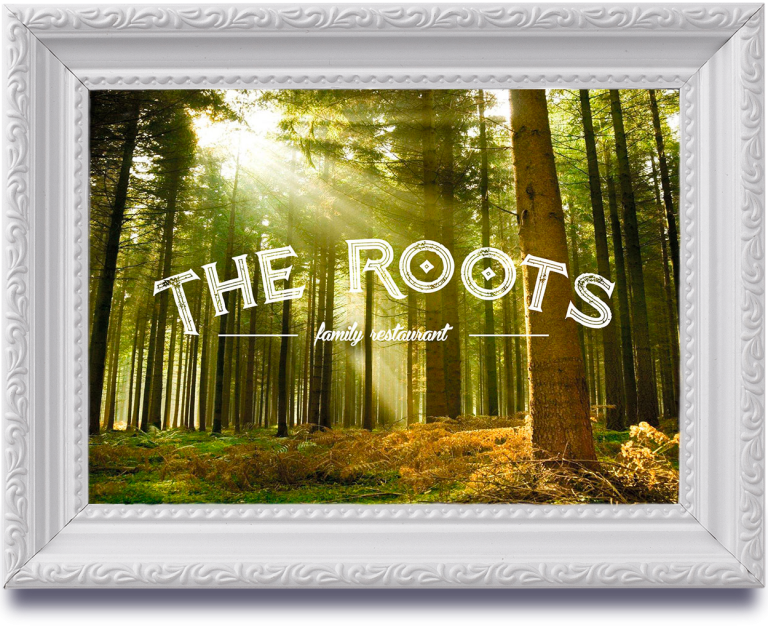
Keywords: source, history, roots, era, ancestors, forest, tradition, foundation, kinship, memory, family, parents. This is a beautiful and good facility, suitable for the whole family. When decorating the halls, it is possible to take as a reference point any epoch in the history of the USA.
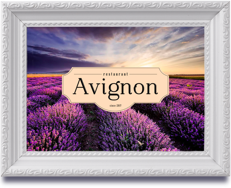
Keywords: France, Provence, grapes, south, lightness, elegance, flowers, herbs, lavender, ceramics, coast. The atmosphere of the azure coast and French countryside, which visitors feel immediately from the entrance to the institution
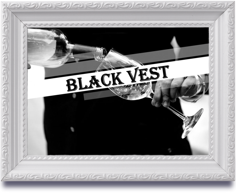
Keywords: respectability, importance, service, style, prestige, quality, elegance, aesthetics, image, perfectionism. A top class establishment. Strict dress code of waiters and service staff – suit trousers, white shirt and black waistcoat. Table linen and crockery are made to order. Strict but expensive style in decoration.
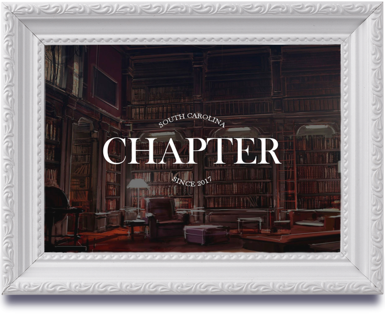
Keywords: literature, history, part, book, beginning new, library, novel, plot, hero, scenario, play, narrative, adventure.
Chapter is a place that holds a whole host of stories and mysteries.
Argumentation of the chosen option
Argumentation of the selected optionIt also showed high recognisability in a focus group test of Americans. It was read in a variety of ways, but the associative range was overwhelmingly positive.
The main advantage of this variant is its multiple meanings. By choosing it, we had the opportunity to build several positioning variants: ghostly, transition, and shadow.
From a psycholinguistic point of view, “l’Ombre” won out over the other names, as it is not associated with the feminine gender, but only with the middle gender (for those who read “ombre”) and the masculine gender (for those who read “l’ombre”). The domain we needed was free, though it should be said that this was the initial condition and all the options presented were free on .com.
Logo development
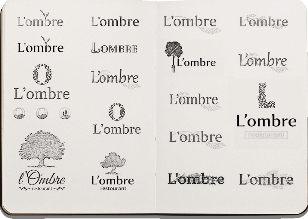
Thumbnails
Working out the concepts
Final version
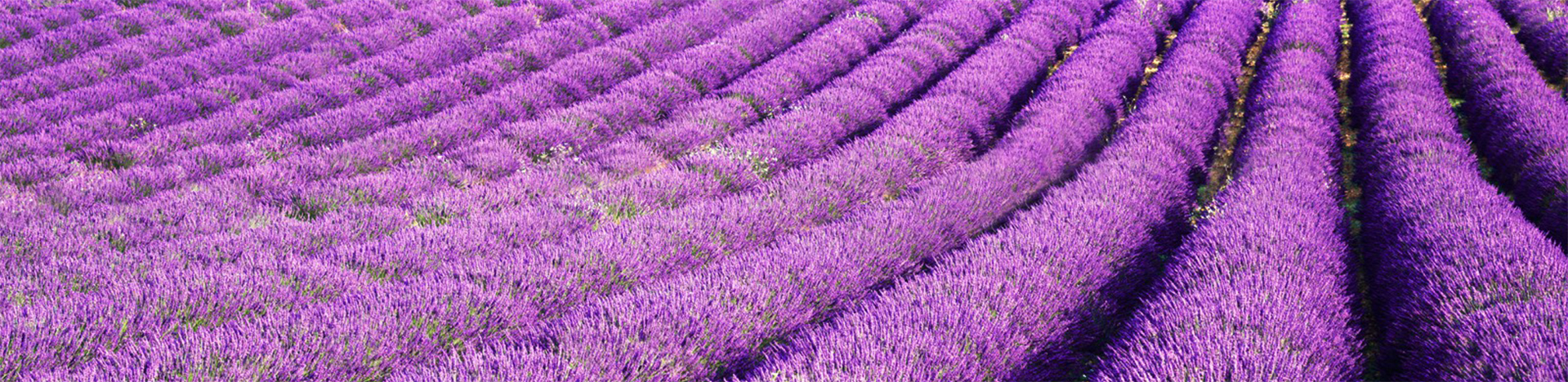
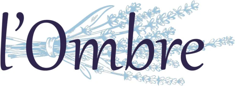
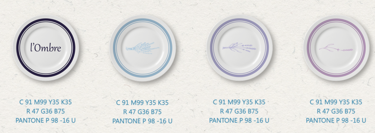
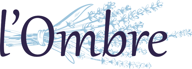
The central element of the lavender logo is the idea of transition, transformation and stadiality. It is revealed with the help of lavender branch, which the designers reflected in 3 variants:
saturated branch;
a branch of medium complexity;
minimal complexity and saturation.
The lavender logo successfully reveals and complements the idea of the restaurant and the name. Lavender is a symbol of Provence, together with the French name it complements the brand positioning – sophistication, refinement, elitism.
You can create a corporate style of the restaurant in KOLORO! Co-operate with experienced agencies to get the expected result.


Protection zone
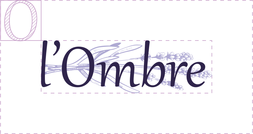
The protection zone is the area around the brand block, which must not contain any other graphic elements, text, layout edges. The size of the protection zone is equal to the abstract module (X). X in this case is equal to the height of the letter “O” in the logo.
Signature colours
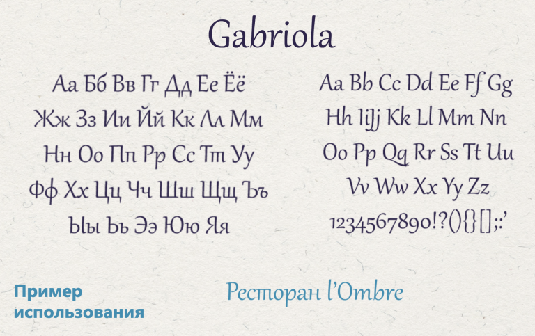
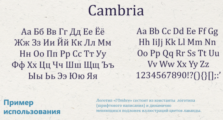
Branded fonts
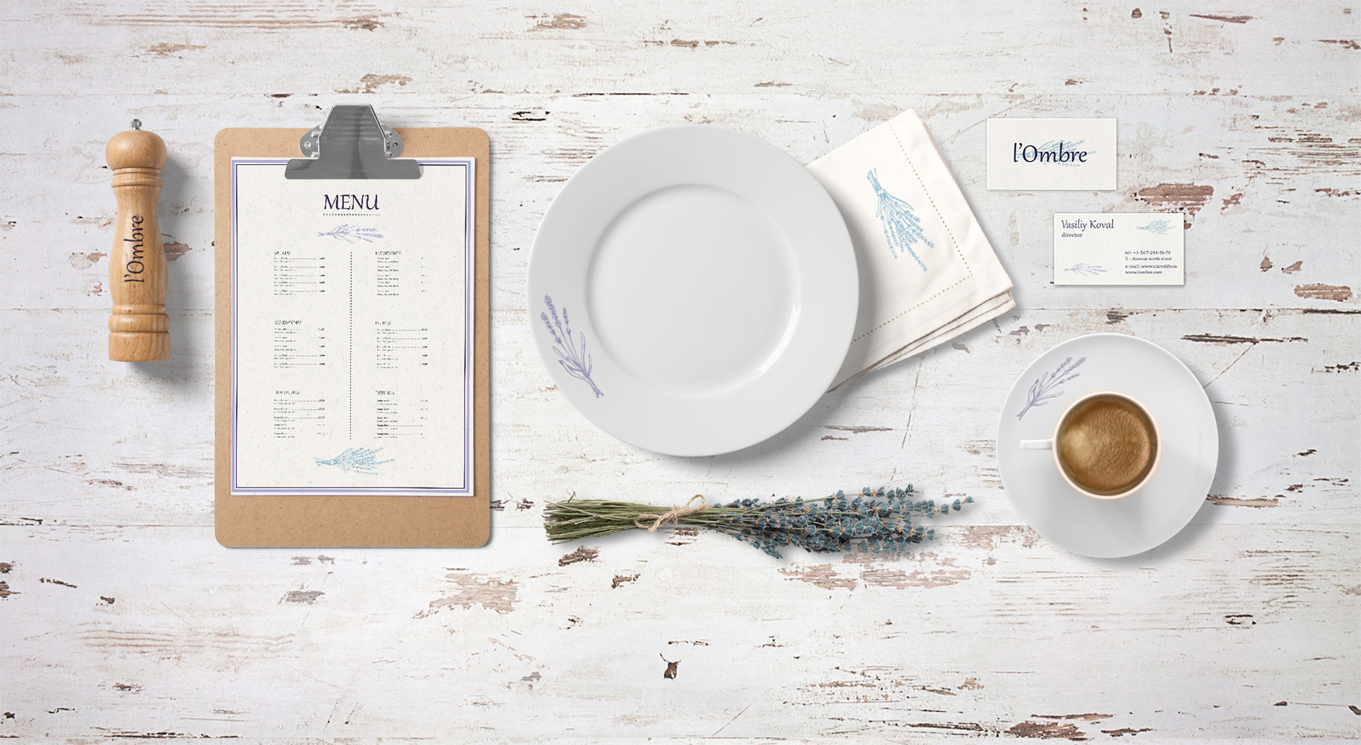
Creating the corporate style of the restaurant
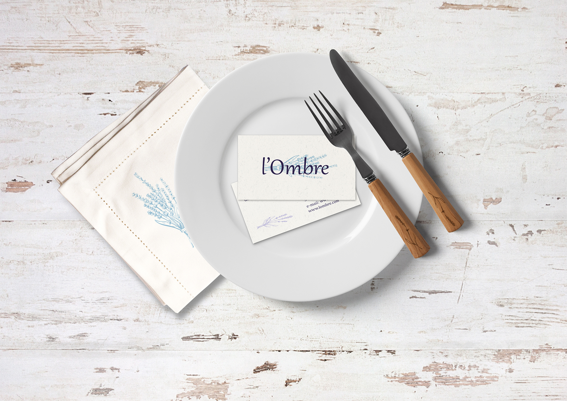
Visualisation of the restaurant logo on branded media