
GRAMMY MIX
"A sound brand name for a rodenticide product."
Project assignment
KOLORO was approached by the head of the marketing department of VISTA LLC with a request to create a new brand for the rodenticide market. So far, the unnamed rodent bait was to become an analogue of the popular “Rat Death” product.
The task was to develop a name for the future umbrella brand that would unite various products for controlling garden pests (moles, aphids, ants, slugs, etc.). Therefore, the name of the new brand should not be directly associated with rodents.
After naming, the packaging for the bait had to be designed. Unlike the name, the packaging had to be unique. Only the logo should unite the umbrella brand. The format of the package is a 200-gram flexible pack. The sales territory is Russia and Ukraine.
Work plan
Analyse the rodenticide market to identify vacant niches and study competitors’ solutions in detail.
Poison naming – 2 stages, presentation of the top ten. Selection of one name.
Packaging design development.More than 100 variants in sketch format and 4 final variants for presentation. Then – selection of the best variant and its finalisation.
Development of the UTP (unique selling proposition) and its display on the packaging.
Phase I. Analysing the market for rodenticide products
Conclusions of the study
The chemical composition of the venom is similar to many other manufacturers. Therefore, our goal was to create additional brand value. The names of existing rodenticide products can be categorised into several categories:
aggressive names that revolve around military terms and personalities;
names that play on the chemical composition of the product;
interesting names that are not directly related to the product.
Such motifs prevail in the packaging design:
screaming colours, playing off the death of insects;
neat design, which mentally refers to white-washed laboratories and researchers.
Many manufacturers use military symbols in the design, for example, drawing a pest in the centre of the sight.
The target audience of the product is men and women from 40-45 years old, residents of the private sector who face rodents all year round, and dacha owners.
Phase II. Development of the name of the rat repellent
«Страж» — простое односложное название, которое легко запоминается и
ассоциируется с надежностью. «Страж» — уверенность в каждом дне, он
не оставит вредителям шансов на выживание. Это название фокус-группа
оценила как надежное и внушающее доверие.
«Страж. Урожай в безопасности.»
Слово «выкуси» — эмоциональное просторечное обращение, которое
употребляется в спорах. Его значение — перебьешься, обойдешься.
Еще один вариант употребления слова — «накося выкуси», что значит
«ничего не получишь», «ничего не выйдет». Опрошенные охарактеризовали
название как юморное и эмоционально окрашенное.
«Выкусите грызуны!»
«Ночной дозор» — название с тройным смыслом. Во-первых, это отсылка
к популярной одноименной серии книг и их экранизации, где силы добра
сражались против сил зла. Во-вторых, оно ассоциируется с надежностью,
и дает уверенность в том, что ночью вредители не побеспокоят хозяйство.
В третьих, словосочетание связано с популярной фразой «ночной дожор»,
которую используют чтобы описать ночные вылазки к холодильнику. Ассоциативно
это накладывается на ночную защиту и говорит потребителю, что мышиный
ночной дожор не пройдет, потому что на страже «Ночной дозор».
Selected name
Among the names we showed the customer was another one. “Rattlesnake mix” is a common phrase used to describe a killer product. It is a vivid name with a clear emotional colouring. Also this name refers to the rattlesnake – a dangerous type of reptiles. The name of the trade mark turned out to be extremely successful: on the one hand it is suitable for any rodenticide product, on the other hand – snakes eat mice, so it reinforces the image of the product.
The customer decided on the latter option, as it is sound and does not contain negative connotations. He rejected the negative and humorous sentiment “Vykusi”, the variant “Guardian” was considered too simple, it is difficult to fill such a name with meaning, and “Night Watch”, although it was free for registration, but could face claims from right holders.
Terms of reference for packaging design
The packaging had to capture the impression of the name. It was necessary to reflect the strength of the drug’s action on the packaging and make it colourful.
The second task was to set ourselves apart from competitors who use bellicose elements and kitschy shouting images.
Since we did not use the names of active substances in the name, we decided to abandon the “laboratory image” in the design.

Phase III. Creating the packaging design
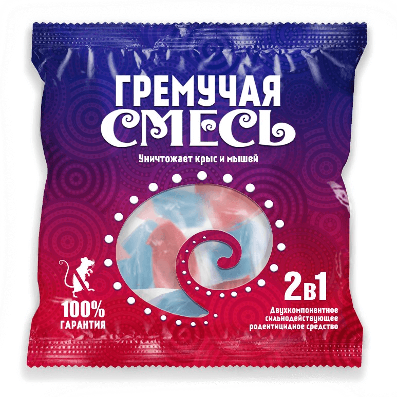
Concept I - "Hypnosis."
The trick of the first concept is a hypnotising gradient. Dark blue gradually flows into violet, which is replaced by bright pink and ends with deep red. The deep shade of blue symbolises calmness, while red symbolises struggle and aggression. These colours did not appear by chance: the form of the product release – red and blue portioned sachets of the substance.
On the left side of the packaging, a mouse is drawn, which is heading towards the bait, as if under hypnosis. In the centre of the packaging we develop this idea using a hypnotic image-pattern. The packaging looks bright and different from competitors’ products, which makes it stand out from the rest!
The concept is based on the following keywords: blending, hypnosis, influence, attraction.
Concept II - Rattlesnake.
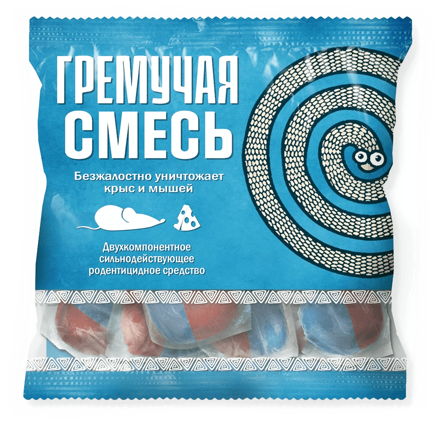
The second concept is laconic. Its peculiarity is the elements that can be seen from afar. The round snake repeats the idea of the previous concept, but interprets it in a different way. The second recognisable element is a text-illustrative block with a bait. For it we chose a stereotypical image of a mouse and cheese and supported it with texts-characteristics of an appetising piece, which is stereotypically attractive to mice.
We also included a viewing window in the packaging cut-out, which demonstrates the product. This allows the consumer to immediately understand what type of poison is in front of him and not to ask unnecessary questions about the form of bait release.
Concept keywords: rattlesnake, waiting, bait, destruction, purification, deliverance, bait, hypnotic circles.
Concept III - "Dead Mouse."
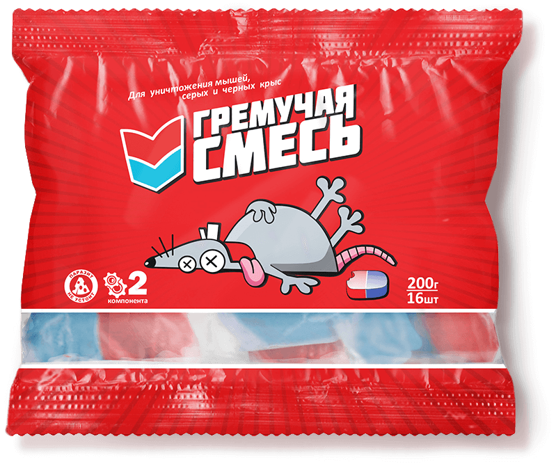
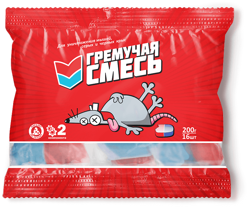
“Dead Mouse” is the winning concept. The red colour of the packaging is bright, it attracts attention, attracts the eye.
The main design elements chosen are:
- font, which creates a sense of dynamics;
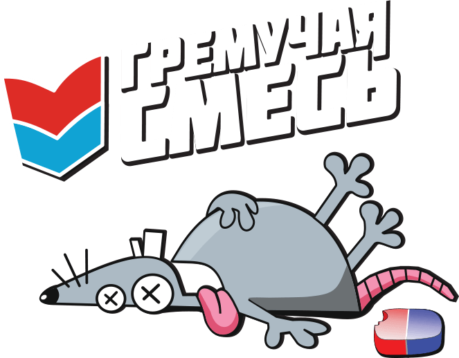
- a two-part arrow (the graphic part of the logo) aimed at the head;
- a two-colour tablet motif (red and blue);
- a dead mouse (which can also be mistaken for a rat).
- A background pattern that centres the gaze of the beholder.
The concept combines 2 advantages. Firstly, it is comical and therefore evokes an emotion, which connects the consumer with the brand. Secondly, it clearly shows the result that the product helps to achieve.
At the top of the packaging we have placed text that indicates that the product is suitable for mice and rats.
Logo
Unique selling proposition
Emphasis is placed on the two-component nature of the rodenticide product. This assures consumers of the product’s effectiveness. Visual elements (two-colour tablet illustration and infographics) and supporting texts helped to reflect the concept.
The packaging is not only bright and memorable, it also fully conveys the key message to the customer, reflects the concept of product positioning, draws attention to the product, and disposes people to buy.
The package design is based on the following associative series: defeat, targeted destruction, caricature, death, 2 pills, possibility of choice, two-component, inevitable final.
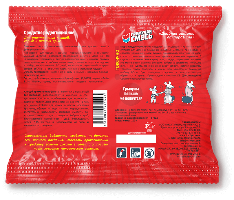
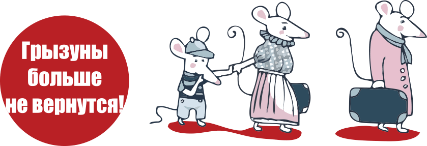
On the back of the package there is an illustration: a mouse family that leaves its nest and goes away. It is accompanied by a reinforcing text: “Rodents will not come back!”. This combination of text and graphic elements emphasises the positioning of the product and makes its benefits clear to the consumer, simplifying the perception of information.

Emphasis is placed on the two-component nature of the rodenticide product. This assures consumers of the product’s effectiveness. Visual elements (two-colour tablet illustration and infographics) and supporting texts helped to reflect the concept.
The packaging is not only bright and memorable, it also fully conveys the key message to the customer, reflects the concept of product positioning, draws attention to the product, and disposes people to buy.
The package design is based on the following associative series: defeat, targeted destruction, caricature, death, 2 pills, possibility of choice, two-component, inevitable final.
On the back of the package there is an illustration: a mouse family that leaves its nest and goes away. It is accompanied by a reinforcing text: “Rodents will not come back!”. This combination of text and graphic elements emphasises the positioning of the product and makes its benefits clear to the consumer, simplifying the perception of information.
Result
The new brand for the rodenticide market has turned out to be original, comical and distinctive. The Rattlesnake Mix brand has already appeared in specialised outlets and online shops. It was able to show high results in sales, displacing competitive brands.
Summary
You can order a packaging design that will be recognisable and unlike competitive products from KOLORO. We also specialise in catchy naming and a working UTP.


