DAIRY UMBRELLA BRAND "GLOBINO:

BUTTER AND CHEESE

"More milk than milk"

Background

Globino is one of the leading producers of meat and sausage products on the Ukrainian market. The company is on the 11th place in the rating of “Focus” magazine – 50 most popular brands of Ukraine. In addition to meat products the company is engaged in production of dairy products.

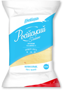
Globino Group of Companies turned to KOLORO branding agency and ordered redesign of packaging for dairy products (hard cheese, butter, processed cheese). First we created the corporate identity and design of the hard cheese packaging. The next stage was the redesign of butter and cheese packaging for Globino dairy brand.

Packaging design of cheesecakes and butter: the challenge

– to form an extraordinary corporate style;
– increase brand recognition;
– strengthen positions in the dairy market of Ukraine;
– increase sales.

It was also necessary to develop a UTP (unique selling proposition) for the dairy brand. When creating positioning, the connection between the dairy segment and Globino meat direction was taken into account. The work on creating a new packaging design for butter and processed cheese lasted 4 months. The corporate identity was based on the idea of “Splash”, which we had already approved for hard cheese.

Stage 1: Market Analysis of butter and processed cheese

Globino

Consumer portrait

Melted cheese is bought by men and women in their 20s and older. Students and workers often snack on them at lunchtime. Parents sometimes buy processed cheese for their children’s afternoon snack. They are also an ingredient in salads and snacks. Because of the young age of CA, the design of processed cheese can be more playful, colourful and fun. Since 2014, the consumption of processed cheese has increased (due to the share of hard cheese in the mid-price segment).

Butter in Ukraine is mainly bought by women aged 30 and above. Most often butter is bought for the whole family: a married couple and children. Customers have defined the average price segment for Globino butter. The most popular is butter with fat content up to 85%. The market is also characterised by high competition and the presence of regional leaders, which leads to greater rivalry on the shelf.


Trends in packaging design processed cheese and butter

White colour is most often used for the design of dairy products in the medium price segment. This draws attention to the natural origin of the products. Images of farm animals on the packaging are also designed to emphasise the freshness and purity of dairy products.

Playful motifs, images of appetising photos on the packaging – sandwiches and vegetables, which can be combined with cheese for a snack, are popular among producers in the Ukrainian cheese market. Golden colours prevail in butter packaging design, and references to Soviet motifs are common.


The situation of buying processed cheese and butter

Butter is bought once every 2-3 weeks. Most often consumers choose a standard pack of 200 grams. If consumers have a large family, they can choose a 500-gram pack, but it is a rarity for Ukrainian producers.

Melted cheese is an irregular purchase. Their consumption grows slightly during holidays, as they are elements of several popular salads. City dwellers prefer to buy butter and cheese in supermarkets. In second place are specialised dairy shops or kiosks.


Consumption situation processed cheese and butter

Butter is one of the key elements of sandwiches. It is also used to top porridge and in the preparation of a variety of baked goods. Melted cheese is constantly present in the diet of students. They add them to soups, often combine them with rice and use them to make sandwiches (instead of hard cheese).

Also, melted cheese can be an independent dish, it is suitable for a quick snack.

Source material - Previously developed by us corporate identity of the Globino umbrella brand

Globino

Stage 2: Developing the concept design of processed cheese packaging

Searching for an idea

The processed cheese market in Ukraine is quite saturated. When working on the design of the cheeses, we immediately refused to use traditional dairy motifs. The only dairy reference is the winning combination of blue and white colours, which has already been used in the design of hard cheese packaging.

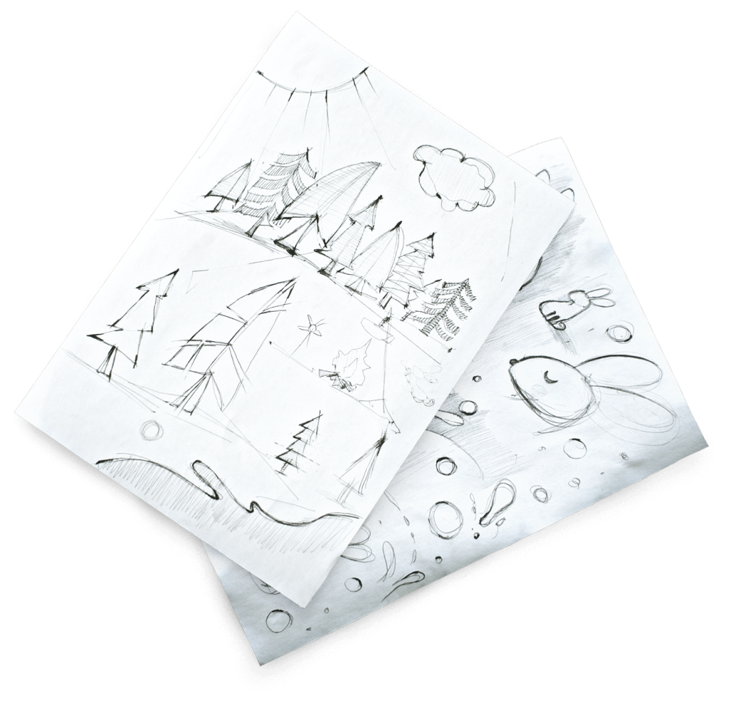
Best idea: the process

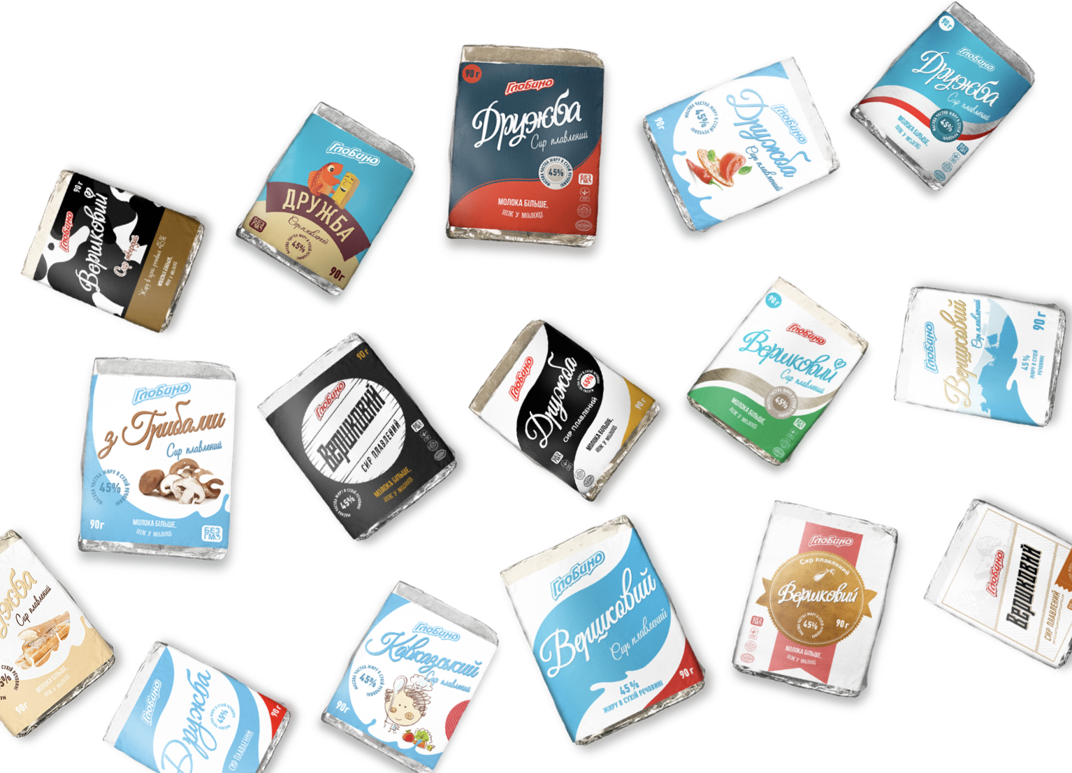
At first, we thought rather formulaic. We tried to use Soviet motifs, as cheesecakes are associated with this period by a part of the population. We also thought about focusing on wave silhouettes (you can see all the concepts a bit below). However, all of these had already been used by someone else, so we continued our search.

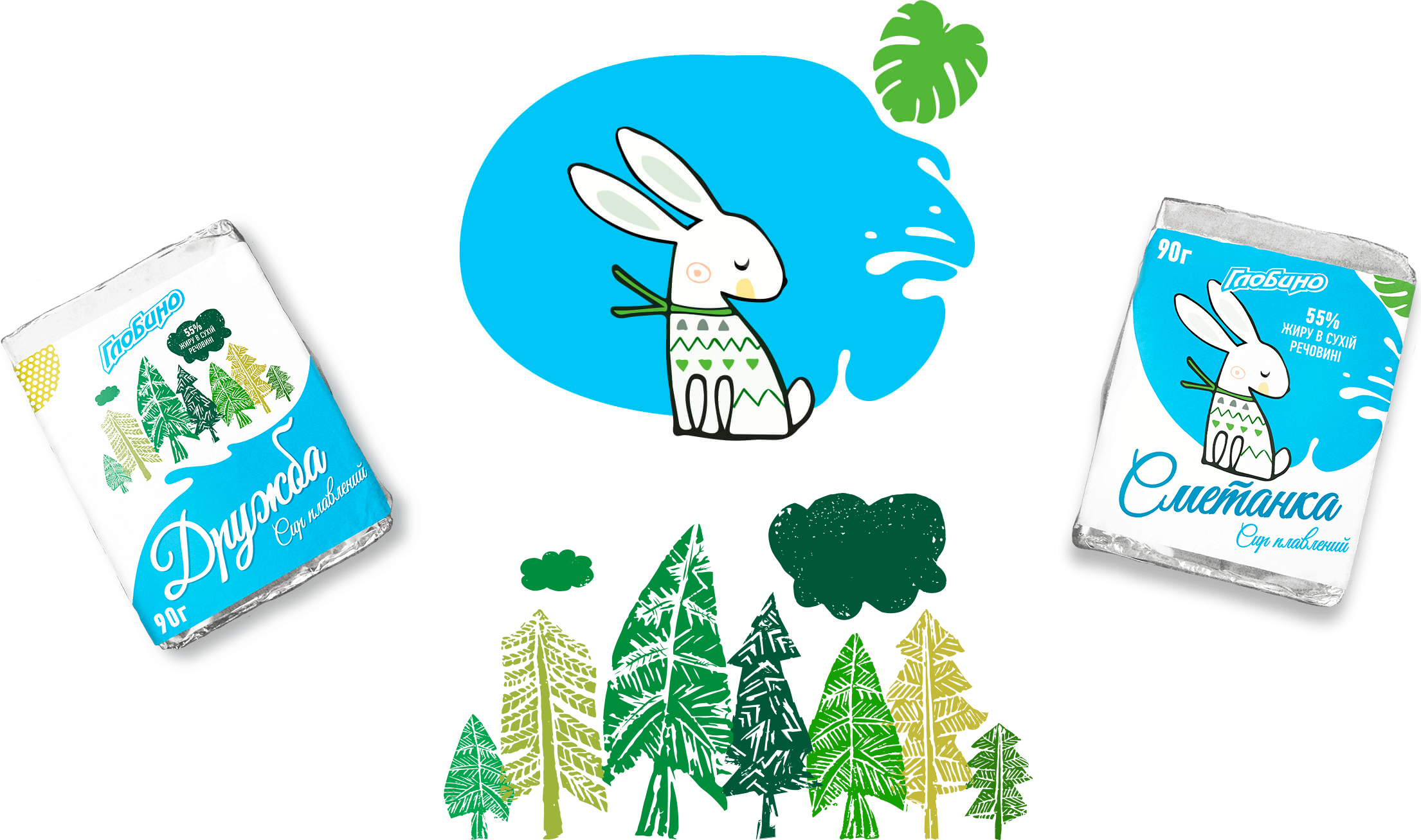
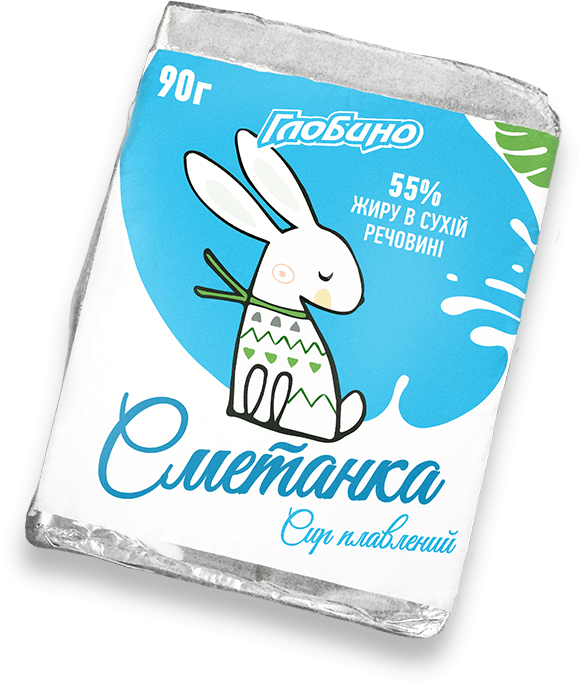
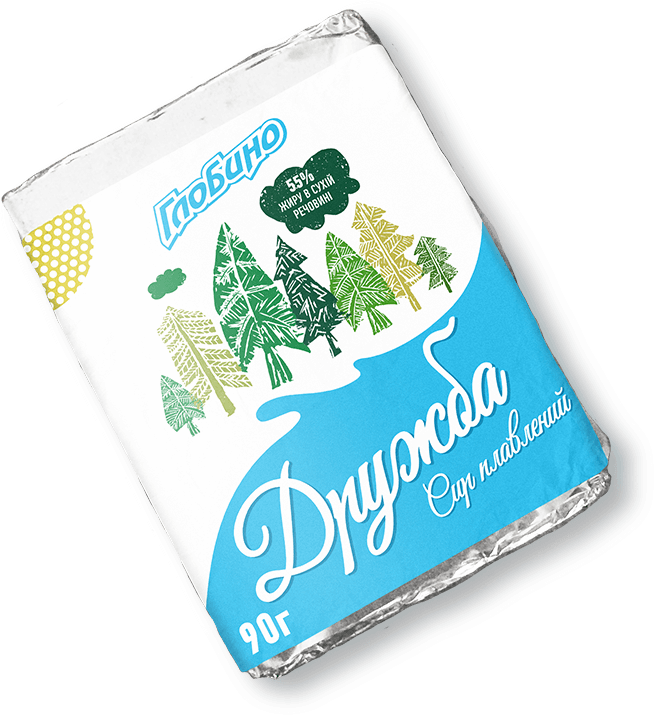
As we learnt from the research above, the target audience for cheesecakes is young people. This means they are less inhibited and more likely to be open to new things (compared to the older generation). This means that product packaging aimed at a younger audience may not be directly associated with the product: you don’t have to draw a sandwich or a person eating it on a cheese. So we were brave and came up with two completely different illustrations that are only indirectly associated with cheese. The Friendship packaging was decorated with motley trees, and for the cream cheese we came up with a character – a snow-white rabbit in a fashionable jumper and with a sad look. The branded combination of blue and white colours and milk splashes formed the basis of the packaging.

The final result

A cute rabbit in a stylish scarf is the centrepiece of the Smetanka cheese packaging. The green variegated trees on Druzhba contain several semantic connotations. Firstly, they symbolise a pure ecological product without harmful additives. Secondly, it encrypts the name of the cheese. Although the trees belong to different species, they are united into one forest. This is how different people are united by friendship. The combination of colours and the characteristic milk splash remain common to the design of all packages.

Developing a name Smetanka cheese

The product line consists of 2 products. The first is Druzhba and the second is Smetanka. Thinking about sour cream cheese and comparing its name with an already invented character, the KOLORO team had an epiphany. The white rabbit had a name – Smetanka.

CBP​

All the processed cheese concepts

Globino

Stage 3: Developing the concept butter packaging design

Searching for a concept design concept for the oil

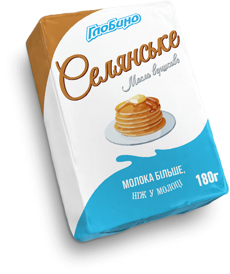
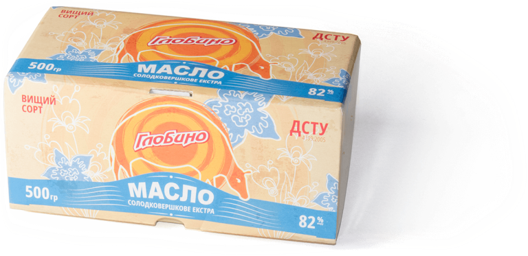
The designers and marketers of KOLORO branding agency faced a difficult task: to create a packaging design that would emphasise the main advantages of the product and make the brand different from its competitors. When developing the first packaging design concepts, we decided to emphasise the naturalness of the butter. We thought about using watercolour illustrations that depict the situation of butter consumption (left concept).

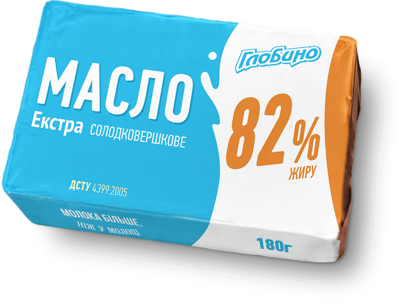
The right concept was simple, it echoed the cheese design. The colour scheme was kept in calm tones: light blue packaging with orange flecks. When choosing the colours, the designers relied on research in the field of psychology: blue is associated with freshness and orange with health.

Selected concept

Globino

Approved Concept oil range design concept

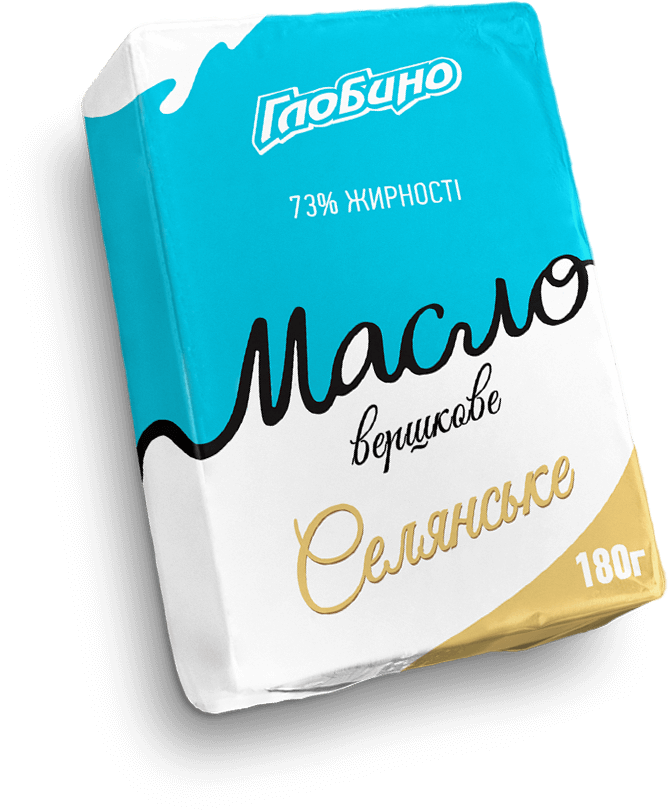
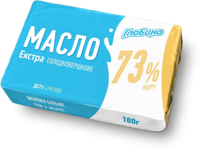
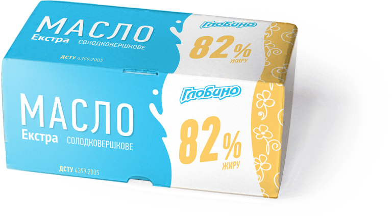
Based on the data about the Ukrainian butter market, marketers and designers of KOLORO branding agency decided to use European experience in design. The final design of the butter package contains 4 colours: white, blue, yellow and orange. The butter line consists of products of different fat content, so the fatter the butter, the more intense the yellow colour of the corner of the package. The colour gradation helps the customer to intuitively understand the main characteristics of the product and find the right pack on the shelf. Such care for consumers causes attachment to the brand.

For the butter they chose the flat style and used three colours: white, blue and warm yellow. The minimalist design emphasised the quality of the product: it does not need additional images to emphasise its naturalness and freshness. The new design will also help consumers. All information about the oil is clearly visible. For example, the fat content is indicated in large numbers on the white splash. The company logo is also located there. The splash on the packaging emphasises the high amount of milk in the product.
Old design

New design

Pattern

Globino

Design of the back side of the packaging back of packaging

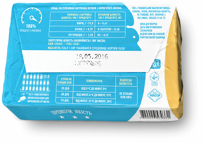
On the back side of the package you should put information about the manufacturer, expiry dates, composition and calories. The designers of KOLORO tried to unload the packaging, use a schematic structure, which will simplify the consumer’s interaction with the packaging. Simple fonts of medium size helped in this.

Also on the back side there is an explanation of the UTP – “Milk is more than milk”. Thanks to research, marketers of the KOLORO branding agency found out that to create 1 kg of butter or cheese it is necessary to process 10.5 litres of milk. This is how the UTP for Globino dairy umbrella brand was created: “Milk is more than milk”. The designers were able to give it a graphic expression and created an infographic. It explains in a simple and clear form what the advantage of Globino dairy products is.

Results of the project on brand design:

– Attracting consumers’ attention to Globino dairy products;
– Increasing sales and increasing the retail market share in the dairy segment;
– Globino dairy brand got its own face;
– The company managed to move away from the image of an exclusively meat producer;
– Unusual packaging allows to stand out among competitors.

Click to rate this post!
Voted: 0

Did you like the work? Leave your vote:)

DID THIS PROJECT MAKE YOU WANT TO WORK WITH US?

Discuss Your Project

Developing the Work Plan

Pricing and Timelines