
FROZEN SPRING
"A CHILLING FLAVOUR FROM THE HEART OF THE EARTH."
Background
The Ice Spring trade mark owes its birth to the company OOO SK Rodnik, one of the largest producers of alcoholic beverages of European quality, located in Samara.
OOO SK Rodnik produces alcoholic beverages not only for most regions of Russia, but also for export to such countries as Armenia, Georgia, Germany, Latvia, Kazakhstan, Israel, Mexico, USA.
Not so long ago the management of the company decided to develop a local Samara vodka brand.
Thanks to advanced technologies, high quality raw materials, modern equipment and automated system of control over the production process, OOO SK Rodnik was very likely to succeed. It is a joint product of two companies “Russian Spirits International” and “Russian Original Drinks”.
Task
The client’s tight deadlines and limited budget created “extreme” conditions for developing the design of the label and cap of the new vodka brand, logo, creating the concept of positioning and finding an idea for the UTP (unique selling proposition).
And it was necessary to create a “special” and distinctive brand, emphasising the ecological purity of the product.
Decision
Label design.
Bottle capping
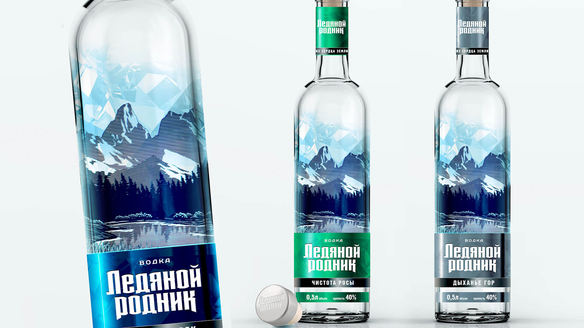
Work on the project began with the creation of a label design and the development of bottle closure options. For this trade mark, the bottle was selected from a free sale: a standard round shape.
This shape is the most popular in Russia. The designers developed several design variants, but based on the budget, one design variant of the label and cap with two possible logo variants was sent to the customer for presentation.
Brand name and UTP – natural rustic product, a benchmark of quality and distinctive flavour.
Brand images and identity elements that are directly related to the name of the vodka. For example: vodka “Dobryi Medved” – image of a brown bear, vodka “Perepelka” – image of a quail bird, TM “Snezhny Bars” – illustrations of a snow leopard, etc.
In addition, the study showed that 90% of vodka brands in Russia use a cylindrical shape. The geometry of the corkscrew also arouses considerable interest among consumers. once again emphasising the positioning of the product as an environmentally friendly product.
Logo development - Crystal Concept
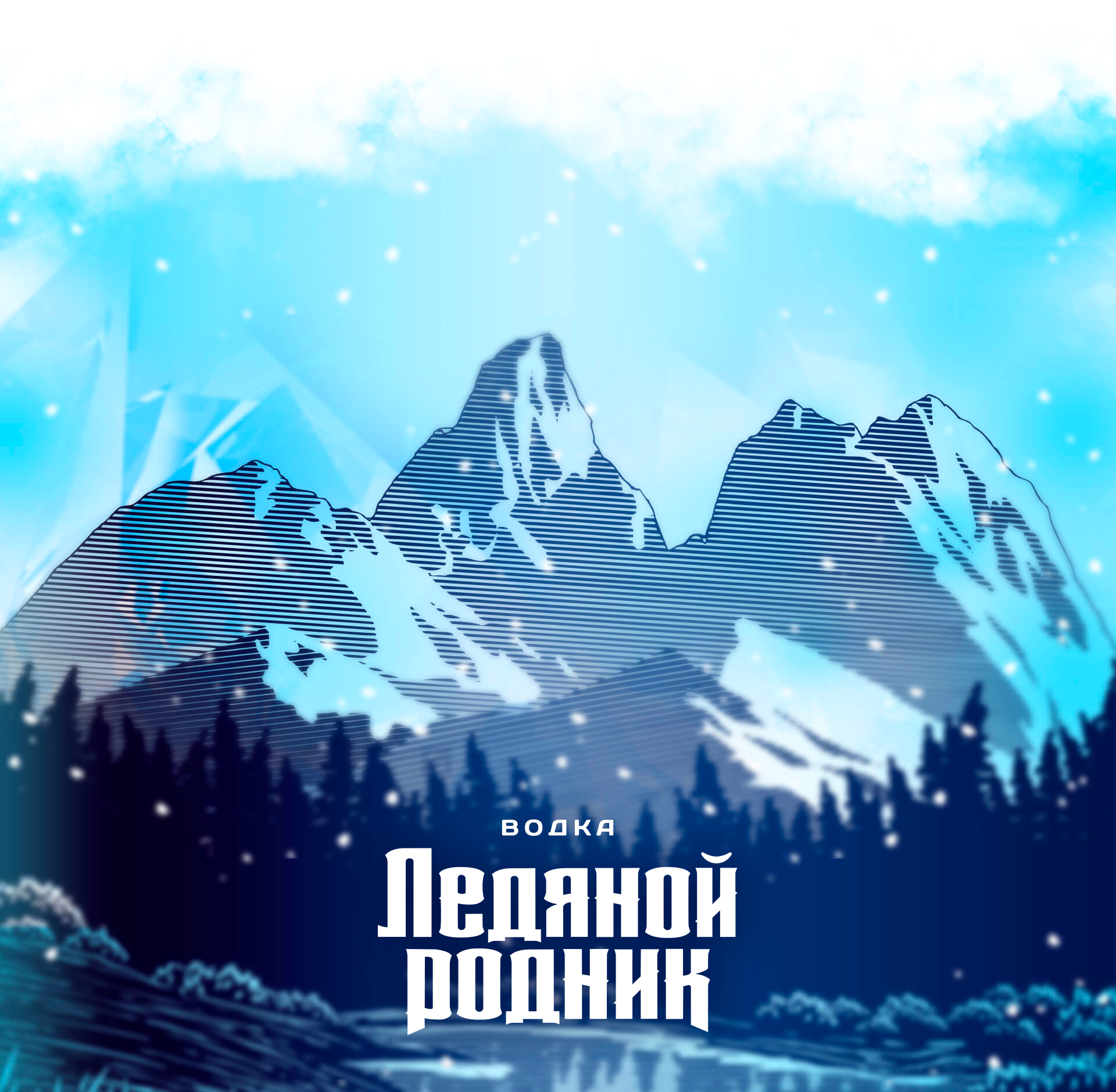
The concept is based on the naturalness and environmental friendliness of the brand. The theme of naturalness is very relevant, as the Samara region, where the product was planned to be sold, is a unique combination of natural riches. “Ice Spring” is an economy segment vodka. The theme of environmental friendliness will be relevant for many years to come, and the design of vodka with this theme should provide the product with leading positions in the economy segment.
The theme of naturalness is revealed by a stereotypical image of wild nature. The picture is stylised under an additional communication – the theme of crystallinity, which distinguishes our product from similar ones. In addition, the study showed that 90% of vodka brands in Russia use a cylindrical shape. The geometry of the corkscrew also arouses considerable interest among consumers. Once again emphasising the positioning of the product as an environmentally friendly product.

Identifying elements
Main brand attributes and identifying elements:
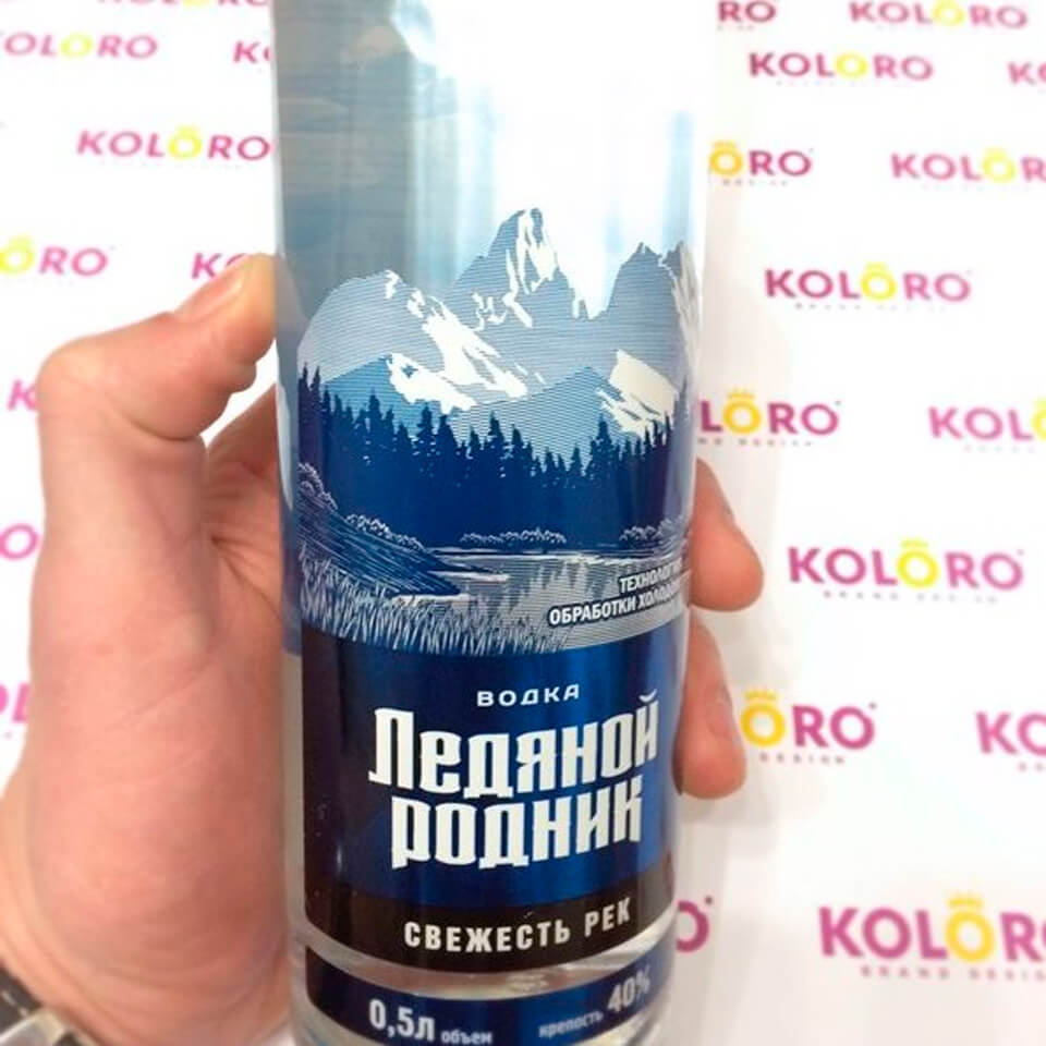
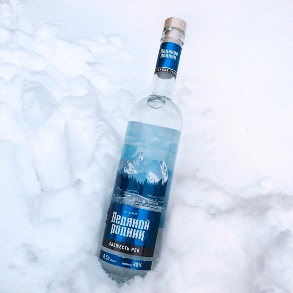
– Sky – the top part of the image (bluish crystal) is a double-sided counter-label (sandwich) that shines through the bottle;
– The main image of the front label (mountains, forest, water) made with a tactile (stencil volumetric) varnish, which creates an additional tactile sensation.
The front label was printed on diffraction (holographic) foil.
For example: vodka “Dobryi Medved” – image of a brown bear, vodka “Perepelka” – image of a quail bird, TM “Snezhny Bars” – illustrations of a snow leopard, etc.
In addition, the study showed that 90% of vodka brands in Russia use a cylindrical shape. The geometry of the corkscrew also arouses considerable interest among consumers. Once again emphasising the positioning of the product as an environmentally friendly product
Lineup titles
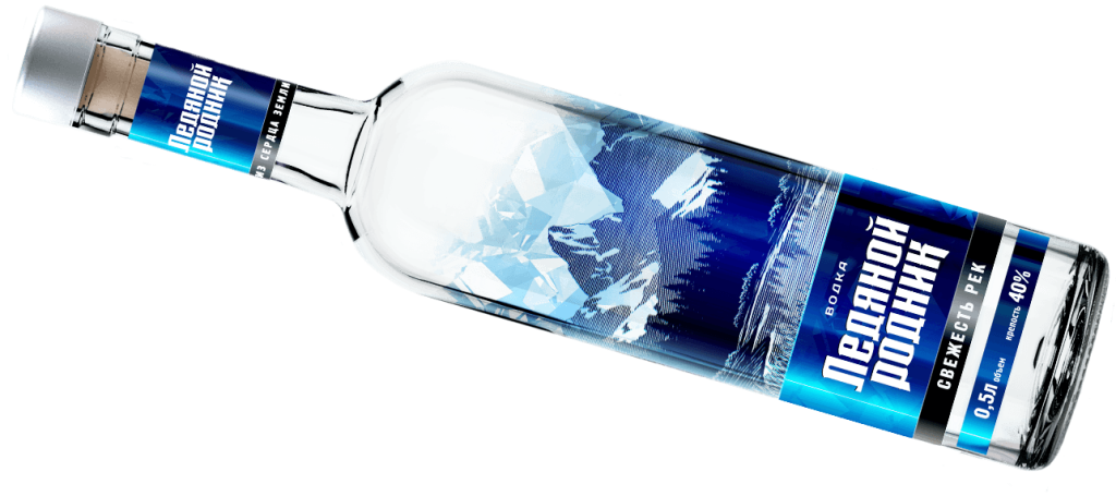
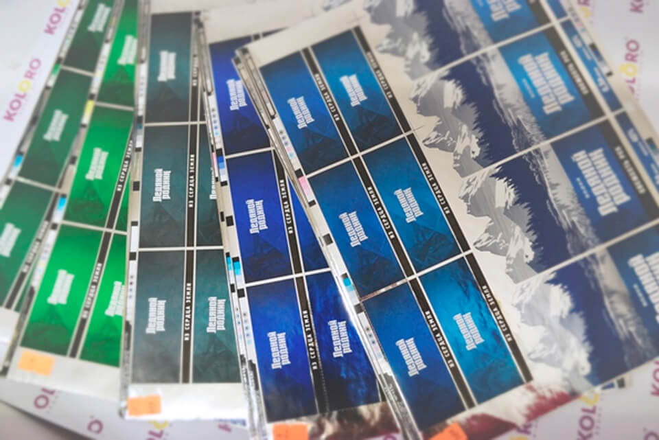
Further, the following line of TM “Ice Spring” vodka names was developed: breath of mountains – grey backing; freshness of rivers – blue backing; purity of dew – green backing. Poetic names once again reinforce the communication message of the trade mark and serve as a finishing touch of the brand image.
Result
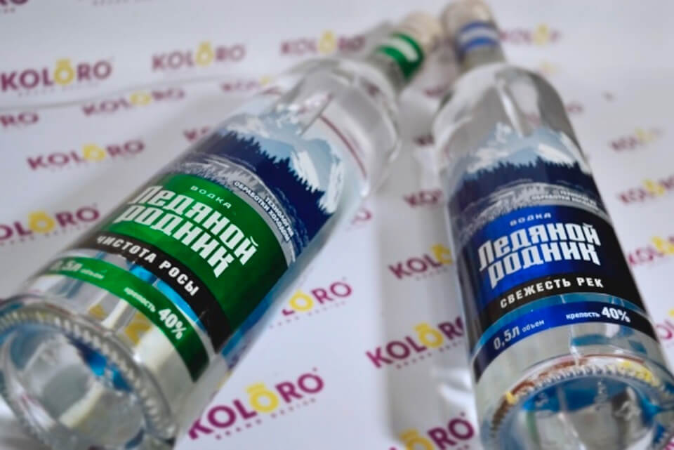
The trade mark “Ledyanoy Rodnik” is already on free sale in the Russian market. The vodka novelty has received considerable demand among consumers in the economy segment of the Samara region, positive feedback from experts and has taken a strong position among competitive brands.
Pure “ice” product is mentally close to our consumer, so the success of the brand was predicted in advance.
Packaging design for the vodka brand “Ice Spring” decided to radically change the image of the brand and decided to keep the former design of “Derevensky moonshine”.
Summary
A competent positioning concept and beautiful packaging that emphasises the product’s UTP can win over even the most fastidious consumers. Because the product touches the main values and preferences of the target audience. Branding agency KOLORO will help you to create not just original packaging, but a real “royal” brand with all the “attributes of power”, not forgetting to emphasise the “soulfulness” of the product, which the consumer loves so much.
Did you like the work?


