
DUBROVKA VODKA
"Humour is the best way to engage the consumer."
Background
The history of the Dubrovka trade mark is directly linked to the Toral-Group group of companies, founded in 1998.
“Toral-Group” is a well-known importer of spirits and foreign wines, the company is a distributor of alcoholic beverages from Scotland, Spain, France, Argentina, Germany and other countries.
Several years ago Toral-Group introduced to the domestic market a number of its own vodka trade marks, such as Nord Standard, Wheat Dar and Dubrovka.
The new products became very promising trade marks due to modern production technologies, professionalism and technical arsenal of the manufacturing company.
Task
The management of Toral Group decided to create a new brand and even made attempts to develop a vodka design, besides, the name of the new product – “Dubrovka” – was determined. Branding from scratch was necessary – to create a colourful folk brand, emphasising the environmental friendliness of the product. Develop a packaging design and positioning concept, create a line of names and get a successful popular brand.
Decision
Target audience research. Analysing competitors
Work on the project began with market research and studying the preferences of modern consumers in the alcoholic beverages market. The research results showed that domestic consumers are loyal to vodka brands with national and colourful motifs close to our people. In addition, our consumers are looking for natural natural products.
Packaging design and positioning
Several packaging design concepts and brand positioning options were proposed in the course of the work.
The design concept using the image of a perennial mighty oak tree, wise and eternal, so traditional for our people, and a nostalgic concept based on Soviet films received a great response from the audience.
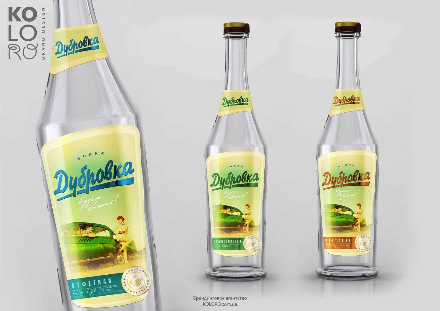
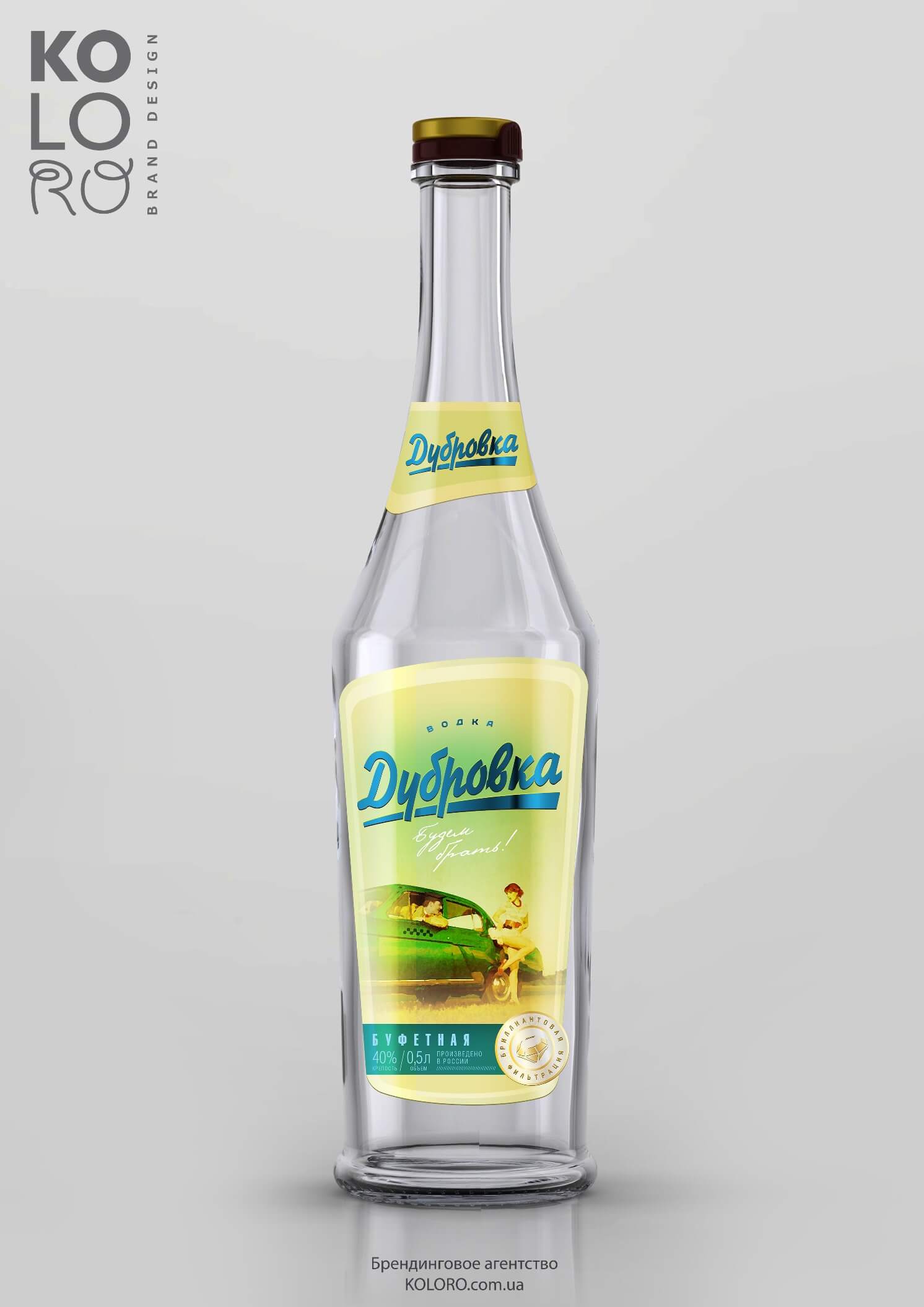
Concept №1 - "Nostalgic."
Concept keywords: nostalgia, film classics, taxi to Dubrovka, flirtation, holiday, stilyagi.
According to the conducted survey, “nostalgic” packaging brings to the consumer associations with the film “Diamond Hand” of the 60s and with the style of the subculture “stilyagi” of the late 50s. The nostalgic theme is complemented by the shape of the bottle, which corresponds to the Soviet era.
Identifying elements:
The main identifying element is the yellow-greenish background – a unique colour that makes the product stand out on the shelf. No competitor uses a similar combination of colours. Vodka Dubrovka will stand out on the shelf among competitors.
A Volga car, a taxi driver and a beautiful girl. The stylistics and plot of the image turn us to the past. There are also associations with the film “Diamond Hand”.
Writing the name on a coloured changeable strip. Will help the consumer to clearly identify each of the line items in the shop window.
Lineup of titles:
The names of the range are words that are in keeping with the spirit of the Soviet era and also refer to the geography where the product will be distributed.
- Buffet
- Secular
- Commission
Nostalgic Concept
Concept №2 - "Tree."
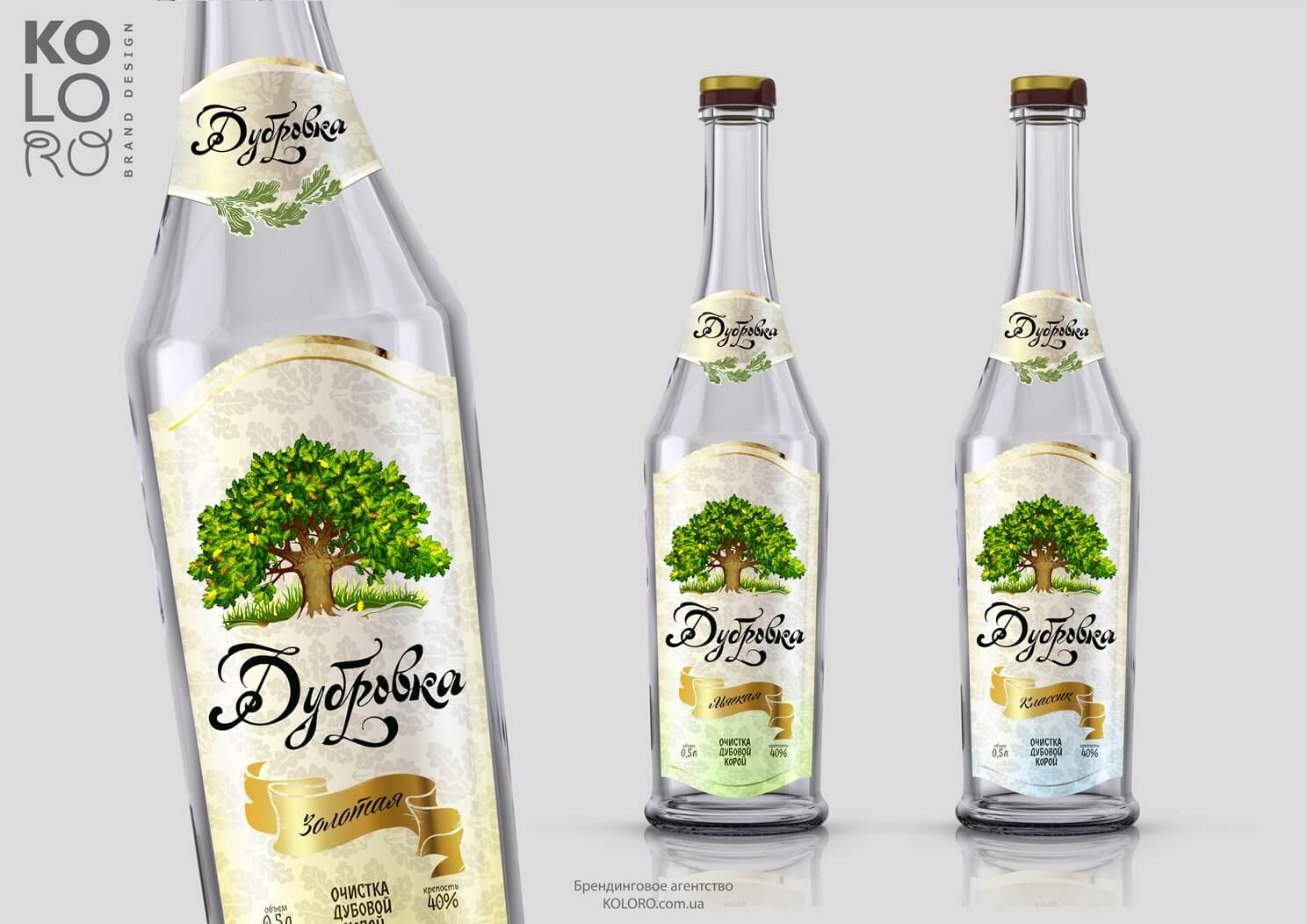
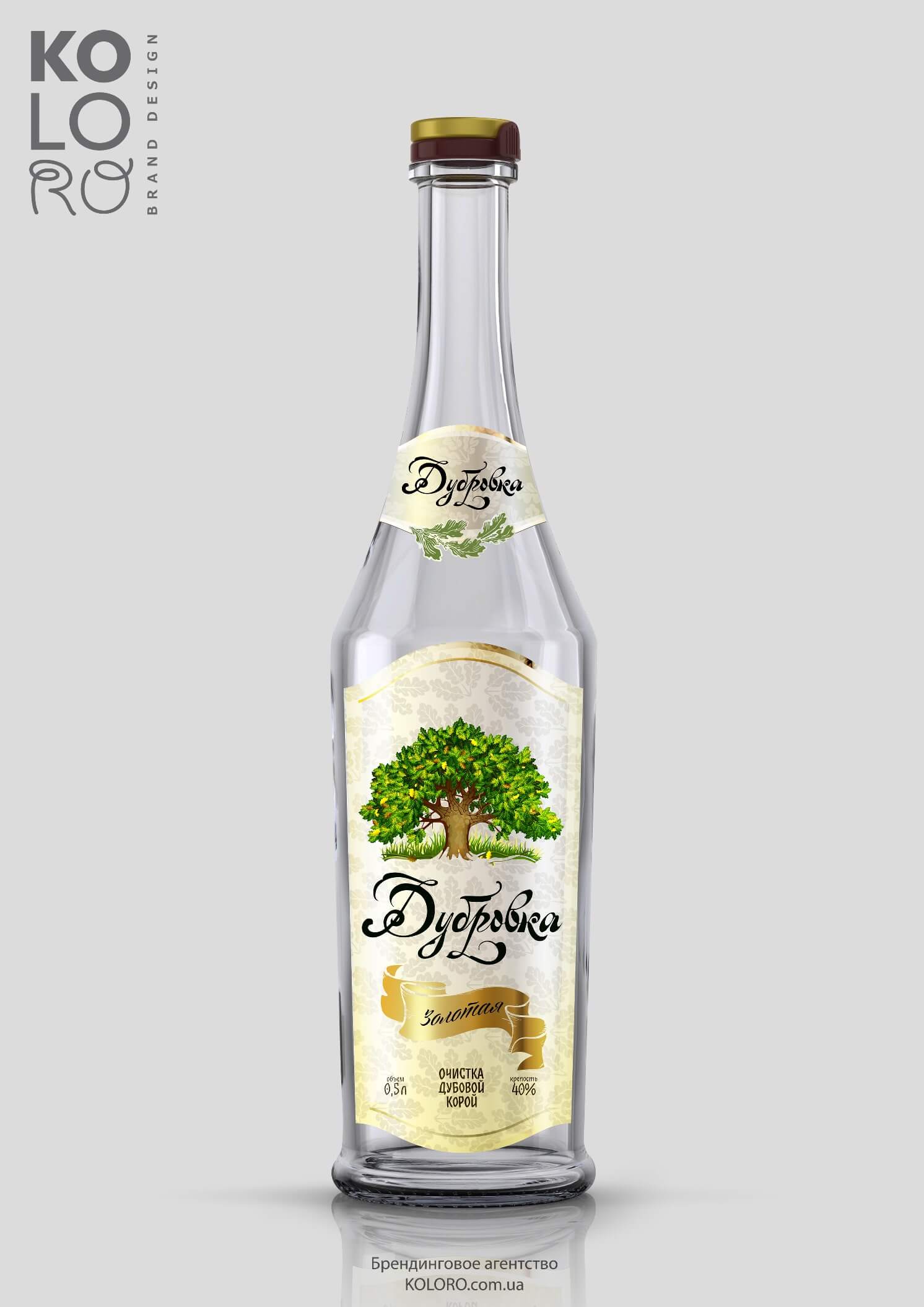
The concept is based on the following associative series: nature, ecology, oak, natural.
The product is aimed at soft, sensitive men who appreciate closeness to nature. For them the most valuable are such qualities of the product as ecological purity, naturalness of the product, as well as the traditionality of the recipe.
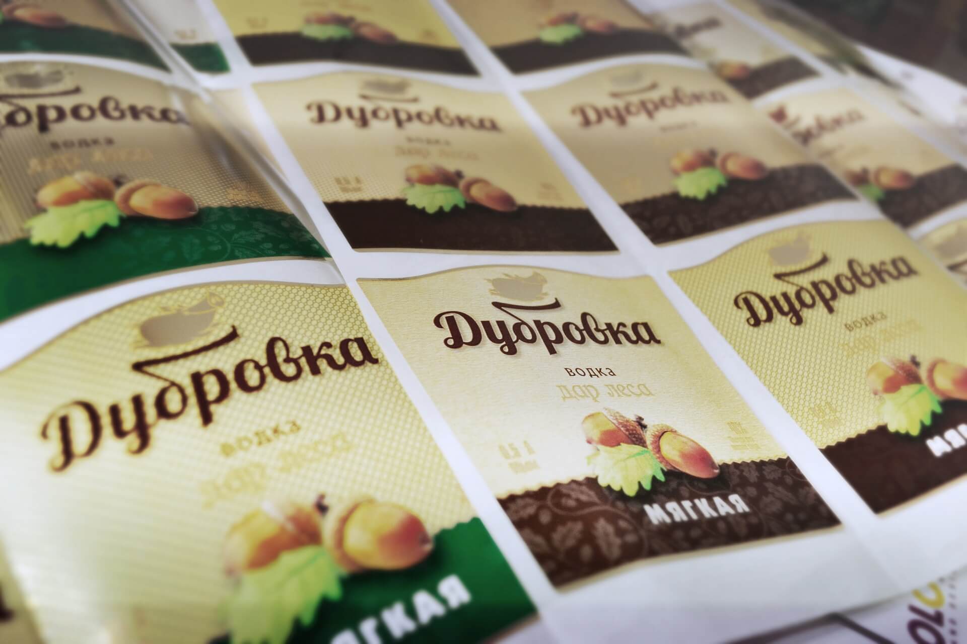
Green oak is the central element on the label. This element in the consciousness of a Russian man is associated with eternity, wisdom, tradition, stability, power, longevity and masculine strength.
Identifying elements:
- Unique oak tree pattern.
- Unique spelling of the name using original font.
- Textured label base – an unusual background, a platform for polygraphic “tricks”.
Lineup of titles:
The range of names presented fully reflects the mood created by the label – timelessness, naturalness, traditionality, wisdom.
- Soft;
- Golden;
- Classic.
Tree Concept
Concept №3 — "Boar and Acorns."
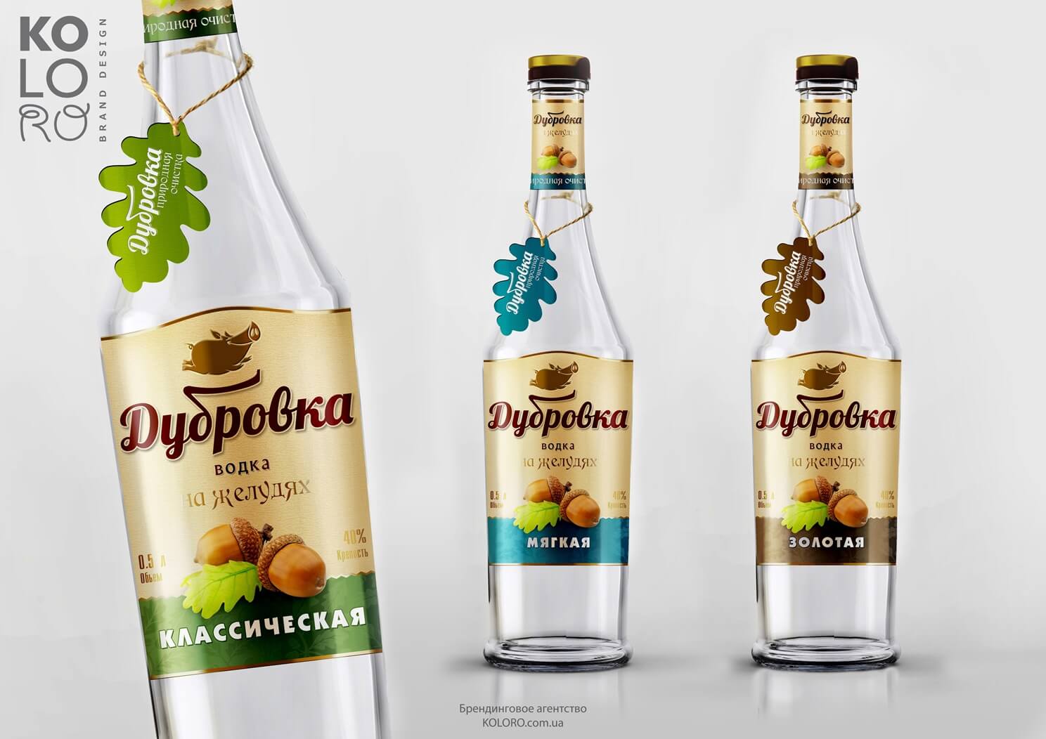
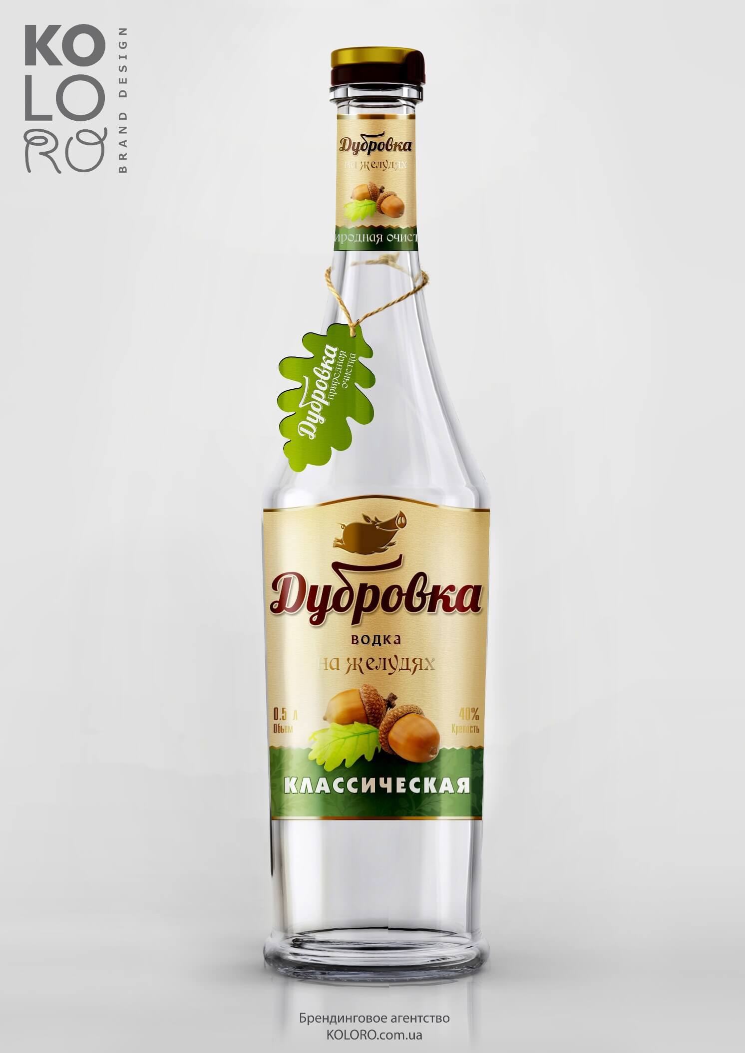
Additional communication with the consumer is created by a tag on the neck of the bottle – a flavoured “souvenir” that attracts consumers’ attention and provokes repeat purchase. The textured ripples on the background of the label are unique and memorable, designed also for further use in advertising and post-materials.When developing the design concept, a ready-made bottle from free sale with a cap-type closure was taken as a basis.
Additional communication with the consumer is created by a tag on the neck of the bottle – a flavoured “souvenir” that attracts consumers’ attention and provokes repeat purchase. The textured ripples on the background of the label are unique and memorable, designed also for further use in advertising and post-materials.The design concept was based on a ready-made bottle from a free sale with a cap-type closure.
Additional communication with the consumer is created by a tag on the neck of the bottle – a flavoured “souvenir” that attracts consumers’ attention and provokes repeat purchase. The textured ripples on the background of the label are unique and memorable, designed also for further use in advertising and post-materials. The design concept was based on a ready-made bottle from a free sale with a cap-type closure.
"Boar and Acorns" concept.
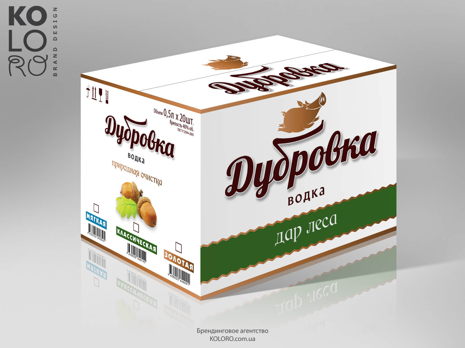
POS-materials for Dubrovka vodka
UTP (unique selling proposition)
The positioning concept and UTP were built on the idea of using acorn flour as a natural flavour enhancer, or the possibility of using acorns as the main raw material for vodka instead of cereals. Acorns themselves have a huge number of useful properties, so the TSS on the concept of “Boar and Acorn” has really tangible technological prospects for the development of a profitable technology of mass production.
Summary
The new Dubrovka vodka brand is already on free sale. Despite the “youth” of the brand, it has managed to win the recognition of consumers and an honourable place in the Russian alcoholic beverages market. The novelty and originality of the brand has attracted a large number of loyal consumers. Experts note TM Dubrovka as a “technologically revolutionary” and promising brand.
Concept - Winner
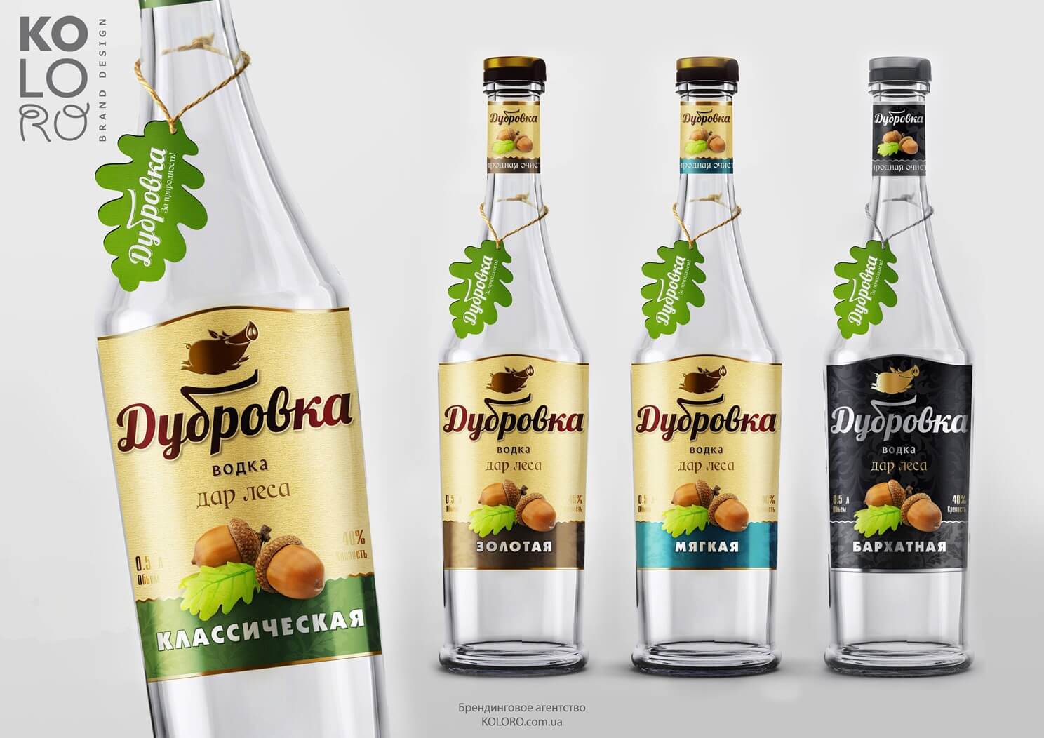
Labels for Dubrovka vodka
A bottle of Dubrovka vodka.
Summary
A humorous touch, both in packaging design and in the concept of brand positioning as a whole, is not a new, but almost always a successful option. KOLORO specialists will be happy to help you create a distinctive and colourful brand.


