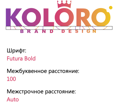
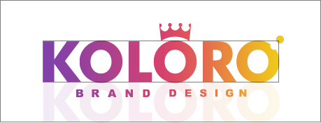
The logo is of a composite type, containing a graphic image and a font name. It is allowed to use them separately, but if space allows, it is better to use a composite block.
Descriptor
The descriptor is a short text transcription of the company’s business area. The indentation from the logo when applying the descriptor should be a quarter of its height. The descriptor can be placed both in the composition block with the logo and separately from it. The indentation from the font writing shall be a quarter of its height.
Free zone
Guard zone – the space around the logo, free of graphics and text. The free space helps to fix attention on the logo and to divide the media space into zones. Depending on the type of the carrier, the logo can be the central element or an additional one. In the latter case, the logo’s task is to indicate authorship rather than to centre attention.
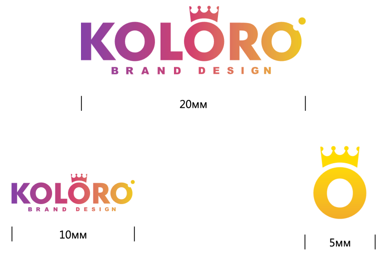
Minimum size
It is not a good idea to use a logo in a size smaller than the size specified in the brandbook. This dilutes the recognisability of the mark.
Logo placement
When the logo should be placed on a coloured background, an example for which is not in the brandbook should choose the most contrasting shade.
Placement on brand colours
Most often the logo is placed on black, white, and against a background of company colours. For these cases, the brandbook prescribes standards.
On company colours and on black the logo remains white, on white the logo is reflected with company colours.
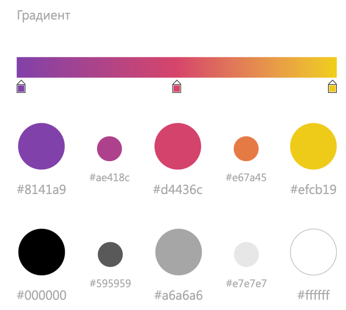
The signature colour consists of a gradient. It is built on 3 shades:
moderate dark purple;
bright crimson;
bright yellow.
Animated strip
The stripe adds dynamics to the logo and helps outline the edges of the logo.
Corporate fonts
The corporate font is Segoe UI. It belongs to the humanistic grotesque and is a sign of the site’s CA, as it is used in many Microsoft products. People subconsciously trust recognisable images and symbols, and the choice of Segoe UI is a plus for the site. The font is sans serif, which simplifies the perception of text by visitors and prolongs the time spent on the site.
Segoe UI
abcdefghijklmnopqrstuvwxyz
ABCDEFGHIJKLMNOPQRSTUVWXYZ
АБВГДЕЁЖЗИЙКЛМНОПРСТУФХЦЧШЩЪЫЬЭЮЯ
abcdefghijklmnopqrstuvwxyz
abcdefghijklmnopqrstuvwxyz
абвгдеёжзийклмнопрстуфхцчшщъыьэюя
1234567890!@#$%^&*()
1234567890!@#$%^&*()
Segoe UI Bold
abcdefghijklmnopqrstuvwxyz
ABCDEFGHIJKLMNOPQRSTUVWXYZ
АБВГДЕЁЖЗИЙКЛМНОПРСТУФХЦЧШЩЪЫЬЭЮЯ
abcdefghijklmnopqrstuvwxyz
abcdefghijklmnopqrstuvwxyz
абвгдеёжзийклмнопрстуфхцчшщъыьэюя
1234567890!@#$%^&*()
1234567890!@#$%^&*()
Standards for writing materials
Font: Segoe UI Bold, Segoe UI Regular Margins: body text – 20pt, headings – 60pt Line spacing: 30pt Letter spacing: 0
Pattern development
The basis of the corporate font is the crowned letter “O”. The crown is a reference to the positioning of COLORO, an agency that creates royal brands
Character creation
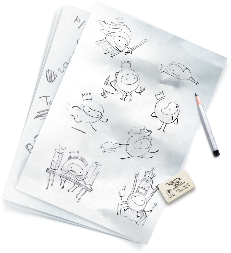
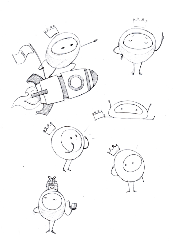
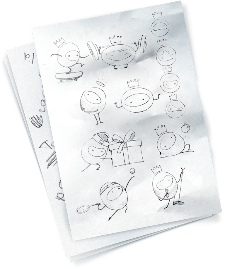
The 3D character KOLORO is Kolorombo. This is the letter “O” brought to life. Before modelling, our designers drew a couple of dozens of sketches with him to reflect different situations with the character.
Kolorombo is inquisitive and curious, he loves to learn and share knowledge, and he can be found on the website in articles, services and on the homepage.
The character on the paraphernalia
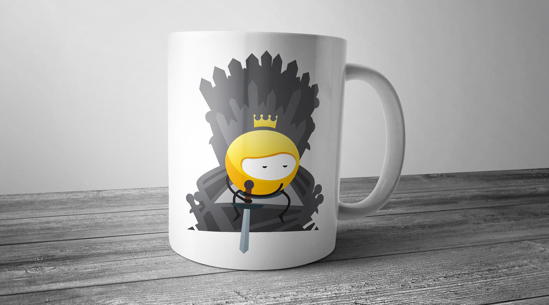
We have created some character prints that are suitable for putting on t-shirts, mugs and stationery.
Slogan
The call “KOLOROnise” – inspires you to become part of the family of satisfied and successful KOLORO customers.
Фирменный стиль
Photo of employees
All staff photos are taken on a black background and processed in a programme that gives the image the appearance of an oil painting.
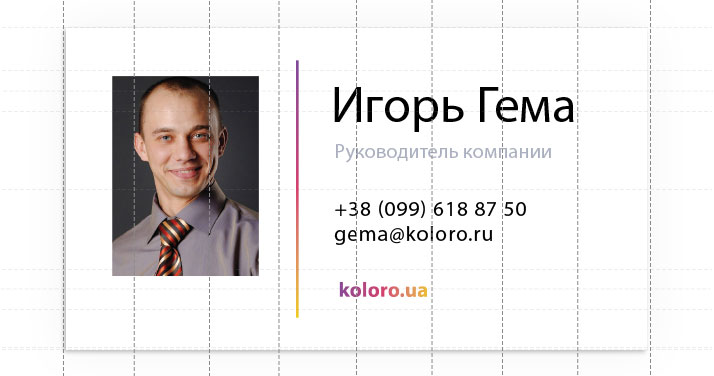
The business card is as simple as possible with few elements. Each has a photo of the manager, which works on a subconscious level, adding humanity to the company.
Commercial offer
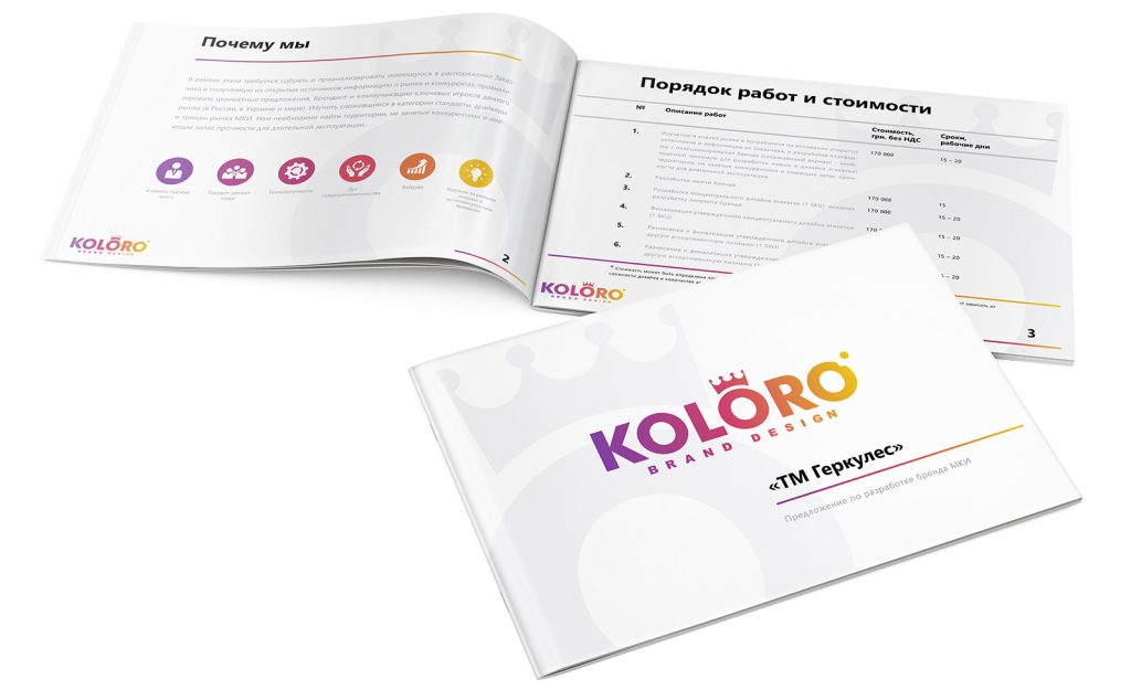
We made two versions of the commercial proposal layout for paper and electronic version. The CP consists of:
cover page;
a page with KOLORO benefits;
a list of services provided;
a final website with CTA contacts.
Presentation
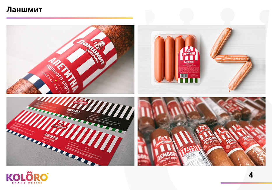
A unified presentation consists of:
cover page;
KOLORO benefits page;
information on competences;
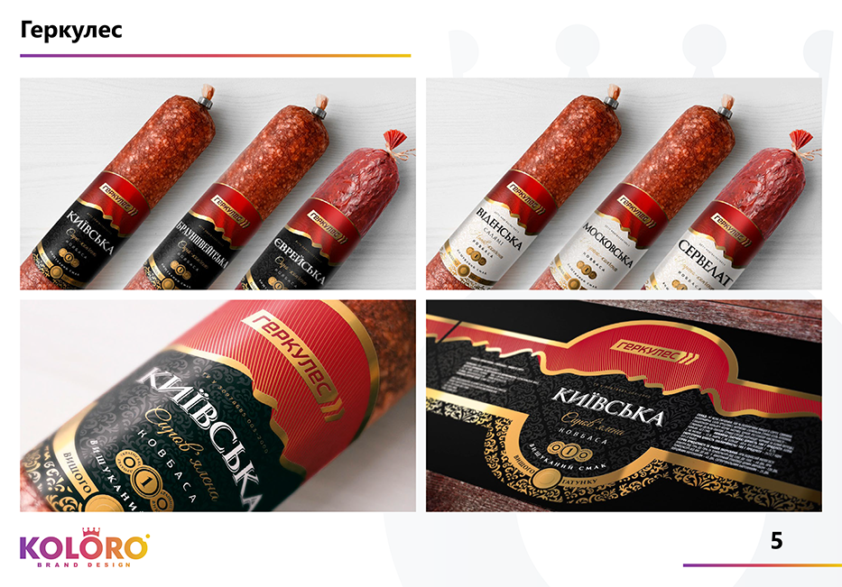
case studies from the portfolio (slide + text or a set of slides);
final website with CTA contacts.
Design of corporate letters
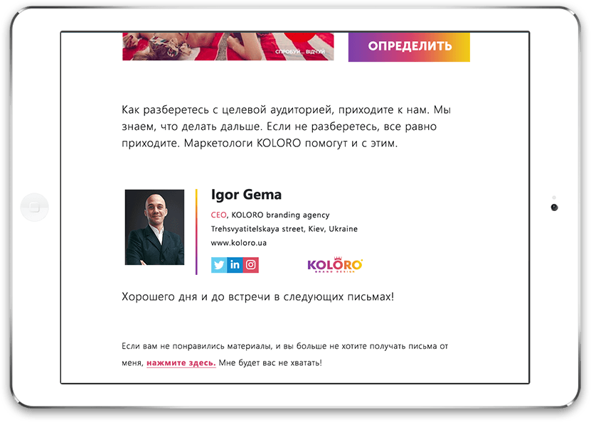
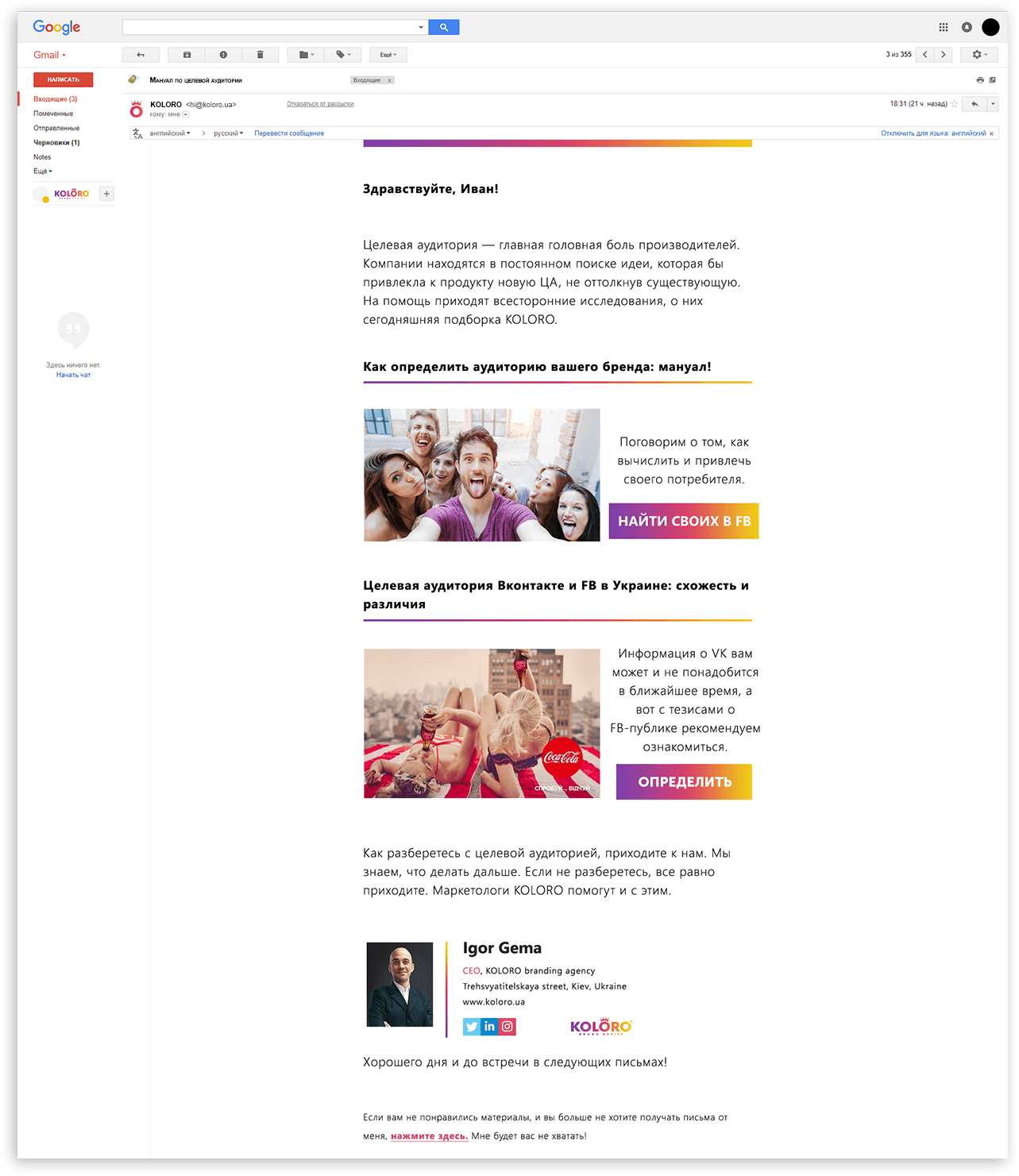
We needed to design several templates for emails.
A letter for general mailing, sent once or twice a month.
A congratulatory letter.
Letter with CP.
A template letter for business correspondence of account managers.
Conclusions
A brandbook with unified corporate identity elements helped to speed up the company’s work and reduce time wasted on typical tasks.
You can order a brandbook and corporate identity development in the branding agency KOLORO. Spend your time to your advantage and entrust the design to us.