
DEVELOPMENT CORPORATION
"Dynamic development, innovation and modernity"
Background
In order to develop a brand model, brandbook and corporate identity, KOLORO was approached by the government of the Belgorod region (Russia). Namely, the company “Razvitie”, which is engaged in project solutions to stimulate investment activity in the Belgorod region.
The goal of the company’s activity is to improve the living standards of Belgorod residents and create favourable conditions for the development of small and medium-sized businesses.
In other words, in terms of its objectives, Razvitie is a company of the future.
Task
Advanced, fast-paced, developing, progressive and reliable. This is exactly how target segments see Development Corporation. Based on this positioning concept, it was necessary to develop several variants of the logo and corporate identity for Development Corporation, which would fully reveal the brand model formed: a modern company keeping up with time and progress.
Decision
Logo development and corporate identity
The logo was created in two language versions – Russian and English: “Razvitie” and “PROGRESS”.
Concept - "Development Process"
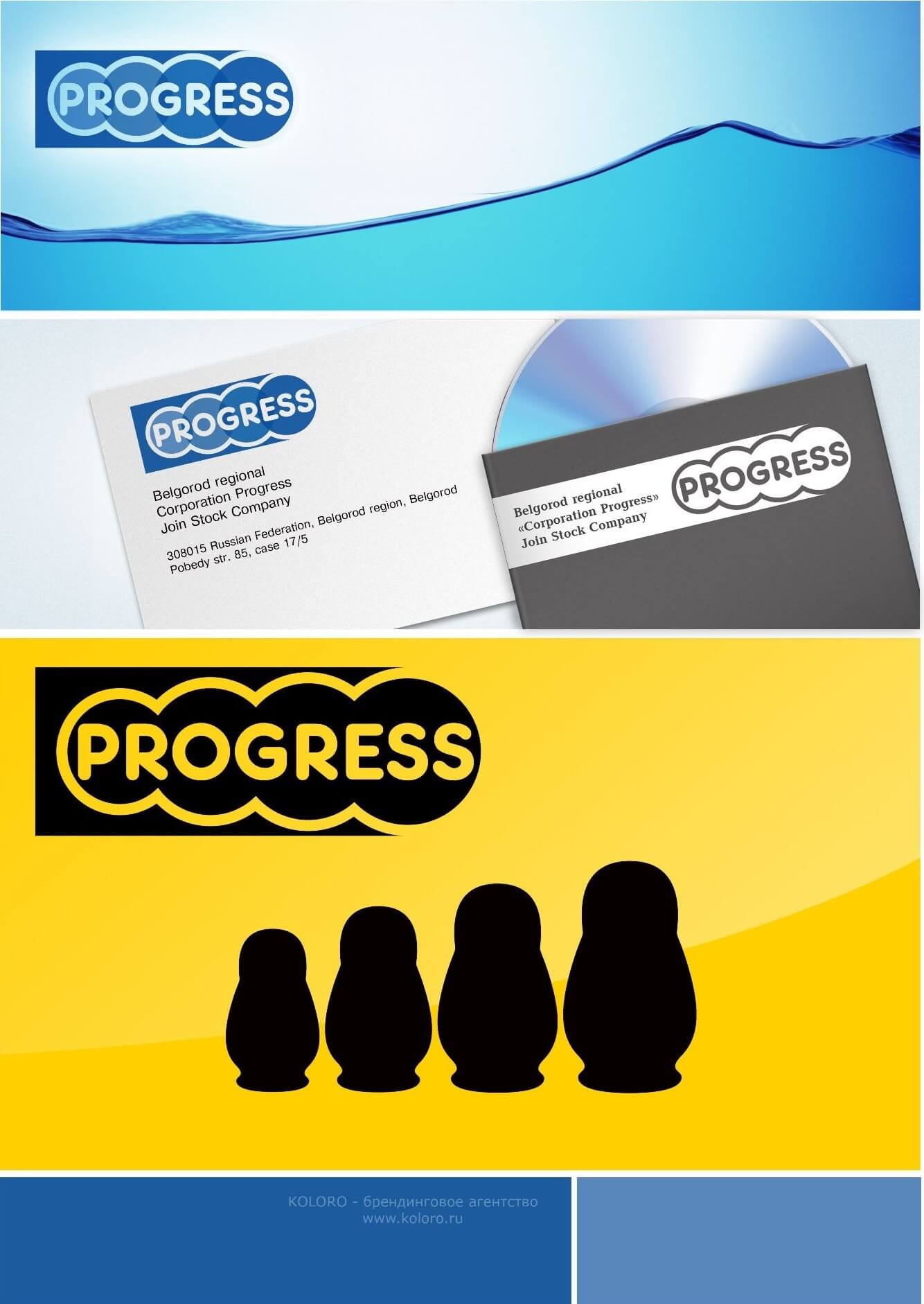
In this concept, the following elements of corporate identity are conveyed: a gradually increasing wave, as well as increasing rings in the company logo, the colour saturation of which increases from left to right. Thus, all the elements of the corporate identity indicate the forward movement and impetuosity of the company.
The rectangular shape of the logo is ideal for business documentation and contributes to quality corporate identification. In this concept, the company name is the main element of the logo, well visible and easy to read.
Concept - "Development Process"
Concept - "Innovation and Modernity"
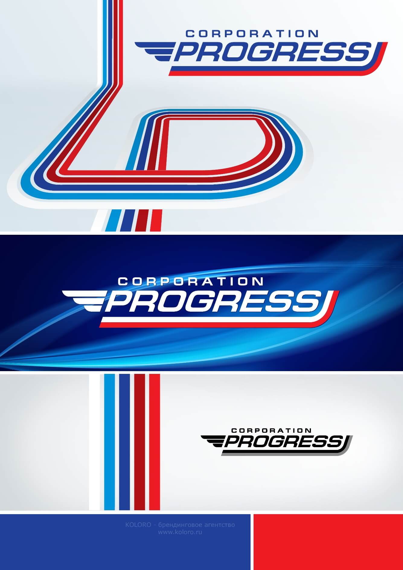
The second concept reveals the dynamic development, innovation and modernity of the company expressed by the following elements of the corporate identity: the letter “R”, built from the lines of the colours of the Russian national flag (red, blue and white), reminiscent of “sledge tracks in the snow”, representing forward movement through obstacles, progress and aspiration for the future.
In addition, the company’s logo has such a graphic element as a “wing”, reminiscent of the sandal of the ancient Greek god Hermes, and once again emphasising the progressiveness of the company. It also evokes a feeling of reliability and stability in the consumer’s mind
Concept - "Innovation and Modernity"
Concept - "Progress"
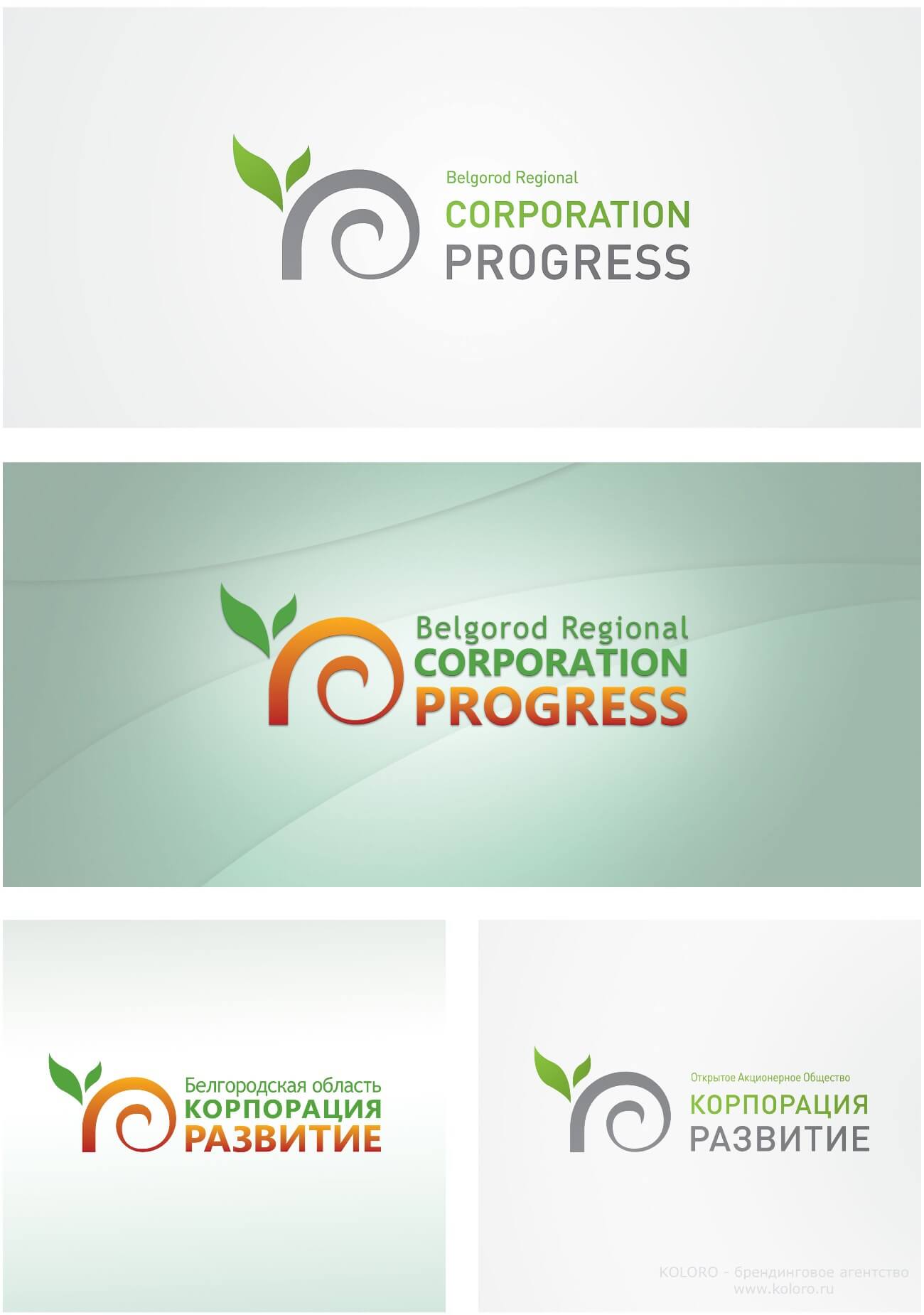
The third concept is based on the association of the word “progress” with plant themes, as trees and plants have indeed always symbolised development and growth.
In addition to the chosen colour of “lush green”, which forms a positive attitude to the company, the graphic design of the concept also uses rich grey, which harmoniously complements the intended natural image of the company.
In the logo there is such a highly recognisable element of corporate identity as “old vine” and a “young sprout” sprouting from it in the form of the letter “P”.
In this case, the association is made: the “old vine” is the government, and the “sprouting sprout” is new investment projects, which are given life by the government of the Belgorod region.
This logo perfectly reflects the idea of the corporation that even a small contribution (a seed or a sprout) to the development of the country is bound to produce a huge result in the future.
Concept - "Progress"
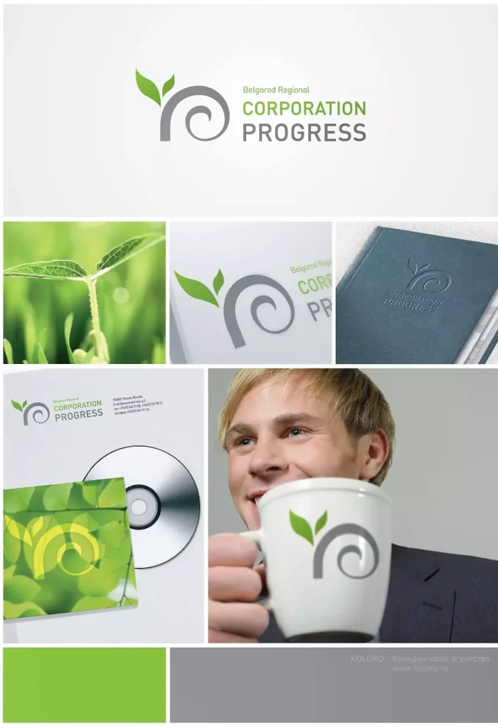
Elements of corporate identity for the Progress concept"
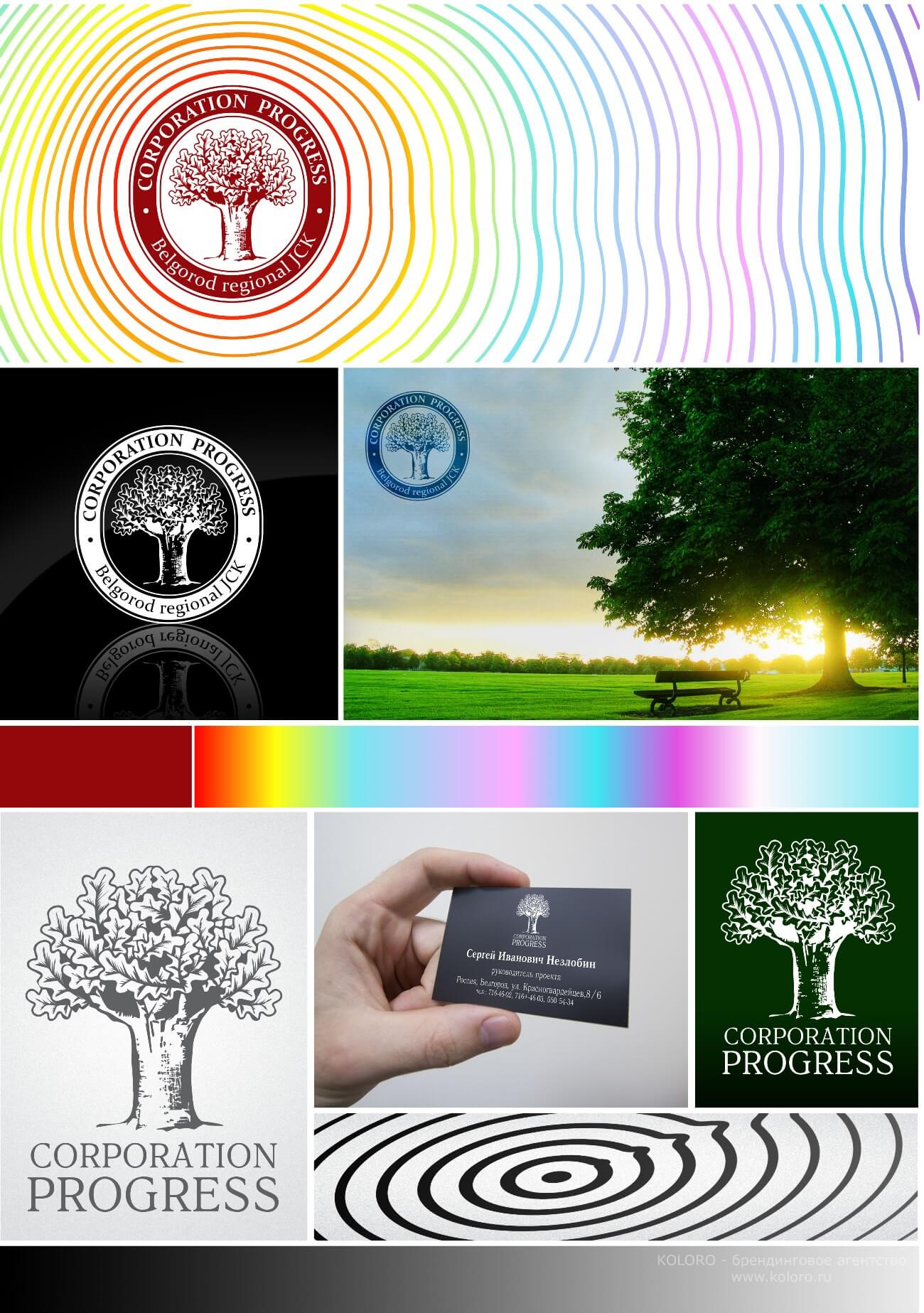
The concept is "Oak."
The fourth concept, as well as the third, is plant-themed.
The main element of the logo is oak – noble, restrained and laconic. The oak reflects the seriousness and reliability of the company. This logo has not only a pleasant graphic design, it has an idea and meaning. Oak symbolises power, reliability, stable growth and continuous development. This is what should be associated with a reliable corporation: it should be trusted, see progress in it, be confident in its future and in its positive outcome.
Концепт — "Дуб"
Result
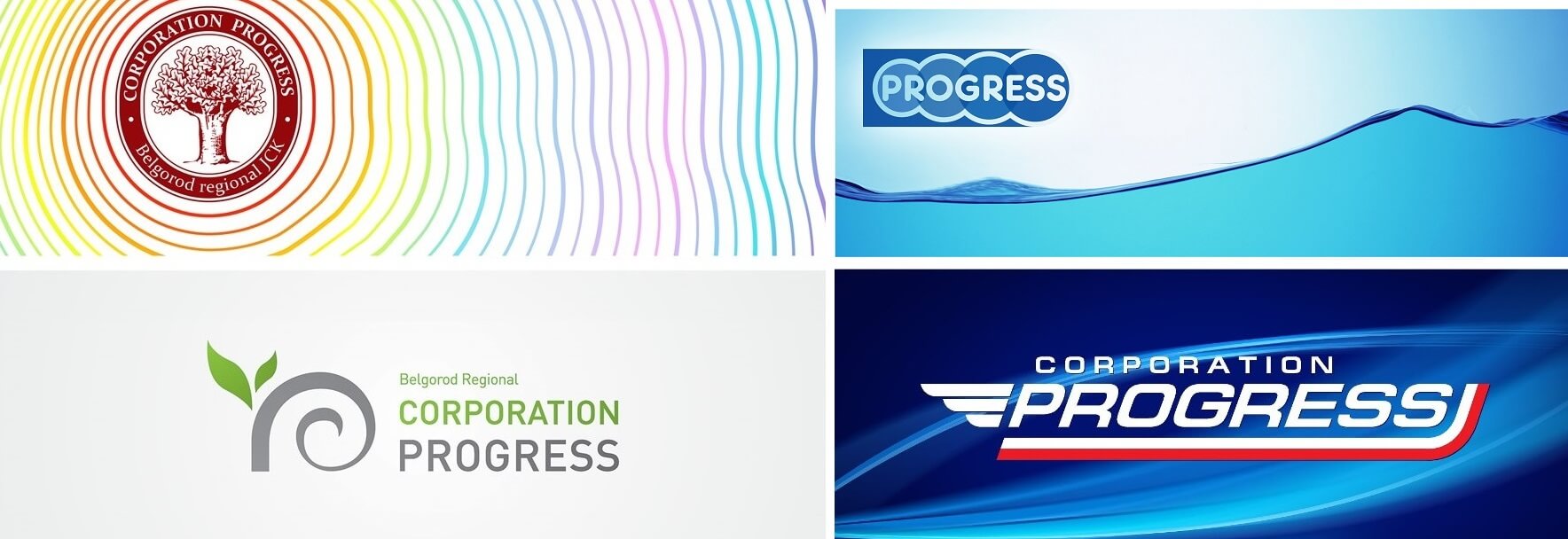
All 4 concepts are easily perceived and remembered. With the help of these elements of corporate identity it is possible to achieve the desired brand recognition by the consumer. Concepts agitate and urge to invest in this particular corporation. In addition, all 4 concepts evoke the desire to join and become part of a company where you can change and build your future.
4 corporate identity concepts for Development Corporation
Beech brand
Based on the developed brand model and positioning concept, a list of techniques was created to ensure a unified graphic corporate identity of the company – brandbook. A colour scheme, fonts, logo and other corporate identity elements were selected for advertising products and materials: letterheads, printing products, souvenirs and other advertising materials. And a sound strategy for promoting the brand of Development Corporation was developed.
Summary
An exclusive corporate identity will emphasise the individuality and professionalism of the company, increases consumer confidence. If you want your brand to become a “king” among brands, then the development of corporate identity is the number one task for you. After all, any “royalty” has its “attributes of power” – seal, sceptre, arms, orb and crown. Your “trappings of power” – are the elements of corporate identity.


