COUNTRY MOONSHINE
"A natural rustic product, a benchmark of quality and distinctive flavour"
Background
“Derevensky moonshine is a traditional Russian drink made by hand in a copper distillation cube. Derevensky Samogon TM is a federal trade mark represented throughout the Russian Federation.
It is a joint product of two companies “Russian Spirits International” and “Russian Original Drinks”. Russian Spirits International directly produces spirits for the EU, which are subsequently bottled in Lithuania.
They are then exported to Russia. Russian Original Spirits controls the quality of the products at every stage of production. Recently, the company decided to redesign the existing bottle and label design of Derevenskoye moonshine, for which a competition was held among design companies and branding agencies.
Task
The task of our company for this project was to develop a unique bottle geometry and a new design of the label of TM “Village Samogon”, to create memorable brand identification elements and other communications with the consumer.
Decision
Since Rustic Moonshine is a premium product, in order to distinguish it from other competitive brands, it was important to develop a new unique bottle shape that would reflect both the product’s modernity and its rich flavour, and would also be memorable. The new label design had to maintain the positioning and UTP of the brand – a natural rustic product, a benchmark of quality and distinctive flavour.
Development of unique bottle geometry and label design
Designers and 3D-modellers of our company took into account all the above requirements and reflected their unique ideas in three concepts presented to the customer.
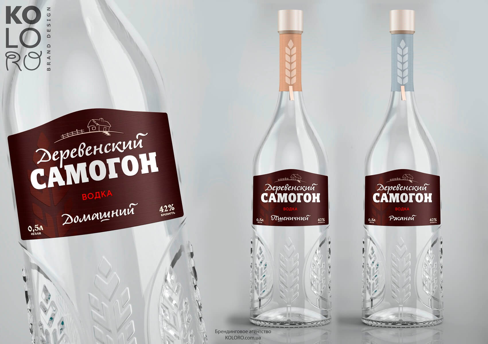
Kolos Concept
The following associative series was used for this concept: grain, harvest, house outside the city, farm, luxury, nationality, premium simplicity. The shape of the bottle is round – the most popular shape in Russia. Volumetric patterns are applied to the surface, just in the place where the hand is taken; this increases the perception and memorability of the product through tactile properties. The shape is similar to the traditional, old moonshine bottle used in Russia for centuries. The thick bottom indicates the exclusivity of the product.
The highlight of the concept is the texture and tactile properties. The texture of noble wood is transferred through the applied stencil. The label material is similar to natural materials in structure and colour.
The rich pattern – stylised spikelets, which serves not only for beauty, but also for convenience and reliability of the bottle’s positioning in the hand – attracts the buyer’s attention with a play of shimmer and shine.
Kolos Concept
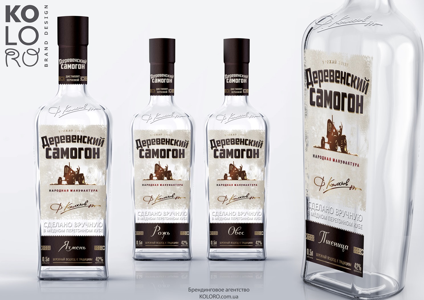
Manufaktura Concept
This concept utilises the barrel shape of the bottle, which is typical for expensive drinks such as whisky or brandy. This bottle lies comfortably in the hand and is relevant for “premium” class moonshine. The communication message of the concept can be expressed in the following key words: power, tractor driver, harvest, authenticity, author’s work, Fedor Koloskov, collective farm, nostalgia, watercolour.
Inscriptions emphasising the overall positioning of the brand were chosen as identifying elements:
- “2012 harvest” – as on expensive wines;
- “people’s manufactory”;
- “handmade in a copper distillation cube”;
- “careful approach to tradition”.
And also the signature character – tractor driver Fedor Koloskov. A strong character who can be trusted and who knows a lot about “Village moonshine”. Vodka from a talented master of production. Multistage selection of components, exclusive blend and careful approach to the production process are three unique features of the brand. Only rich people can afford to “be themselves”.
Manufaktura Concept
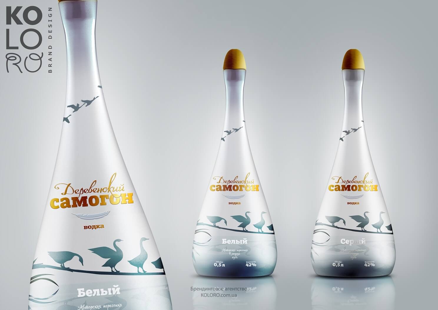
Концепт «Гуси»
Привлекательность дизайна данного концепта подкрепляется уникальной формой бутылки в виде гуся.
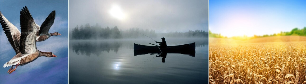
Такая бутылка не просто уникальна, но несет сильный эмоциональный посыл. Концепт деревенского самогона «Гуси» притягивает к себе внимание еще и техникой исполнения дизайна — декорированием бутылки. Гуси могут разгоняться и взлетать по кругу бутылки, что заставит потребителя взять ее в руки и крутить продукт, что является сильным стимулятором совершения покупки. Кроме того, взлетающие вверх птицы свидетельствуют и несут потребителям коммуникацию: движение, стремление вверх, рост. Концепт был построен на следующих ключевых словах: легкость, полет, стая, перелет, дружба, пруд, небо, деревня, перо, мягкость, раздолье.

Name range
white and grey, actual for geese, as well as for moonshine. Many interviewed consumers noted that such a bottle looks very expensive and even as a souvenir. It is very likely that such a bottle will be bought not only for themselves, but also as a gift.
The Goose Concept
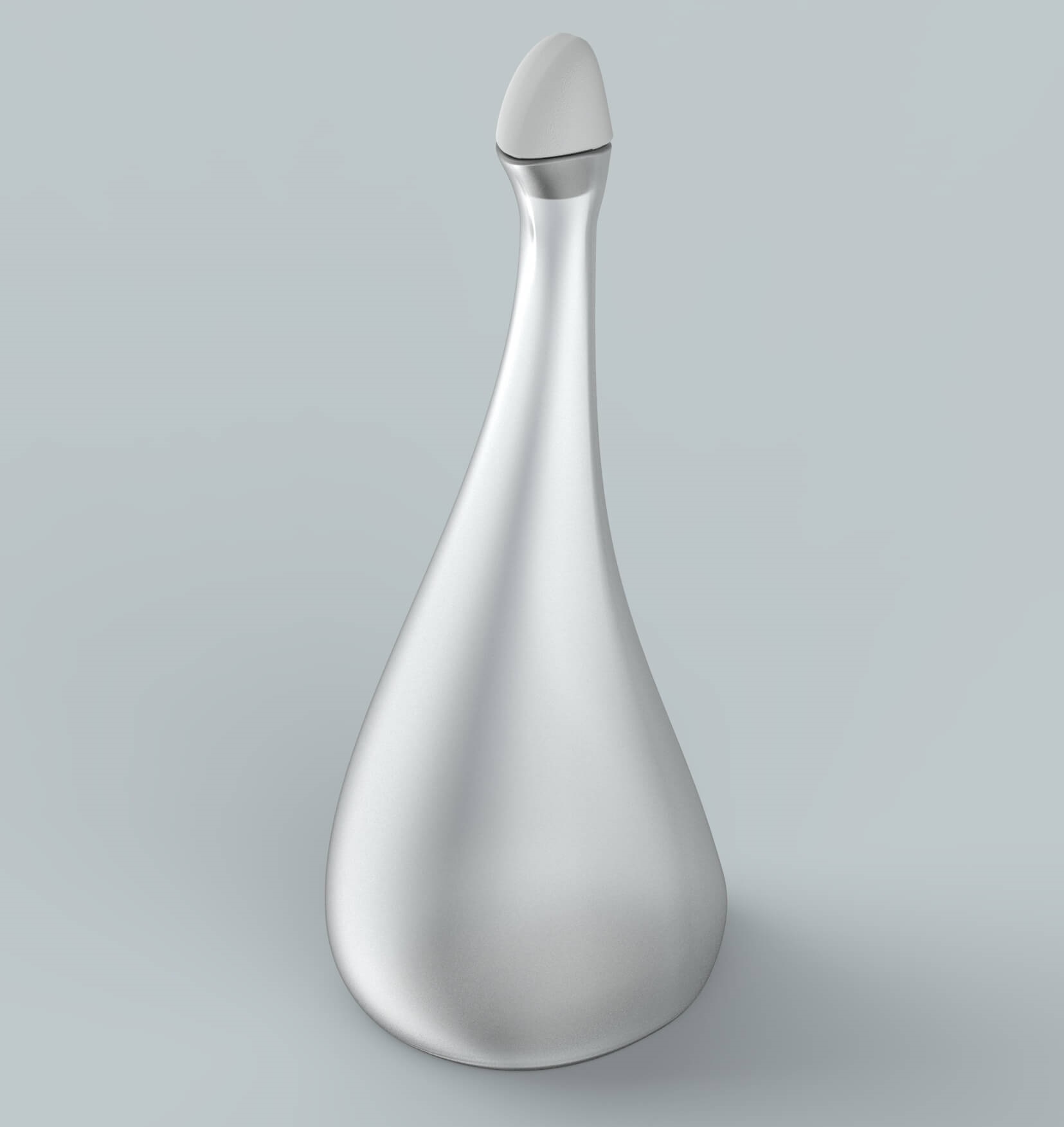
Geometry of the bottle for the Goose concept
Result
At the end of the competition for the bottle geometry and new label design, despite many worthwhile ideas, Russian Original Drinks did not dare to radically change the image of the brand and decided to keep the former design of “Derevenskoye moonshine”.
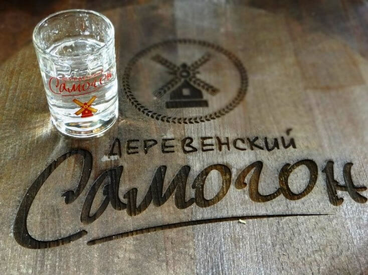
The old design of Village Moonshine.
Among our branding agency’s options, the client specifically mentioned and approved the “Geese” concept.
Summary
Premium brands need to “fit in” in order to maintain and strengthen their position. Therefore, it is very important to have “rich”, “regal” packaging and a unique positioning concept.