"A source of health from the bowels of
of the earth."
ETIQUETTE DESIGN
WATER
The first plant of OJSC Valuysky Distillery was launched back in 1887 and is located in the south-eastern part of the Belgorod Region. The Valuysky Distillery controls the quality of products at every stage of production. However, the competition increasing day by day requires the management of the distillery to make radical changes.
Redesign of mineral water: challenges KOLORO specialists faced the question of forming a distinctive and recognisable brand that would emphasise the purity and usefulness of the product.
MARKET ANALYSIS
– the target audience of the product is men and women from 18 to 50 years old; – sales market – Voronezh, Kursk, Lipetsk, Orel regions; – Consumption motives – aspiration to a healthy lifestyle.
PACKAGING DESIGN AND
POSITIONING
According to the results of the marketing analysis, it was found that many mineral water TMs use images and symbols associated with nature, recreation and health in their brand design. For the development of the new label of “Kreschenskiy Rodnik” the important criteria were: clear positioning of the brand and memorable appearance.
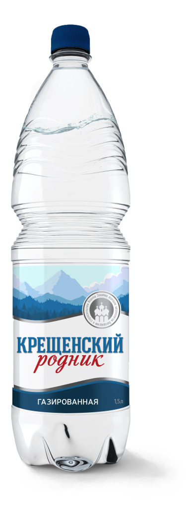
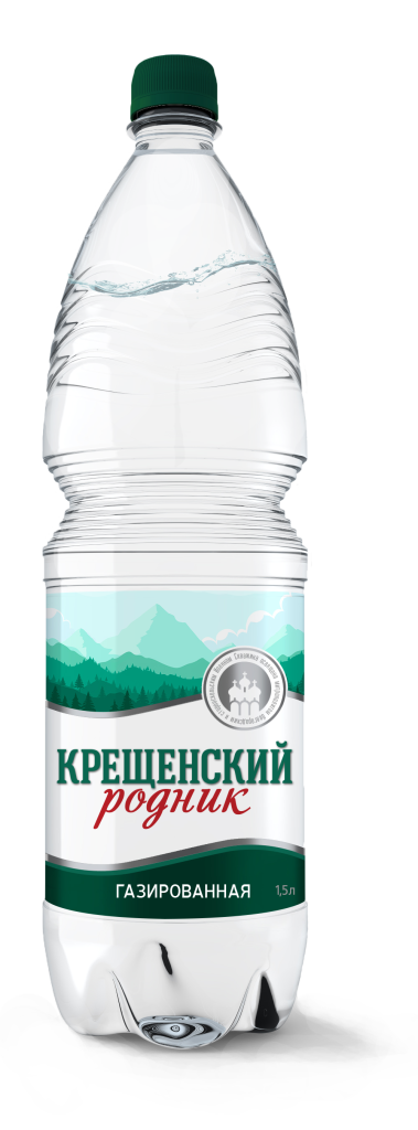
KOLORO designers took into account the customer’s requirements and developed more than 10 variants of label design, selecting 4 most promising among them.
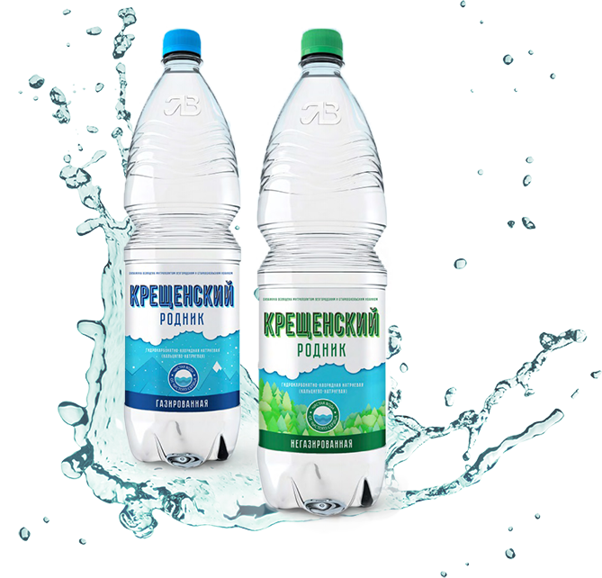
CONCEPT. “MINIMALIST”
According to the results of the marketing analysis, it was found that many mineral water TMs use images and symbols associated with nature, recreation and health in their brand design. For the development of the new label of “Kreschenskiy Rodnik” the important criteria were: clear positioning of the brand and memorable appearance.
KOLORO designers took into account the customer’s requirements and developed more than 10 variants of label design, selecting 4 most promising among them.
– illustrations mimic paper appliqué; – ruler identification through concise depictions of the forest and mountain ecosystem; – contrasting and vibrant colour scheme.
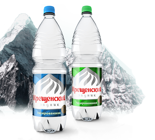
CONCEPT. “MODERN”
The metallic design gives the design a modern and technological look. The main element is a rounded metal cone, which is simultaneously associated with a church dome and a snowy mountain top.
ASSOCIATIVE SERIES:
nature, mountains, church, church bath, freshness, purity.
FEATURES:
– the illustrations are done in metallic style; – identification occurs through a broad associative image of a peak (mountain or temple); – play on the contrast of white background and red lettering.
CONCEPT “PARK”
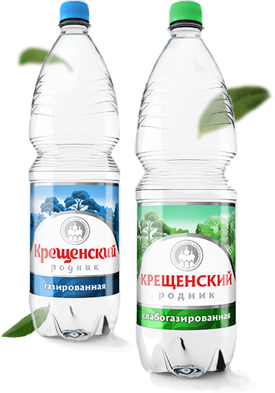
The background uses images of wooded or park-like terrain, which creates a sense of freshness, tranquility, and freedom from the cool product for the consumer.
ASSOCIATIVE SERIES:
park, forest, trees, spaciousness, relaxation, health, naturalness.
FEATURES:
– recognisable background images; – use of rich illustrations; – an identifying element – a logo depicting church baths.
ИСТОЧНИК ЗДОРОВЬЯ
ИЗ НЕДР ЗЕМЛИ
RESULT
The new unique design of the Kreshchenskiy Rodnik mineral water packaging turned out to be bright and recognisable. This is evidenced by the increased demand from the target audience: over the year, the company managed to increase the share of sales of Kreshchenskiy Rodnik TM products in the Belgorod Region from 12% to 14%.
SUMMARY
Due to the obsolescence of packaging design and loss of its former attractiveness, any company sooner or later needs rebranding.
A well-thought-out promotion strategy and high-quality design will win even the most picky buyer. And KOLORO branding agency will help to create not just a unique design, but a real royal brand.
You can order label development and find out the cost of water design by filling out a brief on our website.