AGROHOLDING LOGO DESIGN

LOGO DESIGN

WORK PACKAGE FOR AN AGRICULTURAL HOLDING

HISTORY OF CO-OPERATION

In spring 2017, we were approached by Terra LLP, one of the largest breeding cattle reproducers in Kazakhstan. The company planned to introduce its product line to the retail market of Kazakhstan and neighbouring countries. In order to make a bright statement, the company, together with the branding agency KOLORO, undertook to develop a corporate identity and create a new design for the line of meat products. After the successful completion of this project, both parties were satisfied with the co-operation and launched another project.

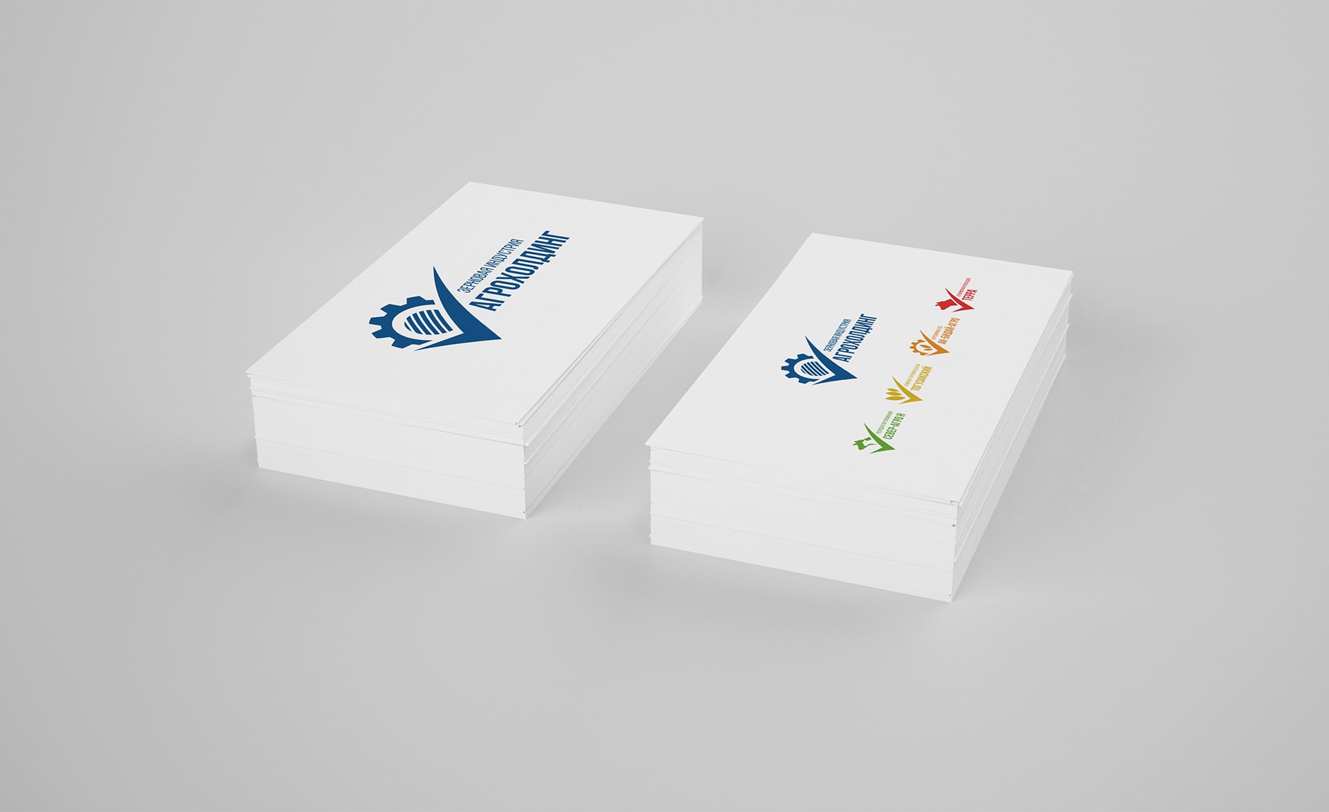
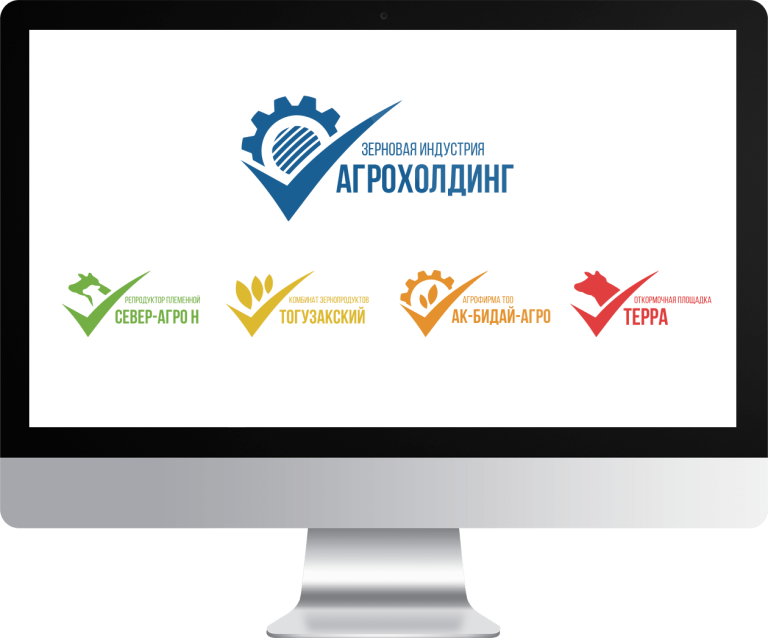
Terra LLP is a part of agroholding, which consists of 4 companies: Toguzak grain products combine (drying, packing, storage of grain); AK Bidai-Agro (cultivation of grain crops); North Agro N (breeding reproducer of Aberdeen-Angus breed); Terra (fattening ground of Aberdeen-Angus breed). The KOLORO team had to create a common logo for the agroholding and individual logos for each of the areas. It was necessary to come up with a logo in a unified style and differentiating elements to show the belonging and individuality of each company.

LOGO DEVELOPMENT FOR THE AGRICULTURAL HOLDING COMPANY

Before starting to create visual concepts, our marketers conducted in-depth desk research, studied international and sub-regional trends. We also familiarised ourselves with the corporate identity of our competitors so as not to accidentally repeat someone else’s identity.

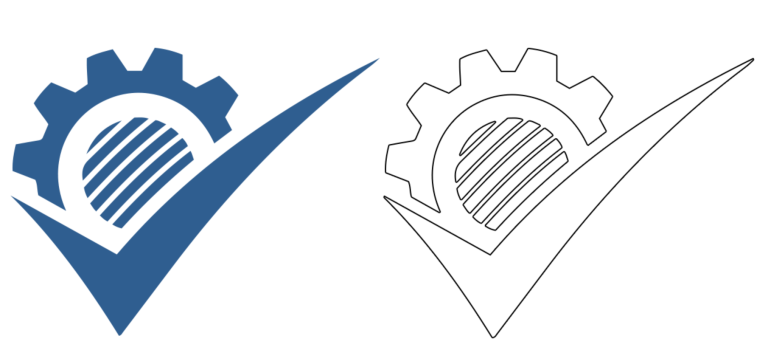
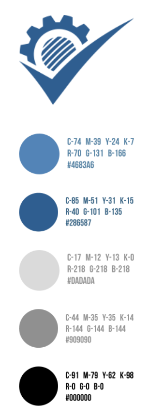
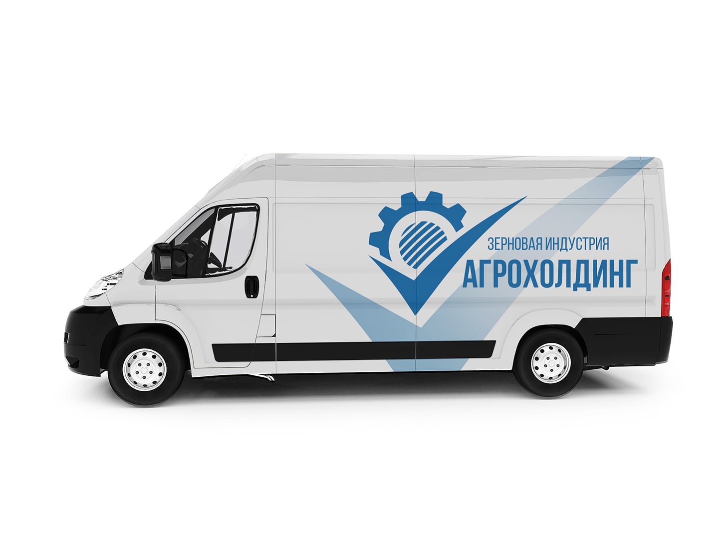
The holding company’s logo reflects the essence of the company – the “tick” sign is sharp, even, clearly drawn. This shade was chosen from 15 variants of close blue and blue, with a focus group test. It best reflects naturalness and naturality – the key emotions that were required for this project.

Each of the lettering options has its own takeaway element. For the general logo it is a gear – a symbol of a smoothly working mechanism.

Before starting to create visual concepts, our marketing specialists conducted an in-depth desk research, studied international and sub-regional trends. We also familiarised ourselves with the corporate style of our competitors so that we would not accidentally repeat someone else’s identity.
CORPORATE BRANDING: FONT SELECTION

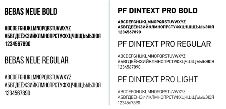
We have chosen 2 types of fonts. Bebas Neue is a chopped sans serif font that is suitable for headlines and good for navigation. PF Din Text Pro is a font with a history, originally from Holland. It is simple, legible and versatile. Like Bebas Neue – Din Text is a sans serif font, which increases the readability of the text.

DEVELOPMENT OF THE AGROHOLDING'S IDENTITY: COLOUR SCHEME

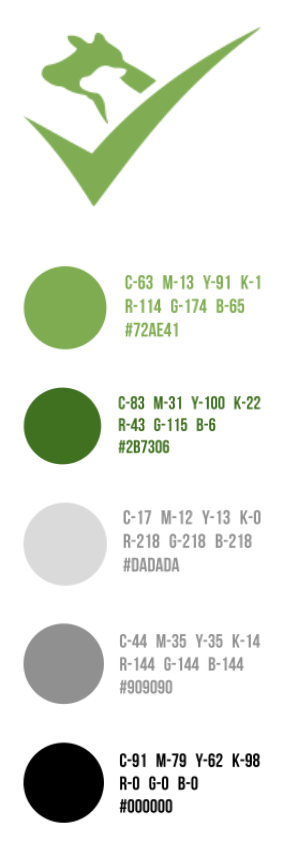
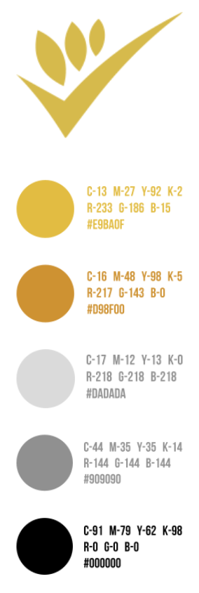
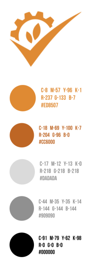
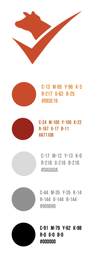
The palette of the logos was chosen to be calm, not flashy. It was important to separate the directions, leaving the semantic message in them. thus, the fattening site received a green colour scheme, the breeding breeder – red, the grain products combine – warm orange, and the grain growing enterprise – beige and yellow.


OUR RESULTS:

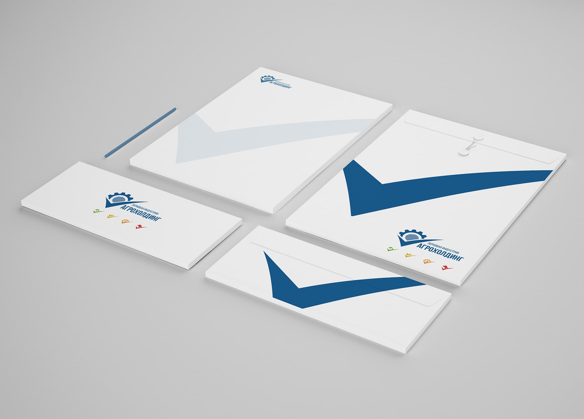
Agroholding Zernovaya Industriya has a recognisable identity, which makes it easier for them to conquer the markets of Kazakhstan, China and Russia. The corporate identity is consistent, solid, and fulfils the main task – to visually unite the company’s divisions, telling about the company’s professionalism, its reliability and the quality of its products.


Click to rate this post!
Voted: 0

Did you like the work? Leave your vote:)

DID THIS PROJECT MAKE YOU WANT TO WORK WITH US?

Discuss Your Project

Developing the Work Plan

Pricing and Timelines